Imprint
Copyright 2012 Smashing Media GmbH, Freiburg, Germany
Version 1: February 2012
ISBN: 978-3-943075-24-3
Cover Design: Ricardo Gimenes
PR & Press: Stephan Poppe
eBook Strategy: Thomas Burkert
Technical Editing: Andrew Rogerson
Idea & Concept: Smashing Media GmbH
About Smashing Magazine
Smashing Magazine is an online magazine dedicated to Web designers and developers worldwide. Its rigorous quality control and thorough editorial work has gathered a devoted community exceeding half a million subscribers, followers and fans. Each and every published article is carefully prepared, edited, reviewed and curated according to the high quality standards set in Smashing Magazine's own publishing policy. Smashing Magazine publishes articles on a daily basis with topics ranging from business, visual design, typography, front-end as well as back-end development, all the way to usability and user experience design. The magazine is and always has been a professional and independent online publication neither controlled nor influenced by any third parties, delivering content in the best interest of its readers. These guidelines are continually revised and updated to assure that the quality of the published content is never compromised.
About Smashing Media GmbH
Smashing Media GmbH is one of the world's leading online publishing companies in the field of Web design. Founded in 2009 by Sven Lennartz and Vitaly Friedman, the company's headquarters is situated in southern Germany, in the sunny city of Freiburg im Breisgau. Smashing Media's lead publication, Smashing Magazine, has gained worldwide attention since its emergence back in 2006, and is supported by the vast, global Smashing community and readership. Smashing Magazine had proven to be a trustworthy online source containing high quality articles on progressive design and coding techniques as well as recent developments in the Web design industry.
About this eBook
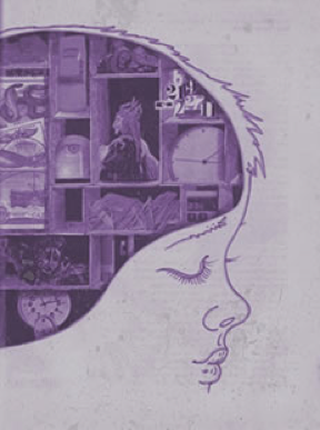
Among the most important ingredients for successful Web designs are creativity, planning, coding and design skills. However, many people forget that various psychological factors also play an important role when making design decisions. Psychology of Web Design gives you insights on how the human brain deals with different elements, colors, contrast, symmetry and balance. Combining the usability guidelines from Maslow's pyramid will surely help you design closer to your audience's desires.
Table of Contents
Designing For The Mind
Francisco Inchauste
Do you know what makes a design good?
Is it merely an opinion, or is there something more to it? Breaking design down seems like such an abstract thing. Even the designers who are able to create thought-provoking work seem purely talented and have natural abilities that cant really be nailed down to a process. But what if there were principles that captured why design and art worked the way that they do?
There are many beautiful designs that have been created on both a conscious and unconscious level. The downside of a designer continuing to create on an unconscious level is that the decisions they make appear somewhat random. For example, think if you were to ask a pilot why they clicked a few switches and they answered, It just feels like the right switches to me, rather than, I need to adjust the wings to reduce wind drag. As a passenger, the second would make us feel safer and confident in the pilots abilities.
There is a real power that comes from being able to identify and speak to what makes your design meaningful. In the story of the Joshua Tree (Sidebar) we learn that once you recognize and understand something, it unlocks a new level of perception. In this article well take a look at some principles that make the aesthetics of design attractive to people, and explanations on why they do. The more you become conscious of how design works the better you are able to communicate and judge design decisions.
Many years ago I received a tree identification book for Christmas. The first tree in the book was the Joshua tree because it took only two clues to identify it. Now the Joshua tree is a really weird-looking tree and I looked at that picture and said to myself, Oh, we dont have that kind of tree in Northern California. That is a weird-looking tree. I would know if I saw that tree, and Ive never seen one before.

So I took my book and went outside. I had lived in that house for thirteen years, and I had never seen a Joshua tree. I took a walk around the block, and there must have been a sale at the nursery when everyone was landscaping their new homes at least 80 percent of the homes had Joshua trees in the front yards. And I had never seen one before. Once I was conscious of the tree, once I could name it, I saw it everywhere. Which is exactly my point. Once you can name something, youre conscious of it. You have power over it. You own it. Youre in control.
Hello, Im Your Brain
Design is powerful because of the way our brain processes visuals. We might think of vision working by our eyes pulling in images and projecting them in the back of our mind. If this were the case then there would no be design or art. There are in fact 30 areas in the back of your brain that process different aspects of the image. The various vision processing areas of the brain are individually recreating the design. So, in a way, the viewer is also an artist. In reality, design and art stimulate the mind more than a realistic image would do. Which is why it affects us differently. Randomly placing objects on a screen do not create the same reaction. There must be purpose to the visual distortion/arrangement for the mind to pick up.

It would be nearly impossible to lock down all the various styles of design that are out there. Sure, we can categorize them into bigger buckets and generalize with words like clean, or grunge, and designers certainly understand what kind of design to expect from those words. Although at the surface there is a difference between them, at their very core the brain is being stimulated by them in the same way.
The principles below are based on studies of the brain and neurological research that have been presented a variety of ways online. In this article I have attempted to present them in a way that best relates them to design.
The Principles of Aesthetic Experience
Grouping
When you look at a design layout and notice subtle touches like the links of a specific color this is not just a nice design touch, or good usability. It is tapping into the way your mind groups together things like shapes or colors. This technique is used heavily in design and plays off the minds natural tendency to try and find connections in elements. For example, in logos like FedEx, the arrow is created in the mind by grouping the negative space between the E and the X.

The neural mechanisms that we are tapping into are the same as those that evolved as a survival trait in the brain to protect us from predators and defeat their camouflage. Consider an early human seeing a golden color behind some foliage. The mind grouped those together as one whole so we can tell that there is a lion waiting behind the leaves. There are a set of design principles known as Gestalt Theory which breakdown the various types of grouping into specific categories. These can be explored for further understanding of grouping.

