Smashing Magazine is an online magazine dedicated to Web designers and developers worldwide. Its rigorous quality control and thorough editorial work has gathered a devoted community exceeding half a million subscribers, followers and fans. Each and every published article is carefully prepared, edited, reviewed and curated according to the high quality standards set in Smashing Magazine's own publishing policy. Smashing Magazine publishes articles on a daily basis with topics ranging from business, visual design, typography, front-end as well as back-end development, all the way to usability and user experience design. The magazine is and always has been a professional and independent online publication neither controlled nor influenced by any third parties, delivering content in the best interest of its readers. These guidelines are continually revised and updated to assure that the quality of the published content is never compromised.
Smashing Media GmbH is one of the world's leading online publishing companies in the field of Web design. Founded in 2009 by Sven Lennartz and Vitaly Friedman, the company's headquarters is situated in southern Germany, in the sunny city of Freiburg im Breisgau. Smashing Media's lead publication, Smashing Magazine, has gained worldwide attention since its emergence back in 2006, and is supported by the vast, global Smashing community and readership. Smashing Magazine had proven to be a trustworthy online source containing high quality articles on progressive design and coding techniques as well as recent developments in the Web design industry.
10 Harsh Truths About Corporate Websites
Paul Boag
We all make mistakes running our websites. However, the nature of those mistakes varies depending on the size of your company. As your organization grows, the mistakes change. This post addresses common mistakes among large organizations.
Most of the clients I work with are large organizations: universities, large charities, public sector institutions and large companies. Over the last 7 years, I have noticed certain recurring misconceptions among these organizations. This post aims to dispel these illusions and encourage people to face the harsh reality.
The problem is that if you are reading this post, you are probably already aware of these things. But hopefully this article will be helpful to you as you convince others within your organization. In any case, here are our 10 harsh truths about websites of large organizations.
1. You Need A Separate Web Division
In many organizations, the website is managed by either the marketing or IT department. However, this inevitably leads to a turf war, with the website becoming the victim of internal politics.
In reality, pursuing a Web strategy is not particularly suited to either group. IT may be excellent at rolling out complex systems, but it is not suited to developing a friendly user experience or establishing an online brand.

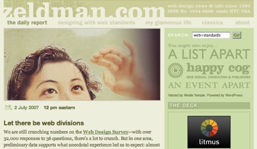
Zeldman urges organisations to create a separate web division.
Marketing, on the other hand, is little better. As Jeffrey Zeldman puts it in his article Let there be Web divisions:
The Web is a conversation. Marketing, by contrast, is a monologue And then theres all that messy business with semantic markup, CSS, unobtrusive scripting, card-sorting exercises, HTML run-throughs, involving users in accessibility, and the rest of the skills and experience that dont fall under Marketings purview.
Instead, the website should be managed by a single unified team. Again, Zeldman sums it up when he writes:
Put them in a division that recognizes that your website is not a bastard of your brochures, nor a natural outgrowth of your group calendar. Let there be Web divisions.
2. Managing Your Website Is A Full-Time Job
Not only is the website often split between marketing and IT, it is also usually under-resourced. Instead of there being a dedicated Web team, those responsible for the website are often expected to run it alongside their day job. When a Web team is in place, it is often over-stretched. The vast majority of its time is spent on day-to-day maintenance rather than longer-term strategic thinking.
This situation is further aggravated by the fact that the people hired to maintain the website are junior members of the staff. They do not have the experience or authority to push the website forward. It is time for organizations to seriously invest in their websites by hiring full-time senior Web managers to move their Web strategies forward.
3. Periodic Redesign Is Not Enough
Because corporate websites are under-resourced, they are often neglected for long periods of time. They slowly become out of date with their content, design and technology.
Eventually, the website becomes such an embarrassment that management steps in and demands that it be sorted. This inevitably leads to a complete redesign at considerable expense. As I point out in the Website Owners Manual, this a flawed approach. It is a waste of money because when the old website is replaced, the investment put into it is lost, too. It is also tough on finances, with a large expenditure having to be made every few years.

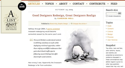
Cameron Moll encourages web designers to realign their website rather than redesign.
A better way is continual investment in your website, allowing it to evolve over time. Not only is this less wasteful, it is also better for users, as pointed out by Cameron Moll in his post Good Designers Redesign, Great Designers Realign.
4. Your Website Cannot Appeal To Everyone
One of the first questions I ask a client is, Who is your target audience? I am regularly shocked at the length of the reply. Too often, it includes a long and detailed list of diverse people. Inevitably, my next question is, Which of those many demographic groups are most important? Depressingly, the answer is usually that they are all equally important.
The harsh truth is that if you build a website for everyone, it will appeal to no one. It is important to be extremely focused about your audience and cater your design and content to it. Does this mean you should ignore your other users? Not at all. Your website should be accessible by all and not offend or exclude anybody. However, the website does need to be primarily aimed at a clearly defined audience.


