Copyright 2015 by Tyler Vigen Cover design and illustration by Rebecca Lown Cover copyright 2015 by Hachette Book Group, Inc.
All rights reserved. In accordance with the U.S. Copyright Act of 1976, the scanning, uploading, and electronic sharing of any part of this book without the permission of the publisher constitute unlawful piracy and theft of the authors intellectual property. If you would like to use material from the book (other than for review purposes), prior written permission must be obtained by contacting the publisher at permissions@hbgusa.com. Thank you for your support of the authors rights. Hachette Books Hachette Book Group 1290 Avenue of the Americas New York, NY 10104 hachettebookgroup.com twitter.com/grandcentralpub First ebook edition: May 2015 Hachette Books is a division of Hachette Book Group, Inc.
The Hachette Books name and logo are trademarks of Hachette Book Group, Inc. The publisher is not responsible for websites (or their content) that are not owned by the publisher. ISBN 978-0-316-33945-2 E3-20160726-JV-PC Dedicated to Kat
for supporting all my crazy ideas
In the late 1800s in Holland, a curious phenomenon occurred: The human birthrate rose at the same pace as the local population of white storks. Generations of parents would later rely on the connection to avoid awkward conversations with their children. While the story faded into folklore, the real-life correlation persisted. New research in the twentieth and twenty-first centuries has consistently confirmed a statistically significant connection between storks and human birthrates in a number of European countries.
In 1958, William Phillips, a professor at the London School of Economics, published a paper regarding the connection between unemployment and inflation. As other economists explored Phillipss data, the correlation spread like wildfire: high inflation rates were linked to low unemployment and vice versa. The policy implications were explicit. National economies needed only to choose between inflation and unemployment, or somehow find a balance between the two. The Phillips curve, as the connection came to be called, informed macroeconomic policy decisions for years in both Europe and the United States. Humans are biologically inclined to recognize patterns.
We spend thousands of dollars on college because education level correlates with monetary earnings later in life. We are attracted to the strong smell of freshly baked cookies because the strength of the aroma correlates with the proximity of the cookies. We go to bed early because a good nights sleep correlates with a better mood the next day. We avoid eating cheese before sleeping because cheese consumption correlates with fatal bedsheet tangling accidents. Wait, what was that about cheese? The pattern is clear: a statistical correlation exists between the increasing rate of national cheese consumption and the increasing number of accidental suffocations and strangulations in bed. Ive got the graph to prove it:  It could be that melted cheese clogs airways.
It could be that cheese causes night terrors. Or it could be that the correlation is totally spurious and accountable to chance. Almost certainly it is the latter. Does correlation imply causation? Its intuitive, but its not always true. Correlation, as a concept, means strictly that two things vary together. Automobile use correlates with automobile accidents.
Warm weather correlates with ice cream sales. Overcast skies correlate with rain. But then theres this one: the number of films Nicolas Cage has appeared in each year correlates with the number of people who have drowned by falling into a swimming pool. 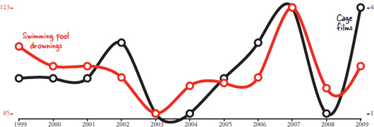 Correlations dont always make sense. Remember the correlation between babies and storks? It was also coincidence. The modern research into the phenomenon was conducted by scientists who wanted to show that statistics used improperly can provide wildly fallible results, and they succeeded.
It turns out William Phillipss theory on economics doesnt hold up either. The inflation-employment connection was pervasive, but it was overly simplistic. Years later, new research showed that Phillipss pattern didnt hold up with long-term data. The variables are related, but they dont directly control each other.  Provided enough data, it is possible to find things that correlate even when they shouldnt. The method is often called data dredging.
Data dredging is a technique used to find something that correlates with one variable by comparing it to hundreds of other variables. Normally scientists first hypothesize about a connection between two variables before they analyze data to determine the extent to which that connection exists. For example, testing the theory of whether storks bring babies by correlating storks with birthrates. Instead of testing individual hypotheses, a computer program can data dredge by simply comparing every dataset to every other dataset. Technology and data collection in the twenty-first century makes this significantly easier. Instead of reading the back of every movie at Blockbuster, I can hop on IMDb.com to find the number of movies Nic Cage appeared in within two minutes.
I dont need to track all of Walmarts annual sales to see if there is a correlation to their data; someone at Statista.com has already pulled it from their annual reports. What about deaths from a particular cause? The Centers for Disease Control publishes all its data. How many stay-at-home dads are there? The U.S. Census will give me an estimate. This is the world of big data and big correlations.  In the following pages youll see dozens of correlations between completely unrelated sets of data.
Every correlation was discovered by a computer. The correlations were all produced in the same way: One giant database of variables collected from a variety of sources is mined to find unexpected connections. In order to create each chart, I begin by selecting a statistic I want to correlate. An algorithm then goes through the entire set of statistics and calculates the correlation coefficient for every variable compared to the one I selected. From there the program displays the strongest correlations. In this book I use Pearsons correlation coefficient, which is very common for expressing linear relationships between variables.
Out of the thousands of graphs my algorithm has generated that could have appeared in this book, I had some help selecting which ones would be the most fun to show. I sent a link to many of my fellow students here at Harvard Law School and asked them to rate and comment on various graphs. Collectively they cast more than 13,000 votes on how interesting they found each graph, and I wish I had space to thank every one of them by name. Since I dont, maybe I can shift the blame to them instead: If you dont find a particular graph interesting, please blame the students of Harvard Law School. Despite the humor, this book has a serious side. Graphs can lie, and not all correlations are indicative of an underlying causal connection.





 In accordance with the U.S. Copyright Act of 1976, the scanning, uploading, and electronic sharing of any part of this book without the permission of the publisher constitute unlawful piracy and theft of the authors intellectual property. If you would like to use material from the book (other than for review purposes), prior written permission must be obtained by contacting the publisher at permissions@hbgusa.com. Thank you for your support of the authors rights.
 It could be that melted cheese clogs airways.
 Correlations dont always make sense. Remember the correlation between babies and storks? It was also coincidence. The modern research into the phenomenon was conducted by scientists who wanted to show that statistics used improperly can provide wildly fallible results, and they succeeded.
 Provided enough data, it is possible to find things that correlate even when they shouldnt. The method is often called data dredging.