Alien
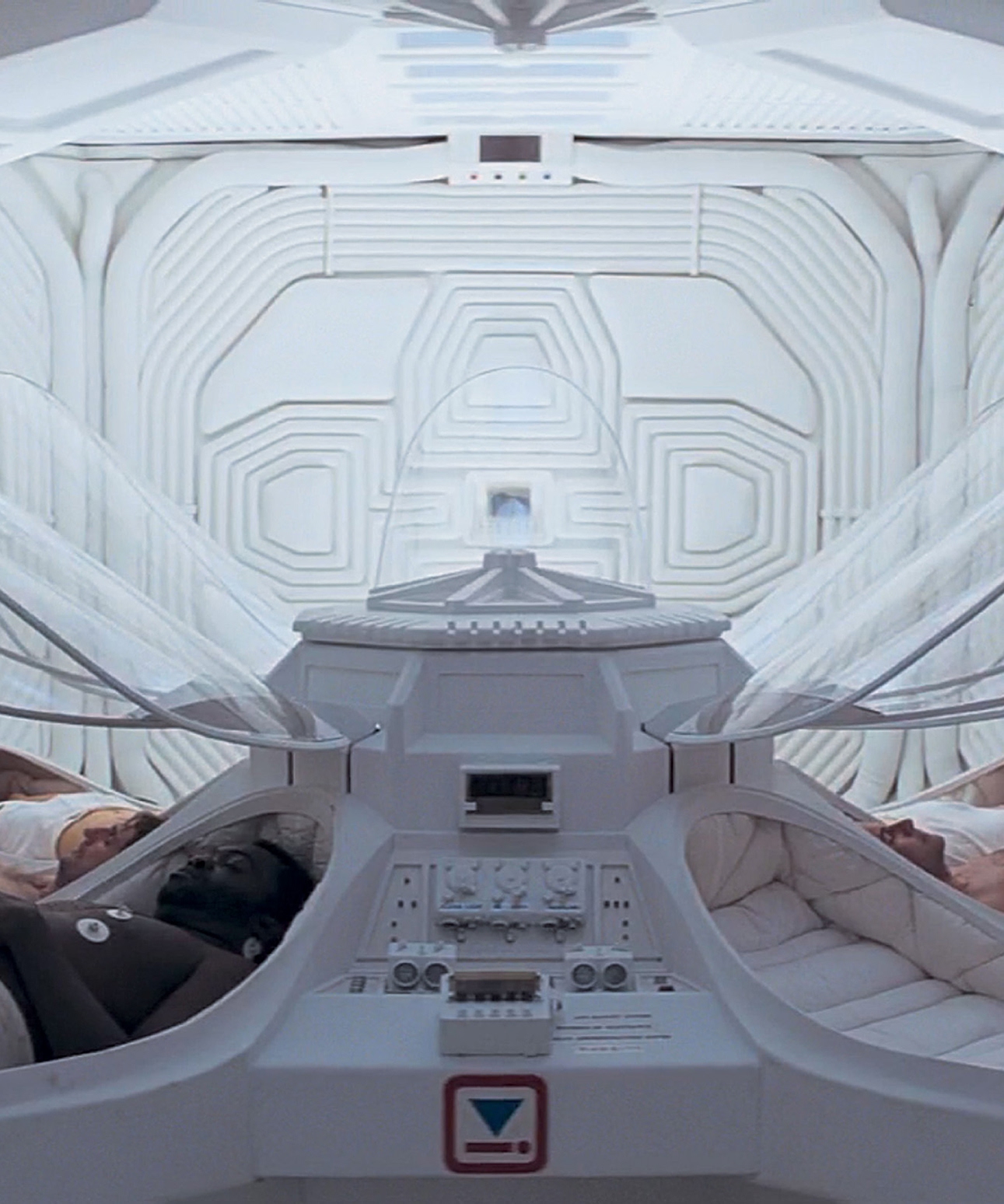
s opening sequence introduces us to the Nostromo s hypersleep pods,
which can be found in the ships cryogenic vault. We know that they are in the
ships cryogenic vault because of the inverted-blue-triangle-and-flat-red-person
icon in the bottom center of this shot, which is clearly labeled CRYOGENIC
VAULT in concept designer Ron Cobbs production sketches. This icon
combines blue (lowered thermal condition) with red (viable, sound, alive,
alertness) as part of Cobbs Semiotic Standard of iconography and color
identification seen throughout the Nostromo s interior. (Well study Cobbs
semiotic standard in more detail on .)

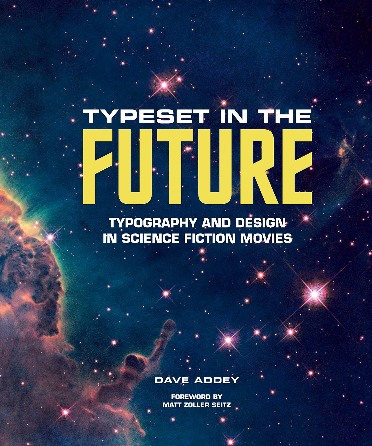
TYPESET IN THE FUTURE
Dave Addey made me miss a deadline.
It was a few years ago. I was trying to finish a rewrite of a long piece for
New York
magazine
that had to go to press the next day. I dont remember how it happenedprobably as the result
of a movie discussion on social mediabut I found myself googling the words
Futura
and
science
fiction films
and somehow ended up on Typeset in the Future, the website that would ultimately
become this book.
And it was there that I encountered the best of all possible discoveries: a thing so special and
enthralling that I briefly wondered if it really existed or if I was dreaming it.
Typeset in the Future was an entire website about the use of fonts to put across the idea of
the future in science fiction movies. That was its primary focus, and it was immediately clear
that Addey was approaching his core mission with monk-like devotion. Starting with Stanley
Kubricks
2001: A Space Odyssey
, he pored over several classic science fiction films, freeze-
framing compositions and zooming in on details, sometimes tilting or flipping the image to give
us a better look at it. He looked at titles and subtitles, signage and manuals, computer screens
and television chyrons, and scrutinized words and sentences, paragraphs and punctuation. He
analyzed the spacing, the kerning, the serifs or lack thereof. He noticed where the filmmakers
seemingly inserted one letter from a different typeface into a word that was otherwise uniform.
It was the damnedest display of hyper-specific expertise that Id seen in a long time.
I looked at the clock four hours later and realized Id missed my deadline. I had to make up
an excuse, because I was up all night reading about fonts doesnt usually cut it with editors.
I regret nothing. The word
fanatic
doesnt do justice to the experience of reading Addey on
fonts. Its like reading Molly Haskell on screwball comedies or Roger Angell on baseball.
Its also like being in a class taught by the sort of professor that you instantly know youre
going to think back on fondly for the rest of your days. Its clear that Addey knows as much
about the particulars as any working designer, and that he also has that great teachers ability
to explain all he knows to somebody who knows very little, with concision, nuance, and lots of
little jokes, many of them endearingly corny. (Good news! announces the opening of the second
chapter. While you were reading about
2001: A Space Odyssey
, a typographic study of
Alien
was
gestating for your enjoyment.)
Another thing that distinguishes a great teacher is the ability to jump from the subject youre
ostensibly studying to an adjacent subject and back again, without damaging the flow of the
discussion. Addey is a master at that. You can see his skill put to fine use as you turn the pages
of this book. Every page of
Typeset in the Future
is meant to be looked at as well as read, and the
images and text are always working in tandem to express an idea. Much of the book is specifically
focused on typefaces used within a given science fiction property (
2001
, the
Alien
franchise,
Blade Runner
,
Moon
, the various iterations of
Star Trek
), but on every other page youll find
Addey expanding his vision to accommodate the historical time period, social customs, and design
clichs that a given film either echoed or pushed against. And, woven throughout the layout,
youll find examples of whatever hes discussing, reproduced in enough detail to be savored as
objects and described in pithy two-line summaries or in clever captions.
FOREWORD

FOREWORD
This is a book so tightly focused that it can spend several pages discussing variants of Hori-
zon, a font specifically created for use on the original
Star Trek
, or Pump Demi, a font often used
in subtitles of alien languages; yet playful and loose enough to conduct lengthy interviews with
important production designers like Mike Okuda and detour into discussions of the narrative
function of dry on-screen factoids (such as the opening description of the
Alien
ore vessel
Nos-
tromo
, which Addey describes as foreshadowing inventory), or the way science fiction film-
makers continue to put jagged-edge, pulsing scan lines on TV screens to signal that were looking
at a TV, even though televisions havent done that since the turn of the millennium.
Treating
2001
as a cinematic big bang that advanced the arts of both motion-picture story-
