ACKNOWLEDGEMENTS
I should like to express my thanks to the directors of the museums and art galleries who assisted me in assembling the material for this book.
The photographers who took the pictures are: Oliver Baker, Colten, Bruce Elkus, Walter Rosenblum, Soichi Sunami, Elizabeth Timberman.
The exercises and student problems reproduced are by my students at the Art Students League of New York.
THE PICTURE BORDER
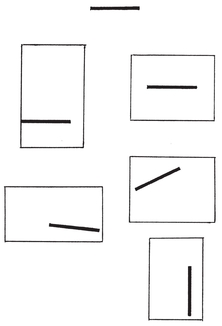
To begin a picture it is necessary first to establish the area in which the picture will be made by drawing the enclosing border. This picture border is frequently referred to as the picture frame, or the frame of reference. The vertical and horizontal lines of the border make a frame of reference for measuring the position and the activity of the elements in the picture.
Many artists begin a picture by drawing the subject and then attempting to enclose it with a border. This inevitably leads to compositional difficulties. It can be likened to the builder who erects the walls for his building and then attempts to place a foundation under them.
This principle of design is demonstrated by using a black square. Note that the square has no pictorial significance until it is related to a border. Only then can its activity and nature be understood, for the square changes into a triangle in a different frame relationship.
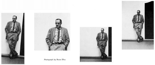
One photograph of the author was taken. By using an enlarger, the relationship of the figure to the border was changed in each of the four pictures.
Photograph by Bruce Elkus.
EXERCISE
Mark off a series of equal-sized picture borders on several sheets of white paper. Cut a number of squares, circles and triangles out of any black paper. Try placing these in different positions and different relationships in each of the picture borders. When the arrangement, or the composition, feels right, paste them into place with rubber cement. Study the results and see if you can feel how each picture acts differently.
This should serve to stimulate and exercise your sensitivity to spatial relationships and their activity.
FLAT OR SHALLOW SPACE
Since the first picture was made, artists have been challenged with the problem of creating the illusion of space on a flat, two-dimensional surface. This has made available to us a rich reservoir of various technical means of achieving space.
All pictures can be divided roughly into two categoriesflat space and deep space. Though many pictures combine these, generally one concept of space or the other is dominant. Most of pictorial art is primarily flat in spatial concept. Only for a limited time in relation to our total art history were pictures made with deep spatial emphasis. This was during the Renaissance, and from that period the theories of perspective evolved. This section of the book concentrates on two-dimentional composition, which dominates contemporary art thinking.
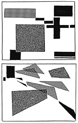
A sense of depth of space can be realized by using planes parallel to the picture frame (without perspective). It is apparent in the illustrated student exercises that they vary in feeling of depth and space. As the horizon, or eye level line, is raised, the sense of depth is increased. The partial overlapping of one subject on another tends to intensify the depth feeling.
G. PRESTOPINO.
Subway.
ACA Gallery.
In one design exercise all the planes are vertical and horizontal to the borders of the picture. In the other a greater penetration of space results from tilting the planes into perspective depth. A deeper sense of space and greater spatial activity result.
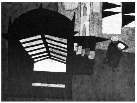
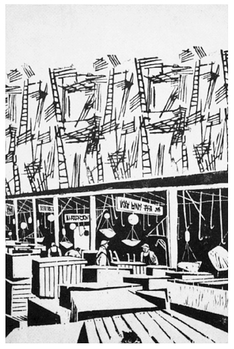
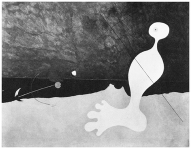
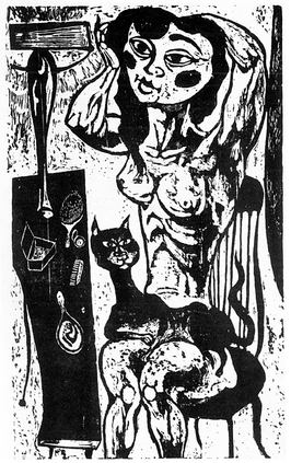
The woodcut by Frasconi and the painting by Miro both use flat design with a shallow depth of spatial feeling. Both use overlapping planes for recessive space.
A. FRASCONI.
Detail from Fulton Fish Market (Cargo). Weyhe Gallery.
JOAN MIRO.
Person Throwing a Stone at a Bird . Collection Museum of Modern Art.
H. STERNBERG .
The Dressing Table. ACA Gallery.
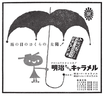
It is interesting to note the influence of Western design on the Eastern picture reproduced below.
The flattening of the perspective in the dressing table in the Sternberg woodcut serves to retain the shallow space of the rest of the picture.
EXERCISE
Arrange a still life with a few simple objects. On several sheets of paper draw picture borderssome vertical and some horizontal. Inside one of these do a line drawing of the still life as you see it. On the other pages do several versions of the still life without moving the objects. Shift their relationship to each other and to the border. Raise and lower the table line. Study the compositions for spatial feeling. Do design exercises as illustrated on the previous page.
POSITIVE AND NEGATIVE SPACE
The borders of a picture, the picture frame, enclose a defined area of space, generally considered as negative space. The shapes or objects placed in the picture create positive space, and the remaining area is negative space. The interrelationship between these two is one of the dynamics of composition. Sole concentration on the positive elements, the figure, vase or tree, inevitably results in compositional inadequacy. The artist must be conscious of both types of space when he designs his picture.


