Foreword
Photographers, painters, and other visual artists are united in their purpose: to reflect and reveal the world around them. Making sense of the world through pictures is a process that begins in the earliest stages of childhood. As soon as I could hold a pen, I started to draw. The habit stuck, and eventually became my career.
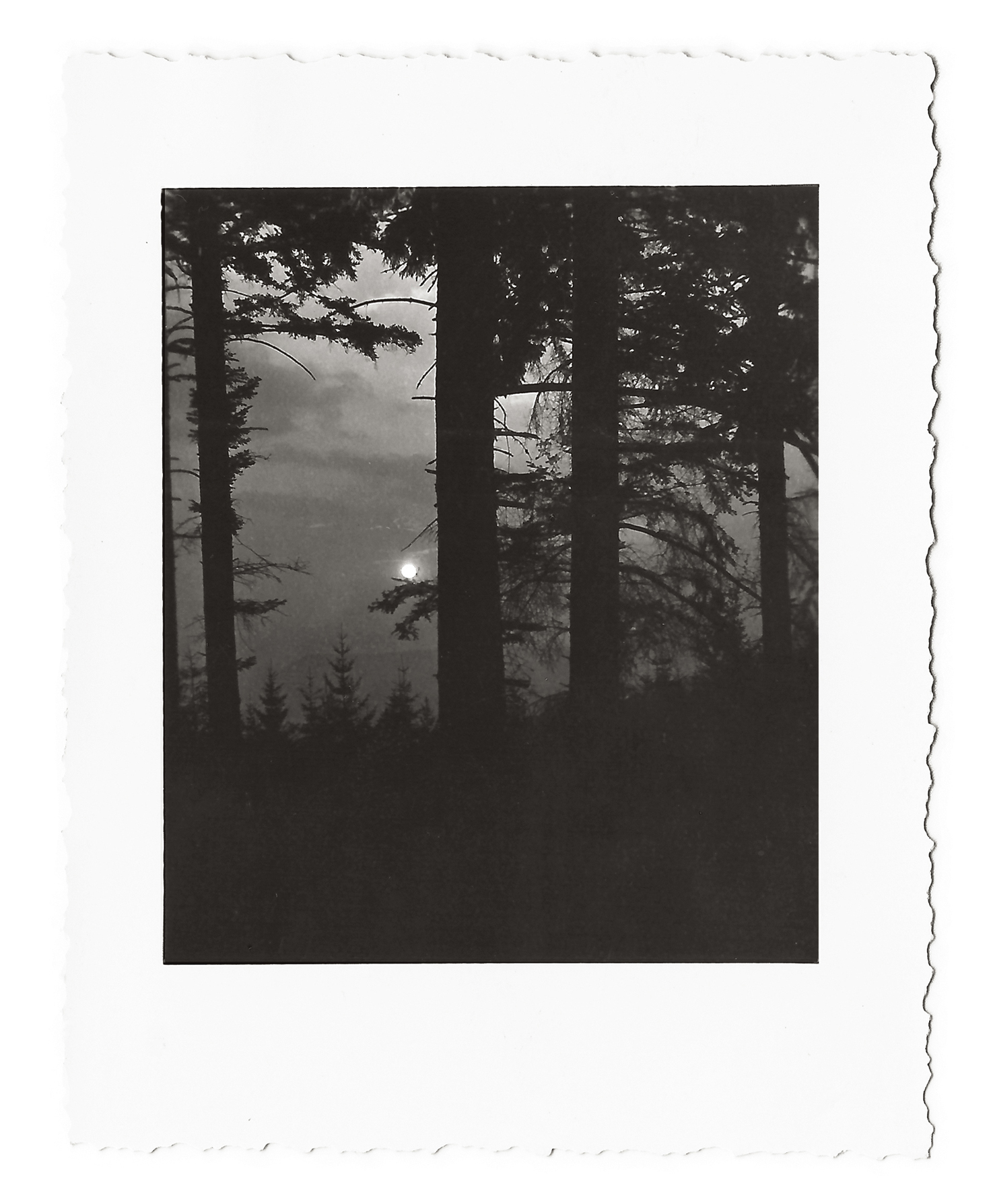
Photography first became a part of my life when my parents entrusted me with a folding camera, which I took on a bicycling tour of southern Germany. At the time, I could afford only two rolls of film16 exposures, which needed to last me 14 days. The very first photograph I took is shown here. I printed it on baryta-coated paper. Today keeping a camera at my side is just as natural as keeping a drawing pad or a sketchbook handy.
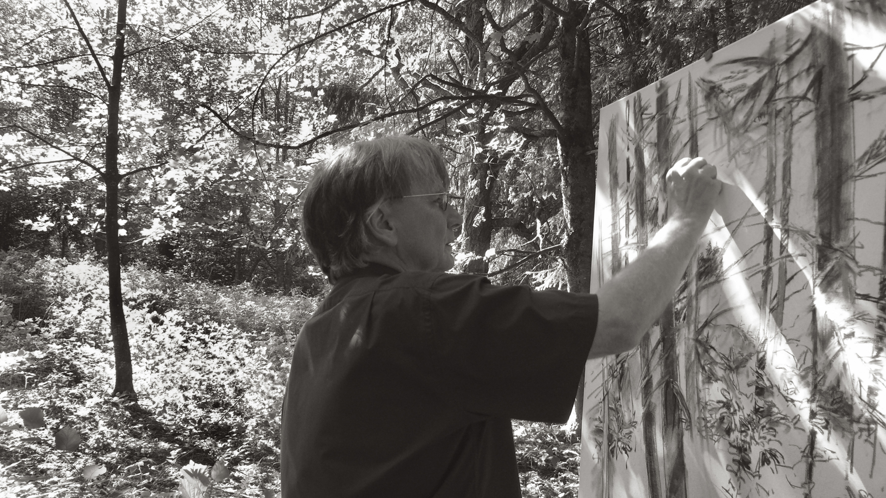
Drawing forces you to be attentive and teaches you how to see. Developing my ability to draw has improved my work with the camera significantly. The inverse is true, too: I owe many of the important artistic inspirations Ive had while drawing to my photography.
The ability to produce good drawings and impressive pictures does not happen overnight. A wide array of experiences is needed to acquire these skills. Artistry and a broad education in the visual arts are the building blocks for a successful artist and they must be complemented by an aptitude for visual composition and design techniques. Viewers will intuitively be able to tell if these skills are being utilized successfully in the image.
Painting, photography, and graphic arts involve composing elements within fixed dimensions. How can a composition use surrounding elements to support and enhance the main subject? Where should the subject be positioned within the visual field? Where should the horizon be placed? How will the viewer navigate through an image? In what direction should a diagonal line point? To what extent does light contribute to the overall effect of a picture? These are critical questions related to visual composition. I address these questions in my lectures on visual design at the University of Mainz. I use examples from all branches of the visual arts, including photography. In many instances, Ive taken pictures for the express purpose of exploring these ideas.
You may lament the gradual disappearance of film photography, but digital cameras offer substantial advantages that are of real use to artists interested in composition. For instance, the framed display screen is a tremendously helpful tool when trying to create an ideal composition. The display instantly reveals your results, which allows you to decide which shots in your series are the most successful. Another advantage of digital photography is that the concerns about the physical equipment required for shooting film are eliminated, allowing you to use your digital camera like a sketchbook. You can keep the good photos and delete the rest.
The original spark for creating this book was the realization that photography is an ideal medium for illustrating the broad possibilities of visual composition. The photographs in these pages are reproduced in black-and-white, or grayscale, so that the main compositional elements are front and center while any potential distractions from colors are kept at bay.
I dedicate this book to my former students. I wrote it for them as well as for the participants in my courses; for beginning and advanced drawers; for graphic designers, painters, and illustrators; and, of course, for artists who work exclusively in photography. This book will also be a valuable tool for readers who would like to view and evaluate imagesregardless of the specific mediumwith greater expertise.
Albrecht Rissler, July 2014
Why Compose?
The Playing Field
Composition means bringing together individual elements into a cohesive whole. Music emerges from the assembly of notes, rhythm, and the interplay of instruments. Individual graphic elements interact in a similar way in the visual arts. Sculptors work with three-dimensional components, as do architects and city planners.
When it comes to painting, drawing, graphic design, and photography, composition pertains to the organization of two-dimensional elements within a predefined image area. In most cases, the image area is a rectangle. It is in this area that all of the visual subject matter is conveyed.
When a viewer observes an image, his or her eye immediately responds to the overall effect of the image, even if it is difficult to initially grasp the elements at play. The fundamental effectiveness of an image is its composition, its formal organization. Even a well-selected subject that has been immaculately reproduced in a technical sense will usually fail to impress viewers when not supported by a compelling visual design: a pictures content and composition should merge into one cohesive image.
An images composition consists of various individual elements that exhibit unique qualities. Individual elements may strike dramatic contrasts with one another or they may play harmoniously off one another. Anything appearing within an image is always seen in relation to its outer boundaries. How a subject is positioned within the image area determines its effect. Keep in mind that different results will be produced depending on the size and shape of the image area you use. The dimensions of the image area and the relative positioning of the objects that appear within it should always be considered when composing an image.
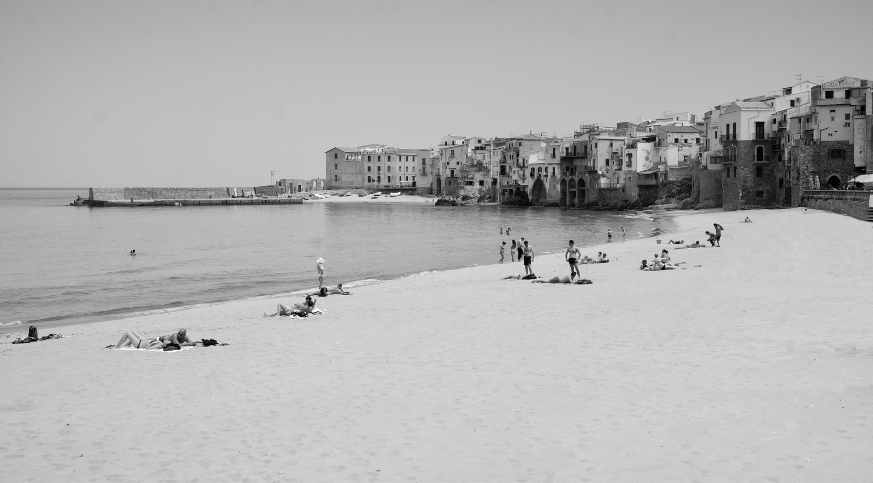
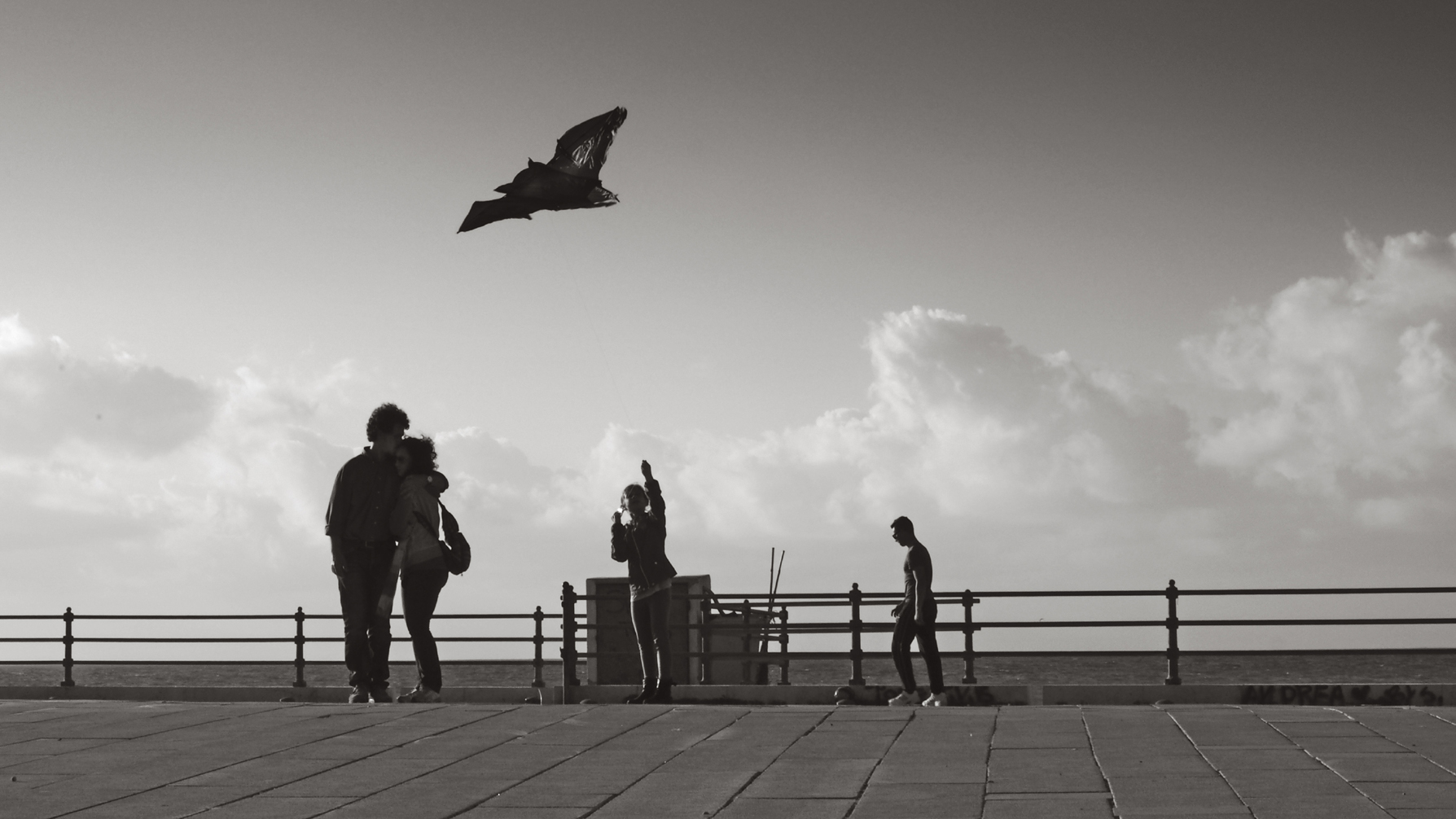
The photos here show scenes from the town of Aspra on the island of Sicily.
Value Added
A familiar experience: the view from a hotel room. There isnt much to see herejust trees and a white chunk of a building blocking the view. Tough luck! This view doesnt make for a worthwhile vacation photo. Time to give up? No!
Turning the camera to find the same view at a different angle causes a few interesting things to happen. By zooming in a little, a picture starts to emerge within the bordered camera display that reveals something more interesting than a hurried memento snapshot. Examining the viewfinder image or the image within the borders of the cameras display screen is really helpful to discover that the subtle curved contour of the mountains creates an interesting contrast with the angular building in the foreground. Gradually the appeal of the subject starts to increase.
Zooming in even more causes the pole and the electrical lines to gain prominence. The large, monochromatic area of the building contrasts with the delicate lines of the wires. Furthermore, the wires dark silhouettes produce a sharp contrast between darkness and light. Now all thats left is to avoid central positioning of the horizontal top edge of the houses wall. A slight adjustment to the perspective results in the inclusion of the edge of the roof, which slants into the pictures spatial depth.


