• Complain

Seema Acharya - Pro Tableau: A Step-by-Step Guide

Here you can read online Seema Acharya - Pro Tableau: A Step-by-Step Guide full text of the book (entire story) in english for free. Download pdf and epub, get meaning, cover and reviews about this ebook. year: 2016, publisher: Apress, genre: Computer. Description of the work, (preface) as well as reviews are available. Best literature library LitArk.com created for fans of good reading and offers a wide selection of genres:

Romance novel Science fiction Adventure Detective Science History Home and family Prose Art Politics Computer Non-fiction Religion Business Children Humor

Choose a favorite category and find really read worthwhile books. Enjoy immersion in the world of imagination, feel the emotions of the characters or learn something new for yourself, make an fascinating discovery.

Seema Acharya Pro Tableau: A Step-by-Step Guide

Pro Tableau: A Step-by-Step Guide: summary, description and annotation

We offer to read an annotation, description, summary or preface (depends on what the author of the book "Pro Tableau: A Step-by-Step Guide" wrote himself). If you haven't found the necessary information about the book — write in the comments, we will try to find it.

Leverage the power of visualization in business intelligence and data science to make quicker and better decisions. Use statistics and data mining to make compelling and interactive dashboards. This book will help those familiar with Tableau software chart their journey to being a visualization expert.

Pro Tableau demonstrates the power of visual analytics and teaches you how to:

  • Connect to various data sources such as spreadsheets, text files, relational databases (Microsoft SQL Server, MySQL, etc.), non-relational databases (NoSQL such as MongoDB, Cassandra), R data files, etc.
  • Write your own custom SQL, etc.
  • Perform statistical analysis in Tableau using R
  • Use a multitude of charts (pie, bar, stacked bar, line, scatter plots, dual axis, histograms, heat maps, tree maps, highlight tables, box and whisker, etc.)
What youll learn
  • Connect to various data sources such as relational databases (Microsoft SQL Server, MySQL), non-relational databases (NoSQL such as MongoDB, Cassandra), write your own custom SQL, join and blend data sources, etc.
  • Leverage table calculations (moving average, year over year growth, LOD (Level of Detail), etc.
  • Integrate Tableau with R
  • Tell a compelling story with data by creating highly interactive dashboards
Who this book is for

All levels of IT professionals, from executives responsible for determining IT strategies to systems administrators, to data analysts, to decision makers responsible for driving strategic initiatives, etc. The book will help those familiar with Tableau software chart their journey to a visualization expert.

Table of Contents

Chapter 1: Introducing Visualization and Tableau
Chapter 2: Working with Single and Multiple Data Sources
Chapter 3: Simplifying and Sorting Your Data
Chapter 4: Measure Names and Measure Values
Chapter 5: Table Calculations
Chapter 6: Customizing Data
Chapter 7: Statistics
Chapter 8: Chart Forms
Chapter 9: Advanced Visualization
Chapter 10: Dashboard and Stories
Chapter 11: Integration of Tableau with R

Seema Acharya: author's other books


Who wrote Pro Tableau: A Step-by-Step Guide? Find out the surname, the name of the author of the book and a list of all author's works by series.


Pro Tableau: A Step-by-Step Guide — read online for free the complete book (whole text) full work

Below is the text of the book, divided by pages. System saving the place of the last page read, allows you to conveniently read the book "Pro Tableau: A Step-by-Step Guide" online for free, without having to search again every time where you left off. Put a bookmark, and you can go to the page where you finished reading at any time.

Light

Font size:

Reset

Interval:

Bookmark:

Make
Seema Acharya and Subhashini Chellappan 2017
Seema Acharya and Subhashini Chellappan Pro Tableau 10.1007/978-1-4842-2352-9_1
1. Introducing Visualization and Tableau
Seema Acharya 1 and Subhashini Chellappan 2
(1)
Pune, Maharashtra, India
(2)
Bangalore, Karnataka, India
Electronic supplementary material
The online version of this chapter (doi: 10.1007/978-1-4842-2352-9_1 ) contains supplementary material, which is available to authorized users.
Graphical excellence is that which gives to the viewer the greatest number of ideas in the shortest time with the least ink in the smallest space.
Edward R. Tufte, a pioneer in the field of data visualization
This chapter will introduce data visualization and the importance of visualizing data well. It will acquaint us with one of the market leading data visualization tools , Tableau. We will learn about the Tableau product line, including Tableau Desktop, Tableau Server, Tableau Online, Tableau Reader, etc. The chapter will also detail out the many file types in Tableau.
Imagine that you have been asked to study pages and pages of data, report your findings, and draw your inferences and conclusions. You prepare yourself for the task which looks uninteresting, time-consuming and plain boring. Would life be any easier if this was replaced with a few good visualizations (Data visualization is the pictorial or graphical depiction of data) that allow you to uncover trends, unearth patterns hitherto hidden, quickly and efficiently?
Data visualization is visual communication. It is to make data more comprehensible, much easier to interpret and analyze. In summary, data visualization serves two important purposes :
  • To make sense of data (also called data analysis)
  • To communicate visually (what you have discovered to others)
Data visualization tools have come a long way from the standard charts and graphs of Excel to the trendier and more sophisticated chart forms such as geographic maps, sparklines, heat maps, tree maps, fever charts, etc.
1.1 Why data visualization?
Imagine that your company has decided for the very first time to launch an exquisite jewelry collection. This will mean a huge investment. You want to be very sure about your target customers. You launch an online survey to get to know your customers. Among the various questions are questions regarding their occupation / profession and their preference for the style of jewelry. The survey is launched across several cities and you have quite a large amount of data to analyze. While this can be done manually, it will mean more time. The festive season is nearing and you want to quickly decide on the style so as to have adequate time for getting your collection ready. You decide to plot the findings of the survey graphically. It clearly shows the trend as the preference for contemporary and, at the same time, conservative jewelry. This implies that your jewelry line should be an amalgamation or fusion of contemporary and conservative styles, because most of the prospective customers work for the corporate sector. A graphical depiction of the survey results allowed you to quickly decide on the style of jewelry that your store should market.
This scenario is an example of why data visualization is important. There are many reasons to use data visualization:
  • You want to understand the correlation between sales and profit.
  • You want to predict sales volume.
  • You want to identify areas where your business is booming and areas where it is dwindling.
  • You want to predict how the market will react to the launch of your new product.
  • You want to understand the factors that influence your customers behavior.
  • You want to understand how your school has performed over the years in the three critical skills (three Rs), i.e. reading, writing and arithmetic.
  • You want to clearly and quickly see the year-over-year growth of your business.
  • You want to dig for deeper insights.
  • You want to tell a story with your data.
1.2 What can data visualization help with?
Data visualization places power in the hands of business users and dramatically shortens the time it takes to transform data to insights. It enables decision makers
  • to quickly spot trends, see patterns, and grasp difficult concepts.
  • to see things that otherwise would go unnoticed.
  • to investigate the cause-effect relationships.
  • to ask a question, to get an answer to their question, and then ask follow-up questions as well.
  • to ask better questions of their data thereby leading to better data driven decisions.
  • to implement infographics, i.e. graphics that are used to convey information.
1.3 An introduction to visualization
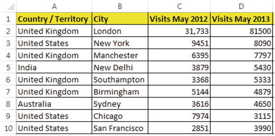
Take a moment to look at the data set given below in Table . It has details on the number of visitors who visited each city in May of 2012 and 2013.
Table 1-1 Sample Visitors dataset The same data is represented with an - photo 1
Table 1-1.
Sample Visitors dataset
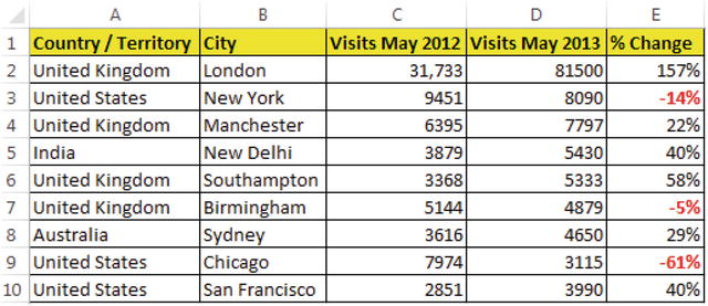
The same data is represented with an additional column in Table . The negative % Change is shown in red.
Table 1-2 New column Change added to the Sample Visitors data set Table - photo 2
Table 1-2.
New column, % Change added to the Sample Visitors data set (Table ) and conditional formatting applied on it
Conditional formatting in combination with colors helps one to clearly depict what the trends are and facilitates decision-making. It makes it easier for readers to understand the data rather than have them remember numbers which are both good and bad as well as asking them to pick out highlights or concerns from a standard column of data.
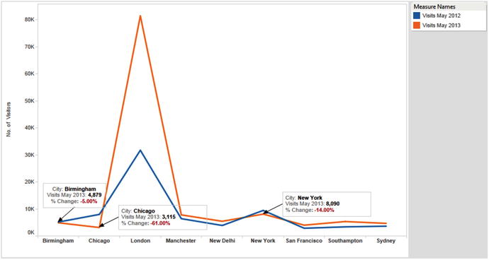
Take a look at Fig.. It is even better at clearly exhibiting the trends. The use of annotations further helps one to draw attention to the negative % change.
Figure 1-1 Graphical depiction of the Sample Visitors data set shown in Table - photo 3
Figure 1-1.
Graphical depiction of the Sample Visitors data set (shown in Table )
Now it is useful to watch the TedEx video (17:56 minutes) by David McCandless on data visualization.
at http://www.ted.com/talks/david_mccandless_the_beauty_of_data_visualization to get an easy understanding of the power of visualization. The video highlights the following points:
  • Visualization helps one to spot patterns and see the connection between data.
  • Readers find it very easy to comprehend the visuals. It calls for much less effort on the part of the readers to make sense.
  • A picture is worth a thousand words. The video illustrates how visualization condenses large amount of information into a small space.
  • Visualization can get you to the answers much faster and provide clarity very easily.
Let us look at another example to realize the power of visualization.
If we were to ask you to look at around 10,000 records (9,994 to be precise) and tell us which category in each region made the greatest sales, what would be your answer? And more importantly how much time would it take for you to provide the answer?
Next page
Light

Font size:

Reset

Interval:

Bookmark:

Make

Similar books «Pro Tableau: A Step-by-Step Guide»

Look at similar books to Pro Tableau: A Step-by-Step Guide. We have selected literature similar in name and meaning in the hope of providing readers with more options to find new, interesting, not yet read works.


Reviews about «Pro Tableau: A Step-by-Step Guide»

Discussion, reviews of the book Pro Tableau: A Step-by-Step Guide and just readers' own opinions. Leave your comments, write what you think about the work, its meaning or the main characters. Specify what exactly you liked and what you didn't like, and why you think so.