Addy Osmani - Image Optimization
Here you can read online Addy Osmani - Image Optimization full text of the book (entire story) in english for free. Download pdf and epub, get meaning, cover and reviews about this ebook. year: 2021, genre: Computer. Description of the work, (preface) as well as reviews are available. Best literature library LitArk.com created for fans of good reading and offers a wide selection of genres:
Romance novel
Science fiction
Adventure
Detective
Science
History
Home and family
Prose
Art
Politics
Computer
Non-fiction
Religion
Business
Children
Humor
Choose a favorite category and find really read worthwhile books. Enjoy immersion in the world of imagination, feel the emotions of the characters or learn something new for yourself, make an fascinating discovery.
- Book:Image Optimization
- Author:
- Genre:
- Year:2021
- Rating:4 / 5
- Favourites:Add to favourites
- Your mark:
- 80
- 1
- 2
- 3
- 4
- 5
Image Optimization: summary, description and annotation
We offer to read an annotation, description, summary or preface (depends on what the author of the book "Image Optimization" wrote himself). If you haven't found the necessary information about the book — write in the comments, we will try to find it.
Image Optimization — read online for free the complete book (whole text) full work
Below is the text of the book, divided by pages. System saving the place of the last page read, allows you to conveniently read the book "Image Optimization" online for free, without having to search again every time where you left off. Put a bookmark, and you can go to the page where you finished reading at any time.
Font size:
Interval:
Bookmark:
Published 2021 by Smashing Media AG, Freiburg, Germany.
All rights reserved.
ISBN (ePUB): 978-3-945749-95-1
Technical editing: Milica Mihajlija and Colin Bendell
Copyediting: Owen Gregory
Cover and section illustrations: Espen Brunborg
Interior full-page illustrations: Nadia Snopek
eBook production: Cosima Mielke
Image Optimization was written by Addy Osmani. Reviewers and contributors include Colin Bendell, Kornel Lesiski, Estelle Weyl, Jeremy Wagner, Tim Kadlec, Nolan OBrien, Pat Meenan, Kristofer Baxter, Henri (Helvetica) Brisard, Houssein Djirdeh, Una Kravets, Ilya Grigorik, Elle Osmani, Leena Sohoni, Katie Hempenius, Jon Sneyers, and Mathias Bynens.
Please send errors to errata@smashingmagazine.com.
By Colin Bendell
Images and animations are an important part of the web experience arguably the most important part. Images and animations can tell complex stories in just one glance, they can attract and engage audiences, and they can provide artistic expression in consistent and unique ways that other web technologies cannot. Every web performance strategy culminates in bringing the visual content to the user. For this reason, even optimizing images, animations, and video is an essential last link in the chain to ensuring the success of our web pages.
Examining the data from the HTTP Archives , we can see both how important media is for the web, and why image optimization can go a long way to lower the size of media on the web.
We can measure how important media resources are in two ways: by the sheer volume of bytes required to download for a page, and how much of the web page layout we devote to presenting these technologies. From a pure bytes perspective, HTTP Archive has an average of two-thirds of resource bytes associated with media. From a distribution perspective, we can see that virtually every web page depends on images and videos. Even at the tenth percentile, we see that 44% of the bytes are from media and can rise to 91% of the total bytes at the 90th percentile of pages.
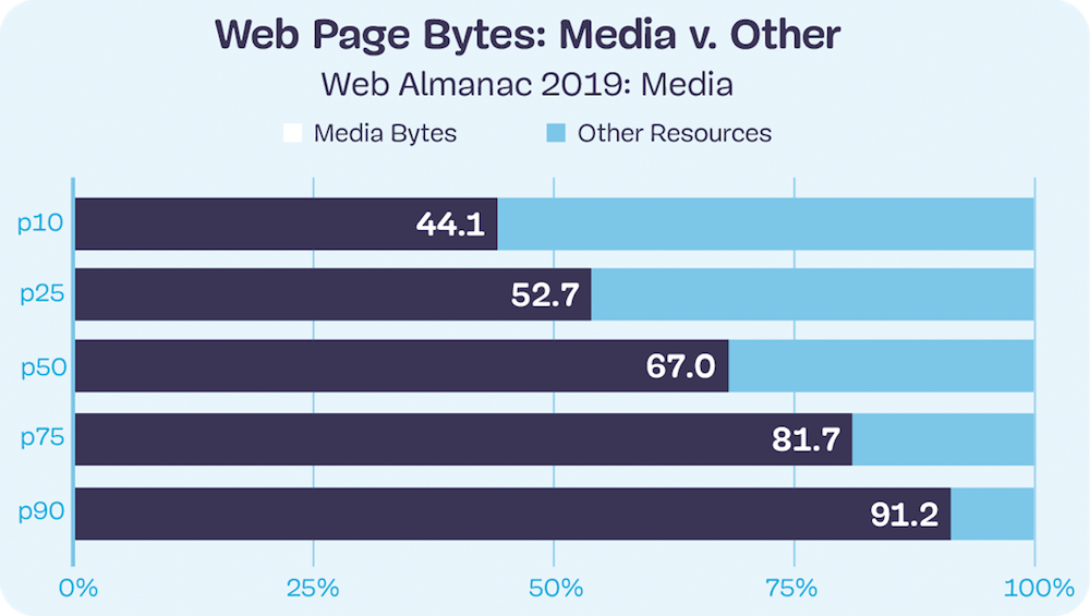
Web page bytes: image and video versus other.
These bytes are important to render pixels on the screen. As such, we can see the importance of the images and video resources by also looking at the amount of pixels used per page. Typically, we express this volume in megapixels, but this can be a challenging metric to internalize because it is largely abstract, and the number grows geometrically, which is hard to easily compare. One easy way to get a feel for the metric is to compare it to devices we use. For example, the Samsung Galaxy S10 has CSS dimensions of 360740 pixels or 0.26MP. But because we use the devices closer to our eyes, the S10 packs more pixels per CSS pixel (referred to as pixel density or device pixel ratio) and has an actual screen display of 1,4403,040 pixels or 4.2MP.
There are three metrics to consider when looking at pixel volume: CSS pixels, natural pixels, and screen pixels:
CSS pixel volume is from the CSS perspective of layout. This measure focuses on the bounding boxes into which an image or video could be stretched or squeezed. It also does not take into account the actual file pixels nor the screen display pixels.
Natural pixels refer to the logical pixels represented in a file. If you were to load this image in GIMP or Photoshop, the pixel file dimensions would be the natural pixels.
Screen pixels refer to the physical electronics on the display. Prior to mobile phones and modern high-resolution displays, there was a 1:1 relationship between CSS pixels and LED points on a screen. However, because mobile devices are held closer to the eye, and laptop screens are closer than the old mainframe terminals, modern screens have a higher ratio of physical pixels to traditional CSS pixels. This ratio is referred to as the device pixel ratio, or colloquially referred to as Retina displays.
In the same Web Almanac data we can see that the median web page had a layout that would show (CSS) 0.65MP. The device used to collect data for the Web Almanac had a (CSS) 0.18MP display (similar to the Samsung Galaxy S10 above, with CSS 0.26MP). This implies that images and media are so important that more than 3.6 screens worth of content is used on the median web page layout. At the 90th percentile, web pages have 25 full displays worth of content!
![]()
Image pixels per page (mobile): CSS versus actual.
Media resources are critical for the user experience.
While media are critical for the visual experience, the impact of this high volume of bytes has two side effects.
First, the network overhead required to download these bytes can be large, and in cellular or slow network environments (like coffee shop Wi-Fi) can dramatically slow down the page . Images represent a lower priority request by the browser but can easily block CSS and JavaScript in the download. This by itself can delay the page rendering. Yet at other times, the image content is the visual cue to the user that the page is ready. Slow transfers of visual content, therefore, can give the perception of a slow web page.
The second impact is on the financial cost to the user. This is often an ignored aspect since it is not a burden on the website owner but a burden to the user. It has been shared anecdotally that some markets, , see a drop in purchases by students near the end of the month when data caps are reached, and users cannot see the visual content.
Further, the financial cost of visiting these websites in different parts of the world is disproportionate. At the median and 90th percentile, the volume of image bytes is 1MB and 1.9MB respectively. Using we can see that the gross national income per capita cost to a user in Madagascar of a single web page load at the 90th percentile would cost 2.6% of daily gross income. By contrast, in Germany this would be 0.3% of daily gross income.
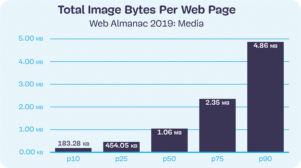
Total image bytes per web page (mobile).
This book covers managing and optimizing images to help reduce the bytes and optimize the user experience. It is an important and critical topic for many because it is the creative media that define a brand experience. Optimizing image and video content is a balancing act between applying best practices that can help reduce the bytes transferred over the network and preserving the fidelity of the intended experience.
While the strategies for images, videos, and animations are broadly similar, the specific approaches can be very different. In general, these strategies boil down to:
File formats: using the optimal file format.
Responsive: applying responsive images techniques to transfer only the pixels that will be shown on screen.
Lazy loading: to transfer content only when a human will see it.
Font size:
Interval:
Bookmark:
Similar books «Image Optimization»
Look at similar books to Image Optimization. We have selected literature similar in name and meaning in the hope of providing readers with more options to find new, interesting, not yet read works.
Discussion, reviews of the book Image Optimization and just readers' own opinions. Leave your comments, write what you think about the work, its meaning or the main characters. Specify what exactly you liked and what you didn't like, and why you think so.









![Addy Osmani [Addy Osmani] - Learning JavaScript Design Patterns](/uploads/posts/book/120569/thumbs/addy-osmani-addy-osmani-learning-javascript.jpg)
