Simon Ng - Intermediate iOS 10 Programming with Swift
Here you can read online Simon Ng - Intermediate iOS 10 Programming with Swift full text of the book (entire story) in english for free. Download pdf and epub, get meaning, cover and reviews about this ebook. year: 2016, genre: Computer. Description of the work, (preface) as well as reviews are available. Best literature library LitArk.com created for fans of good reading and offers a wide selection of genres:
Romance novel
Science fiction
Adventure
Detective
Science
History
Home and family
Prose
Art
Politics
Computer
Non-fiction
Religion
Business
Children
Humor
Choose a favorite category and find really read worthwhile books. Enjoy immersion in the world of imagination, feel the emotions of the characters or learn something new for yourself, make an fascinating discovery.
Intermediate iOS 10 Programming with Swift: summary, description and annotation
We offer to read an annotation, description, summary or preface (depends on what the author of the book "Intermediate iOS 10 Programming with Swift" wrote himself). If you haven't found the necessary information about the book — write in the comments, we will try to find it.
Simon Ng: author's other books
Who wrote Intermediate iOS 10 Programming with Swift? Find out the surname, the name of the author of the book and a list of all author's works by series.


Intermediate iOS 10 Programming with Swift — read online for free the complete book (whole text) full work
Below is the text of the book, divided by pages. System saving the place of the last page read, allows you to conveniently read the book "Intermediate iOS 10 Programming with Swift" online for free, without having to search again every time where you left off. Put a bookmark, and you can go to the page where you finished reading at any time.
Font size:
Interval:
Bookmark:
Building Adaptive User Interfaces
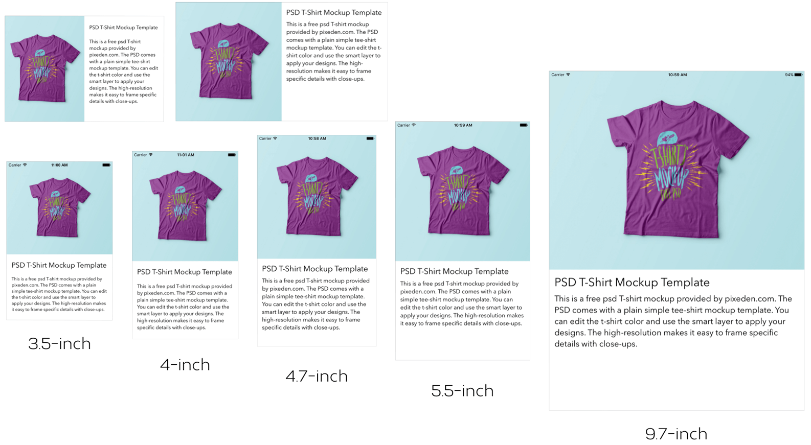
In the beginning, there was only one iPhone with a fixed 3.5-inch display. It was very easy to design your apps; you just needed to account for two different orientations (portrait and orientation). Later on, Apple released the iPad with a 9.7-inch display. If you were an iOS developer at that time, you had to create two different screen designs (i.e. storyboards / XIBs) in Xcode for an app - one for the iPhone and the other for the iPad.
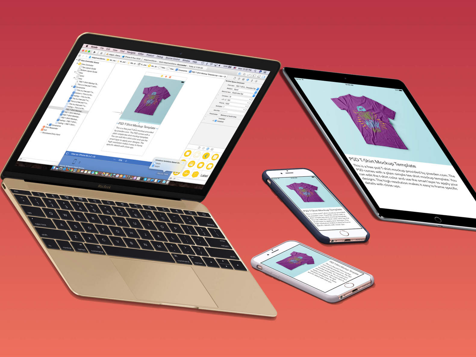
Gone are the good old days. Fast-forward to 2015: Apple's iPhone and iPad lineup has changed a lot. With the launch of the iPhone 6 and iPhone 6 Plus (now iPhone 7 and 7 Plus), your apps are required to support an array of devices with various screen sizes and resolutions including:
- iPhone 4/4s (3.5-inch)
- iPhone 5/5c/5s (4-inch)
- iPhone 6/6s/7 (4.7-inch)
- iPhone 6/6s/7 Plus (5.5-inch)
- iPad / iPad 2 / iPad Air / iPad Air 2 (9.7-inch)
- iPad Mini / iPad Mini 2 / iPad Mini 3 / iPad Mini 4 (7.9-inch)
- iPad Pro (9.7/12.9-inch)
It is a great challenge for iOS developers to create a universal app that adapts its UI for all of the listed screen sizes and orientations. So what can you do to design pixel-perfect apps?
Starting from iOS 8, the mobile OS comes with a new concept called Adaptive User Interfaces, which is Apple's answer to support any size display or orientation of an iOS device. Now apps can adapt their UI to a particular device and device orientation.
This leads to a new UI design concept known as Adaptive Layout. Starting from Xcode 7, the development tool allows developers to build an app UI that adapts to all different devices, screen sizes and orientation using Interface Builder. In Xcode 8, the Interface Builder is further reengineered to streamline the making of adaptive user interface. It even comes with a full live preview of how things will render on any iOS device. You will understand what I mean when we check out the new Interface Builder.
To achieve adaptive layout, you will need to make use of a concept called Size Classes, which is available in iOS 8 or up. This is probably the most important aspect which makes adaptive layout possible. Size classes are an abstraction of how a device is categorized depending on its screen size and orientation. You can use both size classes and auto layout together to design adaptive user interfaces. In iOS 8/9/10, the process for creating adaptive layouts is as follows:
- You start by designing a generic layout. The base layout is good enough to support most of the screen sizes and orientations.
- You choose a particular size class and provide your layout specializations. For example, you want to increase the spacing between two labels when a device is in landscape orientation.
In this chapter, I will walk you through all the adaptive concepts such as size classes, by building a universal app. The app supports all available screen sizes and orientations.
No coding is required for this project. You will primarily use storyboard to lay out the user interface components and learn how to use auto layout and size classes to make the UI adaptive. After going through the chapter, you will have an app with a single view controller that adapts to multiple screen sizes and orientations.
First, fire up Xcode, and create a new project using the Single View Application template. In the project option, name the project AdaptiveUIDemo and make sure to select Universal for the device option.
Once the project is created, go to the project setting and set the Deployment Target from 10.0 to 9.3 (or lower). This allows you to test your app on iPhone 4s because iOS 10 no longer supports the 3.5-inch devices. You probably don't want to support the older generation of device too, but in this demo, I would like to demonstate how to build an adaptive UI for all screen sizes.
Now, open Main.storyboard. In Interface Builder, you should find a view controller that has the size of an iPhone 6s. If you have used Xcode 7 before, I believe you will like this change. It no longer shows you a generic view controller with a square canvas. The new Interface Builder lets you lay out the user interface in a simulated device, and you can easily switch between different devices using the device configuration controls in the bottom bar. For example, select View as to open the device configuration pane, and then select iPhone 6s Plus. This changes the size of the view controller in storyboard to the selected device.
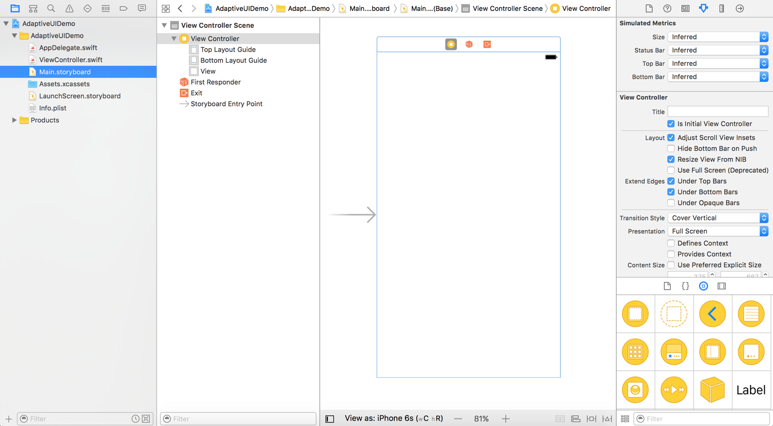
Now we'll start to design the app UI. First, download the image pack from http://www.appcoda.com/resources/swift3/adaptiveui-images.zip and import the images to Assets.xcassets.
Next, go back to the storyboard. I usually start with iPhone 6s to lay out the user interface, and then add layout specializations for other screen sizes. Therefore, if you have chosen other device (e.g. iPhone 6s Plus), I suggest you to change the device setting to iPhone 6s.
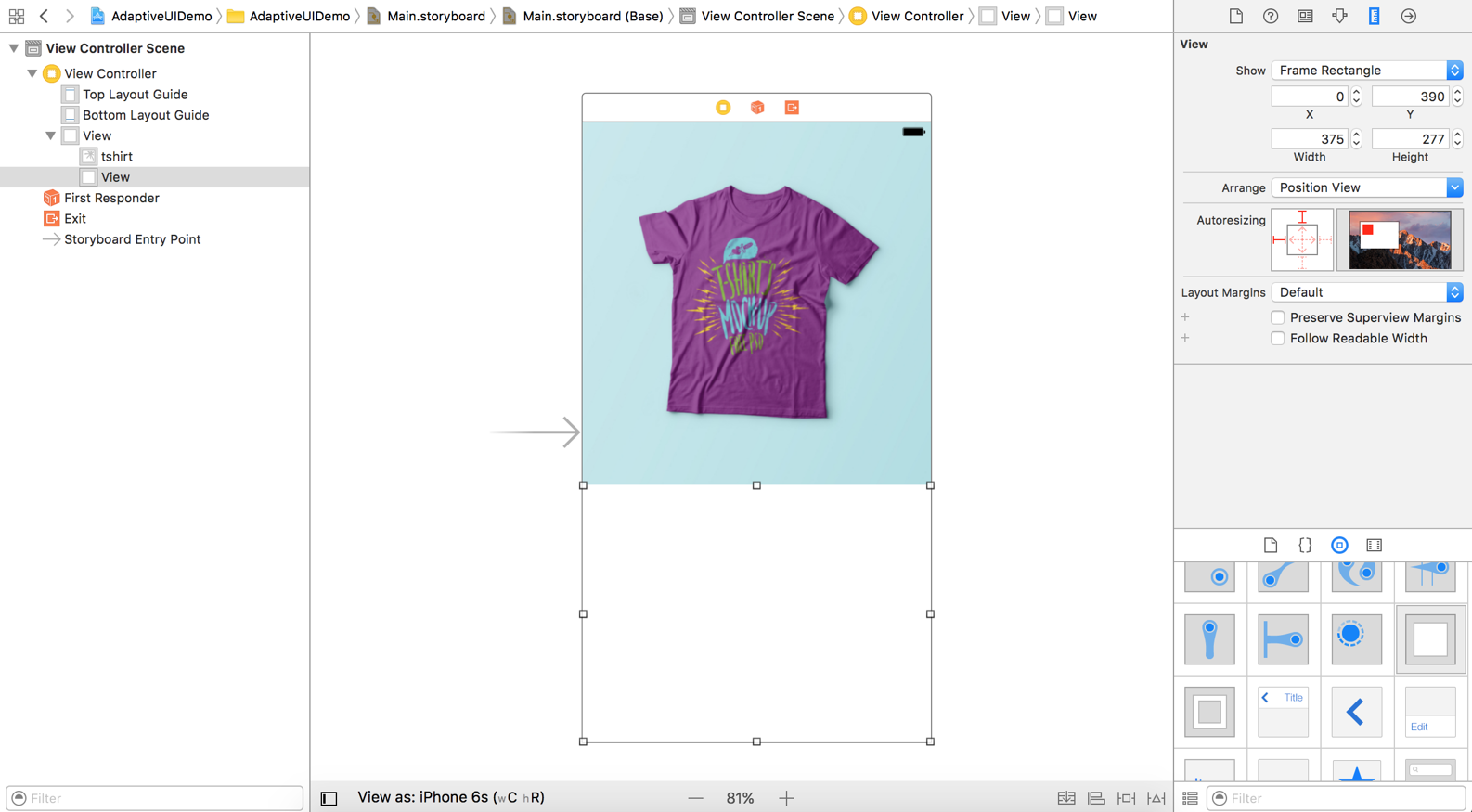
Now, drag an image view from the Object library to the view controller. Set its width to 375 and height to 390. Choose the image view and go to the Attributes inspector. Set the image to tshirt and the mode to Aspect Fill.
Then, drag a view to the view controller and put it right below the image view. This view serves as a container for holding other UI components like labels. By grouping related UI components under the same view, it will be easier for you to work with auto layout in the later section. In Size inspector, make sure you set the width to 375 and height to 277.
Throughout the chapter, I will refer to this view as Product Info View. Your layout should be similar to the figure below.
Next, drag a label to Product Info View. Change the label to PSD T-Shirt Mockup Template. Set the font to Avenir Next, and its size to 25 points. Press command+= to resize the label and make it fit. In Size inspector, change the value of X to 15 and Y to 15.
Drag another label and place it right below the previous label. In Attributes inspector, change the text to This is a free psd T-shirt mockup provided by pixeden.com. The PSD comes with a plain simple tee-shirt mockup template. You can edit the t-shirt color and use the smart layer to apply your designs. The high-resolution makes it easy to frame specific details with close-ups. and set the font to Avenir Next. Change the font size to 18 points and the number of lines to 0.
Under Size inspector, change the value of X to 15 and Y to 58. Set the width to 352 and height to 182.
Note that the two labels should be placed inside
Font size:
Interval:
Bookmark:
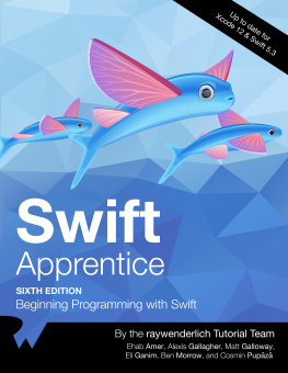
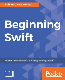
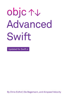
Similar books «Intermediate iOS 10 Programming with Swift»
Look at similar books to Intermediate iOS 10 Programming with Swift. We have selected literature similar in name and meaning in the hope of providing readers with more options to find new, interesting, not yet read works.
Discussion, reviews of the book Intermediate iOS 10 Programming with Swift and just readers' own opinions. Leave your comments, write what you think about the work, its meaning or the main characters. Specify what exactly you liked and what you didn't like, and why you think so.