

Nearly two decades have passed since we published our first Design Book. In those years, we've seen many changes in both the publishing and woodworking fields. In publishing, there's been tremendous growth. When we produced the first issue of Fine Woodworking in 1975, it was the only woodworking magazine available. There are currently more than a dozen magazines on the market. Now more than ever, the woodworking enthusiast has access to a broad source of information on project plans, ideas, tips and techniques.
This dramatic increase is just one indication of the escalating interest in woodworking. Current surveys indicate there are more than 20 million people involved in some form of woodworking. It's no surprise that an entire mail-order industry has evolved to provide these woodworkers with instant access to virtually any tool, hardware item or species of wood-no matter where they live.
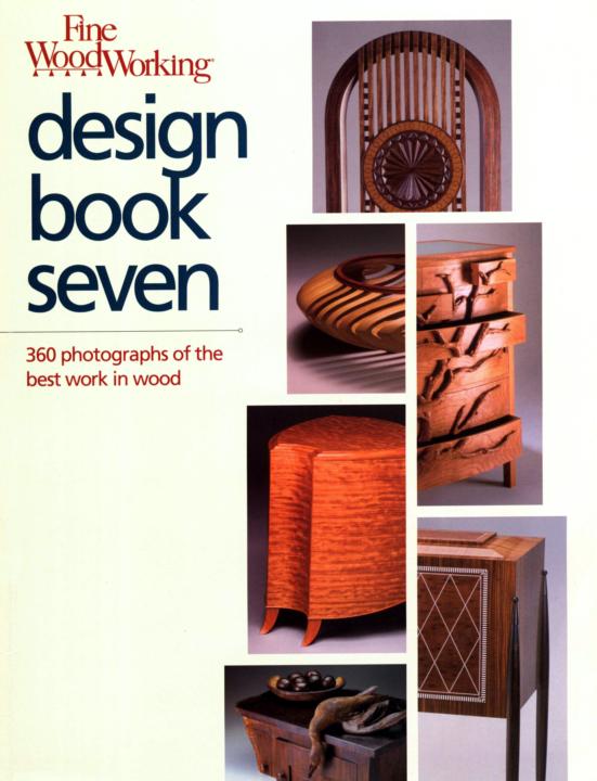
Accelerated growth like this is often the impetus to change. Whether in publishing or woodworking, it forces you to focus on what you're doing, to refine your work, to make it the best it can be. These changes and refinements are evident if you've followed our publications over the years. The first 47 issues of Fine Woodworking and the first three Design Books were black and white. Undeniably this gives them a classic look, but there's nothing quite like seeing a fine piece of furniture in color (except of course, seeing it in person). So with the advent of more powerful, faster computers and the proliferation of new printing technologies, we gladly embraced these improvements and made the exciting change to color. Although the changes in Design Book Seven aren't as noticeable as switching from black and white to color, they're just as important. For example, we've greatly increased the number of detail shots to give you a close-up look at exemplary details: an inlaid design, a handmade pull or a set of exquisite dovetails on a desk drawer. We've also added a new graphic to help tie the information about the maker and the piece to the photograph.
You also may notice a shift in the furniture styles selected for this book. As in the past, the pieces shown here are representative of the best current work in wood. But the majority of the submitted work (more than 2,300 pieces) were practical in design, superbly executed and highly refined. There was also a surprising number of interpretations of traditional styles: delightful pieces that showed a distinct mission, flavor or perhaps a touch of Art Deco. What we didn't receive were large numbers of studio or art furniture. Some of this is surely the result of the influence of well-known craftsmen and teachers like James Krenov, Wendell Castle, Tage Frid, Sam Maloof and Jere Osgood. It may also be the result of refinements and changes in tastes of woodworkers and their patrons alike.
I'd like to thank everyone who submitted entries and encourage you to do the same for our next Design Book. And finally, I'd like to express my appreciation to all those who took time out of their busy work schedules to help out with the judging: Scott Gibson, Tim Schreiner, Rick Peters, Vincent Laurence, Jon Binzen, Zachary Gaulkin, Bill Duckworth, Dennis Preston and Amie Fraser.
Jim Chiavelli
Publisher
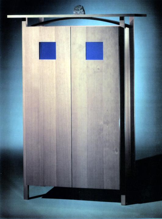
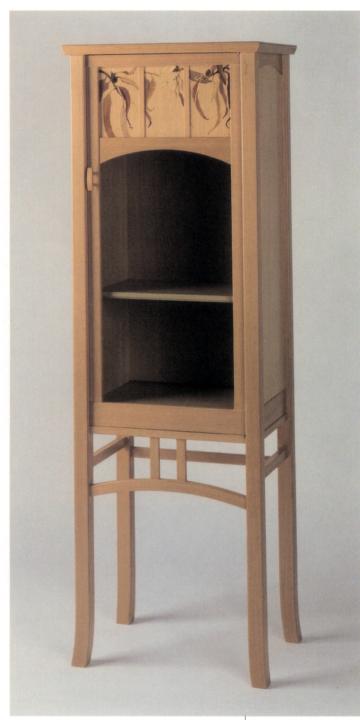
WILLEMSEN FOX Newburyport, Mass.
Visage cabinet Fir, wenge, cobalt glass 42 in. x 24 in. x 60 in. Photo by Bill Truslow

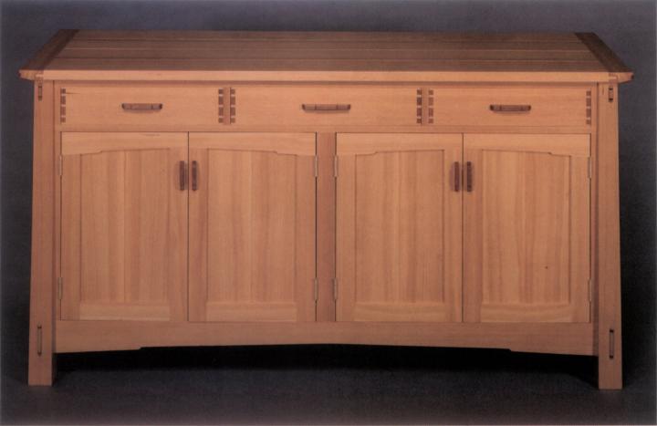
MICHAEL HOFFER Espanola, N.Mex.
Sideboard Douglas fir, mahogany 64 in. x 20 in. x 33 in. Photo by Jamie Hart

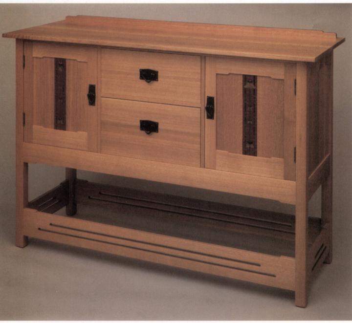
B.A. HARRINGTON Somerville, Mass.
Hybrid sideboard Quartersawn white oak, marquetry in various veneers 58 in. x 22 in. x 40 in. Photo by Lance Patterson

GREG ZALL Sonoma, Calif.
Bookcase Douglas fir 17 in. x 12 in. x 52 in. Photo by Greg Zall
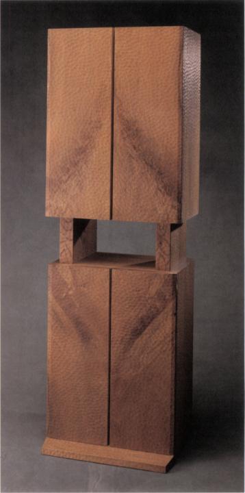
MASAHISA TSUTSUI Nagoya-Shi,Japan
Cabinet Oak 20 in. x 14 in. x 63 in. Photo by Thoru Fukaya
