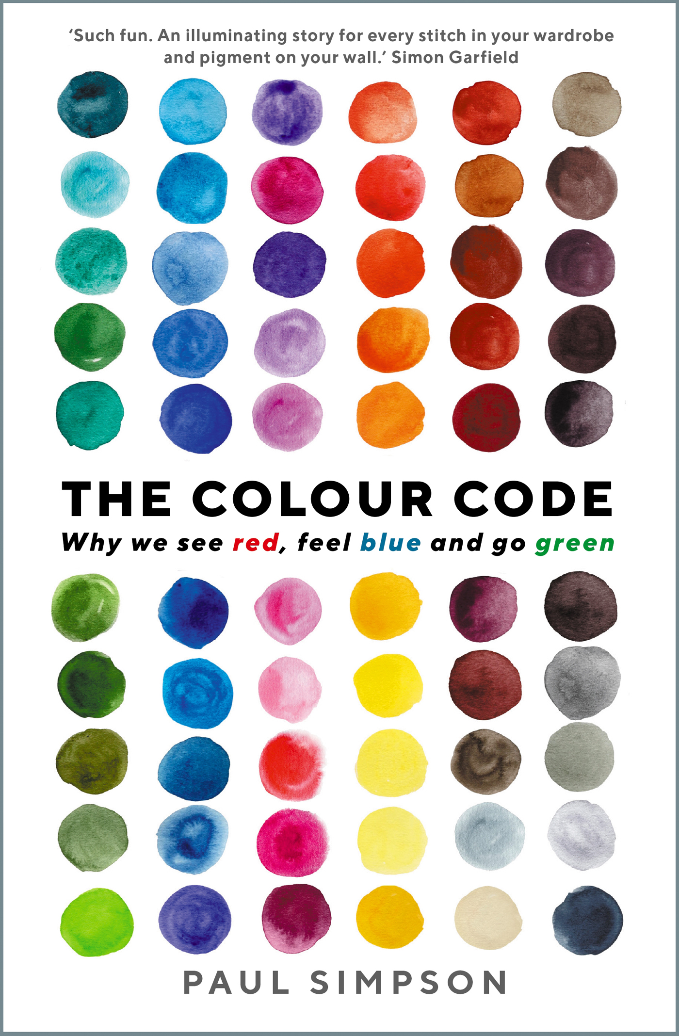
Paul Simpson - The Colour Code: Why we see red, feel blue and go green
Here you can read online Paul Simpson - The Colour Code: Why we see red, feel blue and go green full text of the book (entire story) in english for free. Download pdf and epub, get meaning, cover and reviews about this ebook. year: 2021, publisher: Profile Books, genre: Detective and thriller. Description of the work, (preface) as well as reviews are available. Best literature library LitArk.com created for fans of good reading and offers a wide selection of genres:
Romance novel
Science fiction
Adventure
Detective
Science
History
Home and family
Prose
Art
Politics
Computer
Non-fiction
Religion
Business
Children
Humor
Choose a favorite category and find really read worthwhile books. Enjoy immersion in the world of imagination, feel the emotions of the characters or learn something new for yourself, make an fascinating discovery.
- Book:The Colour Code: Why we see red, feel blue and go green
- Author:
- Publisher:Profile Books
- Genre:
- Year:2021
- Rating:3 / 5
- Favourites:Add to favourites
- Your mark:
The Colour Code: Why we see red, feel blue and go green: summary, description and annotation
We offer to read an annotation, description, summary or preface (depends on what the author of the book "The Colour Code: Why we see red, feel blue and go green" wrote himself). If you haven't found the necessary information about the book — write in the comments, we will try to find it.
How is The Colour Code different to other books on colour? Well, the short answer is that it is a whole lot more fun - not least because it is extensively illustrated. We dont just get a story about Mummy Brown (the pigment made from Egyptian mummies), we see a painting created with pigments from the remains of French kings. We are reminded of the blue/gold dress that swept Twitter, view paintings by Mondrian (red ones sell for higher prices) and Van Eyck (he invented an enduring green), and inspect the red soles of Louboutin shoes.
We see what lumps of Indian yellow look like, while reading what they are made of (strained cows urine). We get to see the latest most vibrant pigment - YinMn Blue - and have a real estate agents tour of Frank Sinatras ranch (he was obsessed by orange). We see William Morriss arsenic-inflected wallpapers and hear about whether wallpaper killed Napoleon. We encounter the pink pussy hats worn on the Womens March and Elviss pink jackets from Lanskys in Memphis, take in a history of the black dress from Audrey Hepburn to Princess Diana and a rare black chicken (even its eggs are black) from Indonesia.
Featuring a cast of actors, artists, chemists, composers, dentists, dictators, fashion designers, film-makers, gods, musicians, mystics, physicists, poets, quacks, tigers and tycoons, The Colour Code will change the way we all perceive the spectrum - and see the world.
Paul Simpson: author's other books
Who wrote The Colour Code: Why we see red, feel blue and go green? Find out the surname, the name of the author of the book and a list of all author's works by series.


The Colour Code: Why we see red, feel blue and go green — read online for free the complete book (whole text) full work
Below is the text of the book, divided by pages. System saving the place of the last page read, allows you to conveniently read the book "The Colour Code: Why we see red, feel blue and go green" online for free, without having to search again every time where you left off. Put a bookmark, and you can go to the page where you finished reading at any time.
Font size:
Interval:
Bookmark:

First published in Great Britain in 2021 by
Profile Books
29 Cloth Fair, Barbican, London EC1A 7JQ.
www.profilebooks.com
1 3 5 7 9 10 8 6 4 2
Typeset in Adobe Garamond Pro to a design by Henry Iles.
Copyright Paul Simpson 2021
The moral right of the author has been asserted.
All rights reserved. Without limiting the rights under copyright reserved above, no part of this publication may be reproduced, stored or introduced into a retrieval system, or transmitted, in any form or by any means (electronic, mechanical, photocopying, recording or otherwise), without the prior written permission of both the copyright owner and the publisher of this book.
A CIP catalogue record for this book is available from the British Library.
ISBN 978-1781256268
e-ISBN 978-1782832423
Printed in Italy by L.E.G.O. S.p.A. on FSC paper
Introduction
Seeing Red
Yellow Fevers
Into the Blue
House of Orange
Purple Reign
Sea of Green
Pink is for Boys
Brown in Town
The Black Stuff
The Grey Area
The Whiteness of Being
Acknowledgements
Photo credits
Colour directly influences the soul. Colour is the keyboard, the eyes are the hammers, the soul is the piano with many strings. Wassily Kandinsky
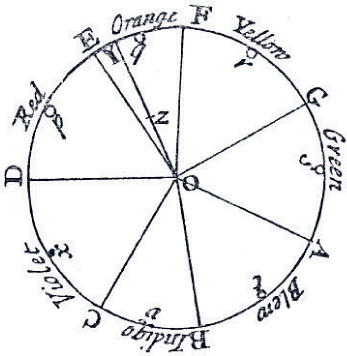 H ow many colours are there in a rainbow? The obvious answer, ever since Sir Isaac Newton codified the spectrum, is seven: red, orange, yellow, green, blue, indigo and violet, which gives us the acronym ROYGBIV. But in his treatise Meteorologica, Aristotle suggested that there were just three principal colours in the rainbow: red, green and purple. The appearance of yellow, Aristotle argued, was merely an effect of the contrast of the red against the green. Anthropologists suggest that for the Pirah and the Candoshi peoples of the Amazon, who have no specific colour terms in their language, the rainbow has only two tones: darker/cooler and lighter/warmer. In reality, there is no particular number of colours in a rainbow, because each colour blends imperceptibly into the next. When we give names to colours, we are imposing an order on the small part of the electromagnetic spectrum we call visible light (wavelengths of c.400740 nanometres).
In deciding that seven was the correct number, Newton who admitted that my own eyes are not very critical in distinguishing colours might have been drawn to the age-old pattern of sevens (seven days in a week, seven wonders of the world, seven notes in the musical scale, seven liberal arts, etc.), and to the mystical aura with which the number had been invested by Pythagorean philosophers.
In his book Opticks (1704), Newton categorised colours as primary (red, blue and yellow), secondary (green, orange and purple) and tertiary (hyphenated colour names). If you mix the primary colours, you can create every other colour. His experiments proved that white light could be separated into pure prismatic colours, which could then be combined to make white light again. As he concluded: If the Suns Light consisted of but one sort of Rays, there would be but one colour in the whole World.

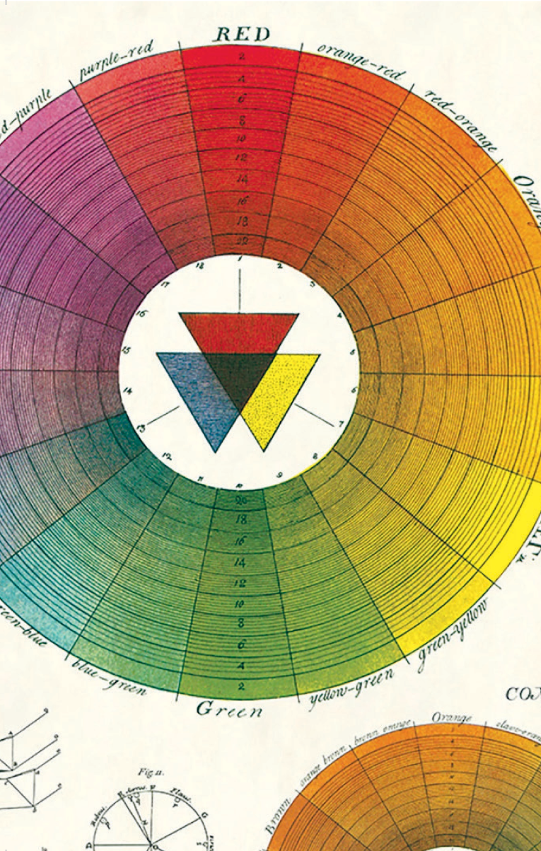
Newtons analysis was not universally popular. John Keats famously lamented that Newton had Destroyed the poetry of the rainbow by reducing it to a prism, while German polymath Johann Wolfgang von Goethe made a passionate case for colour as a subjective, rather than purely scientific, phenomenon in his book Theory of Colours (1810). Colour, Goethe argued, was created by the interaction between the physical behaviour of light and the apparatus with which we perceive it. Accordingly, he divided the spectrum into life-enhancing plus colours (yellow, yellow-red) and anxiety-inducing minus colours (blues, purples and blue-greens). As philosopher Ludwig Wittgenstein observed: What Goethe was really seeking was not a physiological but a psychological theory of colours.
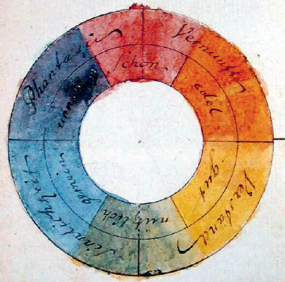
Goethe's symmetric colour wheel with reciprocally evoked colours (1810).
Goethes insistence on the emotional force of colour inspired J.M.W. Turner, who acknowledged his debt explicitly in the title of his painting Light and Colour (Goethes Theory) The Morning after the Deluge Moses Writing the Book of Genesis (1843). Over time, Goethes ideas would be embraced by artists as diverse as Vincent van Gogh, Konstantin Malevich, Wassily Kandinsky (whose book Concerning the Spiritual in Art reflects Goethes influence) and Mark Rothko.
It could be said that in emphasising the subjective element of visual perception, Goethe was a forerunner of thinkers such as the French cultural historian Michel Pastoureau, who has written a series of brilliant books on colour. We see the world through a prism more complicated than Newtons a prism in which our emotions, culture, age, gender, religion, politics, sporting allegiance and personal experiences all come into play. As Pastoureau puts it: Colour is, first and foremost, a social construct.
Goethes reflections on contrasting, complementary and successive colours were formulated more scientifically by French chemist Michel-Eugne Chevreul. In 1824, Chevreul was tasked with reviving the fortunes of the Gobelins tapestry workshop in Paris. Customers had complained that its colours were too dull and grey. After investigating the dyes, which were as bright as anyone elses, he concluded the problem was not chemical but optical the apparent dullness was caused by the way that the colours were juxtaposed. Chevreuls consequent law of simultaneous contrast was elaborated in his book The Laws of Contrast and Colour (1839), in which he systematically analysed the ways in which the intensity of any colour was affected by an adjacent one. Bringing all the colours in the visible spectrum together in a wheel, he showed that complementary colours opposites on the colour wheel packed more visual punch when juxtaposed.
His book became the most widely used and artistically influential colour manual of the nineteenth century. Eugne Delacroix was so convinced by Chevreuls work, he declared he could paint the face of Venus in mud, provided you let me surround it as I will. The Impressionists recognised that by applying brushstrokes of pure colour to a canvas and letting the viewers eye combine them optically they could make light and colour more brilliant. One of Chevreuls colour effects, the use of massed monochromatic dots, inspired the Pointillism of Georges Seurat and Paul Signac. The abstract colours employed by the Orphists particularly Robert Delaunay, Sonia Delaunay and Frantiek Kupka are also rooted in the chemists seminal work.
Font size:
Interval:
Bookmark:
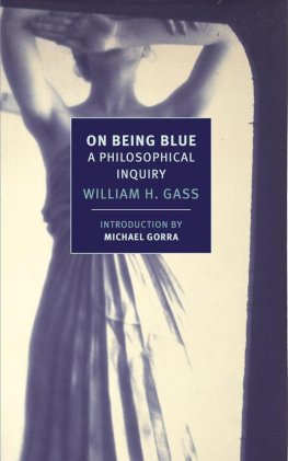
Similar books «The Colour Code: Why we see red, feel blue and go green»
Look at similar books to The Colour Code: Why we see red, feel blue and go green. We have selected literature similar in name and meaning in the hope of providing readers with more options to find new, interesting, not yet read works.
Discussion, reviews of the book The Colour Code: Why we see red, feel blue and go green and just readers' own opinions. Leave your comments, write what you think about the work, its meaning or the main characters. Specify what exactly you liked and what you didn't like, and why you think so.