First Time Art Quilts
Design Elements Plus 5 Easy Projects

2015 Creative Publishing international, a member of Quarto Publishing Group USA Inc., 400 First Avenue North, Suite 400, Minneapolis, MN 55401, www.creativepub.com.
All rights reserved. No part of this work covered by the copyrights hereon may be reproduced or used in any form or by any meansgraphic, electronic, or mechanical, including photocopying, recording, taping of information on storage and retrieval systemswithout the written permission of the publisher. Due to differing conditions, materials, and skill levels, the publisher and various manufacturers disclaim any liability for unsatisfactory results or injury due to improper use of tools, materials, or information in this publication.
This material originally appeared in the book The Complete Photo Guide to Art Quilting (ISBN: 978-1-58923-689-9) by Susan Stein.
Digital edition published 2015.
Digital edition: 978-1-62788-258-3
Softcover edition: 978-1-58923-874-9
Visit craftside.net
CONTENTS
DESIGN ELEMENTS
K nowing a few basics about design can make creating art quilts a little easier. How often have you tried to put different fabrics together or tried to make a collage and found that it didnt look quite right? Realizing that variations in value or an asymmetrical arrangement are needed can make all the difference. Its even a valuable exercise to work through a design book with a few friends and see what different approaches emerge when everyones work is shown together. Learning in the abstract is one thing, but seeing actual work and discussing a variety of interpretations can be truly eye-opening.
Lines
While there are variations in the way design elements and principles are defined, all artists follow basic guidelines to create good art, ones that apply to prehistoric cave paintings and to our work today.
Designs are built around lines, which are defined as a series of dotssomething that is longer than it is wide. Lines sometimes enclose shapes or they may stand alone; sometimes they convey mood and emotion. Horizontal lines are calming, vertical ones imply the possibility of motion, and diagonal lines imply action. The eye naturally follows a line, and artists use them as a vehicle to keep the viewer moving around a piece of art. In landscapes, a horizontal line usually indicates a horizon, and parallel lines that converge toward the top of the picture indicate a road or river receding into the distance.
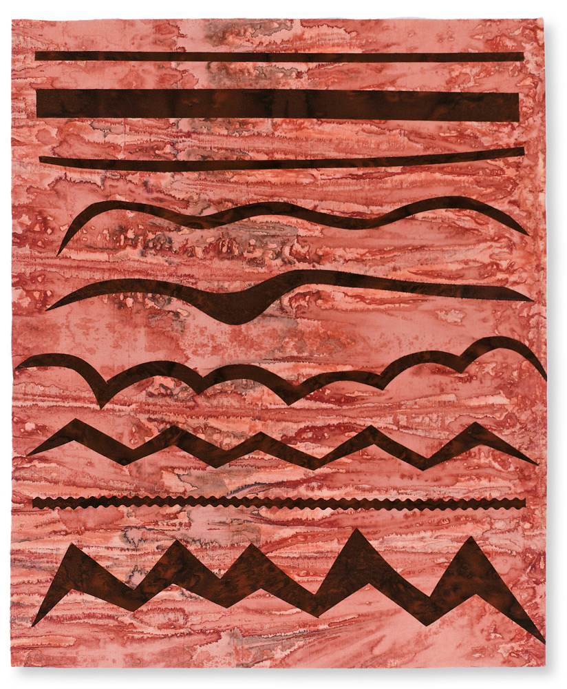
Lines can vary considerably, even though they are always longer than they are wide. Here is an assortment of lines cut from fabric. How do their differences affect the way you respond to them? Do any suggest landscape, sky features, anger, happiness? Notice how the lines in the background fabric add more interest than a plain piece of fabric.
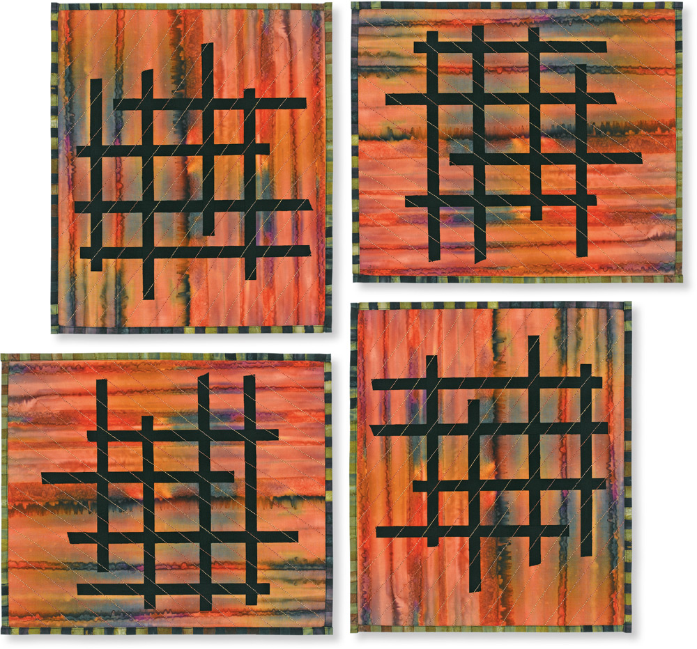
Make a small piece with a striped background and simple fused lines. The ones in this sample are placed asymmetrically in a grid pattern. Turn your piece in different directionsyou might see a Japanese gate, a building under construction, or the windows of an apartment building. The lines of gold stitching might represent rain or, if they all came from a common point, the suns rays. Using a binding fabric with lines makes an interesting edge. In quilting, lines become a very real element because they appear in the fabric, the pattern, and the stitching.
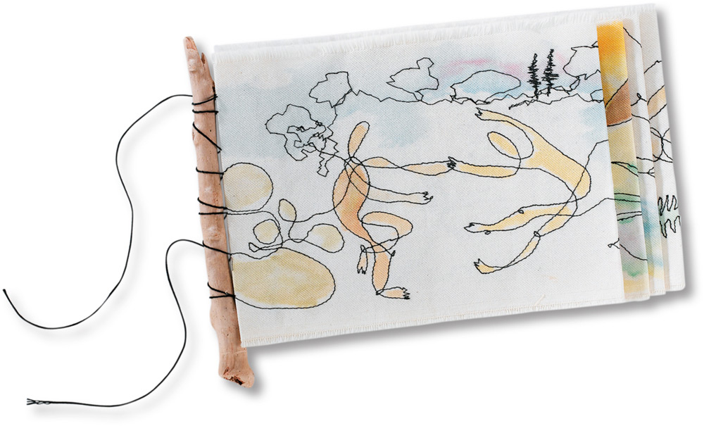
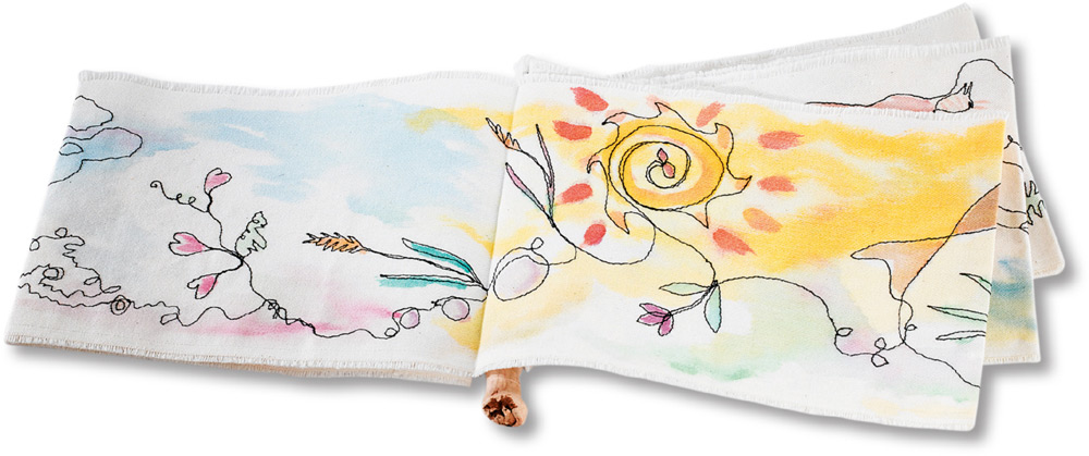
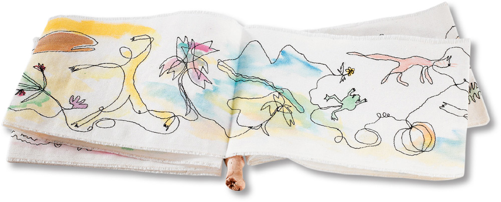
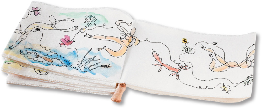
A charming stitched book made by Damaris Jackson illustrates just how expressive a single line can be!
Value
Value is another design element that vitally influences how a piece will look. It is defined as the lightness or darkness of a color, and some people say that value is more important than the color of a fabric. Monochromatic color schemes (those using one color in several values) are very powerful and are being used more and more in contemporary quilting.
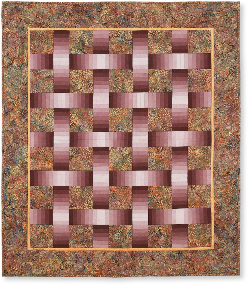
Here a bundle of carefully dyed fabrics in eight values has been used to create a simple but dramatic quilt with visual dimensionality. 52" 45" (132 114.5 cm)
This piece illustrates how pairing brightly colored fabrics with black-and-white elements creates a dynamic effect. The text on the white rectangles invites a closer view of the quilt and, by its sentiments, calms the excitement generated by the harsh color contrasts. 34 /" 10 /" (87.5 26 cm)
Value in art quilting may differ from what is used in traditional quilting, because sharp value differences are more dramatic. There are fewer pastels and muted or grayed colors used, probably because the artist is making something for the wall and not to match a bedroom or sofa. High contrast attracts the eye.
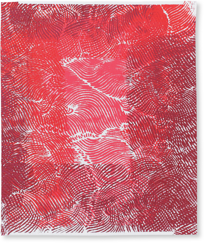
Screen printing three values of red paint onto white fabric illustrates how simply depth can be created. The lightest value was printed first.
Color
Color is likely the most intimidating element to the beginning quilter, yet it is the most fun to play with and master.
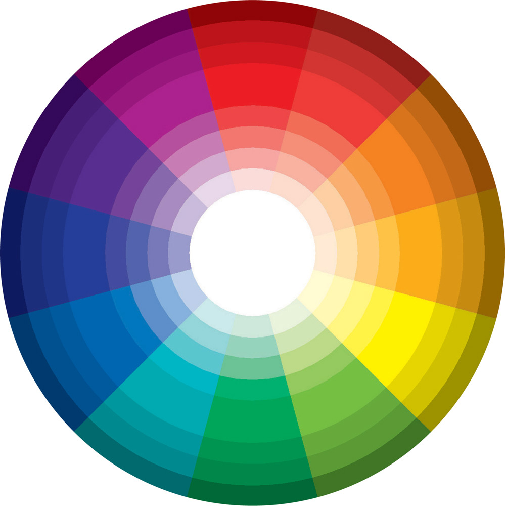
Colors have emotional context and there are many phrases that refer to color, like I feel blue today, Im seeing red, Im in the pink, or green with envy. Notice the colors used in doctors offices, hospitals, concert halls, restaurantsall designed to set a mood. Its important to remember that color theory wont help you design your next project unless you actually take out the paints or fabrics and play with them so the concepts become real.
