Richard Brath - Visualizing with Text
Here you can read online Richard Brath - Visualizing with Text full text of the book (entire story) in english for free. Download pdf and epub, get meaning, cover and reviews about this ebook. year: 2020, publisher: A K Peters/CRC Press, genre: Home and family. Description of the work, (preface) as well as reviews are available. Best literature library LitArk.com created for fans of good reading and offers a wide selection of genres:
Romance novel
Science fiction
Adventure
Detective
Science
History
Home and family
Prose
Art
Politics
Computer
Non-fiction
Religion
Business
Children
Humor
Choose a favorite category and find really read worthwhile books. Enjoy immersion in the world of imagination, feel the emotions of the characters or learn something new for yourself, make an fascinating discovery.

- Book:Visualizing with Text
- Author:
- Publisher:A K Peters/CRC Press
- Genre:
- Year:2020
- Rating:5 / 5
- Favourites:Add to favourites
- Your mark:
Visualizing with Text: summary, description and annotation
We offer to read an annotation, description, summary or preface (depends on what the author of the book "Visualizing with Text" wrote himself). If you haven't found the necessary information about the book — write in the comments, we will try to find it.
Richard Brath: author's other books
Who wrote Visualizing with Text? Find out the surname, the name of the author of the book and a list of all author's works by series.


Visualizing with Text — read online for free the complete book (whole text) full work
Below is the text of the book, divided by pages. System saving the place of the last page read, allows you to conveniently read the book "Visualizing with Text" online for free, without having to search again every time where you left off. Put a bookmark, and you can go to the page where you finished reading at any time.
Font size:
Interval:
Bookmark:
Fake news. Voice-based interfaces. Chatbots that answer the wrong questions. Automated transcription. Phishing emails. Underutilized customer feedback. Trolls posting hate speech. Incorrect translations. Algorithms that inadvertently promote extremism. Product reviews posted by bots. These are some very real text-oriented problems confronting 21st-century society. In the past 20 years, the visual display of quantitative information has significantly enhanced the analysis of measurements. There is now a pressing need to expand our visualization vocabulary and repertoire for the analysis of text using visualization techniques.
Data visualization transforms data into visual representations such as size and color so that we can easily see trends, patterns, and anomalies across the display. Text, however, requires focused attention, sequentially perceived a few words at a time. Visualization leverages humans automatic preattentive perceptual capabilities where preattentive means that we perceive the patterns before we consciously focus on specific items in the view. Reading, by comparison, is slow. Therefore, the use of text inside a visualization seems counterintuitive.
So, why should text be used with visualization other than simple supporting roles, such as axes labels, legends, or explanations?
Consider some medieval visualizations. In , part of a circular diagram is shown (Virgil 1405). Pie-chart-like, it is formed of wedges, with sequences of individual characters around the perimeter, sentences in each wedge, and a few character codes per wedge as well. Text color differentiates wedges and some individual characters are highlighted in yellow.
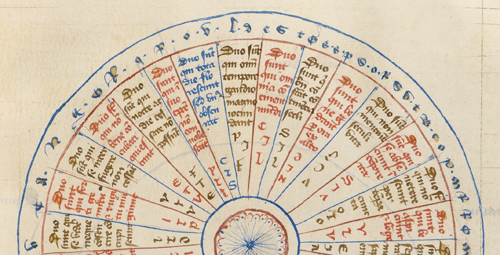 Portion of a text-heavy medieval circular chart from 1405 with sentences filling wedges, plus character codes and text around the perimeter.
 In the top image of , a portion of a map of England is shown (Paris 1255). Text ranges from simple labels, to phrases to sentences. Text color varies: cities are brown, counties are red, some regions are entirely red (e.g. DORSET ) or combinations of alternating red and blue letters ( NORTHFOLK ). Case varies: cities are lowercase, regions in uppercase. Colored boxes (brown or red) surround the text for many cities.
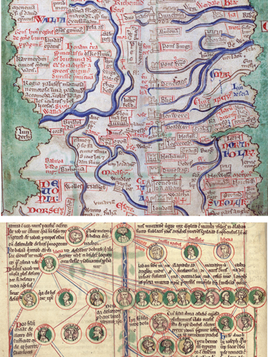 Early medieval map and graph. Text is fully integrated within the other visual elements.
 At the bottom of is a genealogical diagram (Peter of Poitier 1205). Nodes are thumbnail portraits with colored names with connections sometimes labeled. The accompanying text is fluidly set out in relation to and adjacent to the nodes. This text will cross lines or squish into narrow spaces in order to be close, while not overlapping the nodes.
Clearly, medieval scribes were very flexible with regards to the textual content, graphical elements, and their composition. Text and visualization were not separate.
How did text become separated from visualization?
Guttenbergs printing press of 1455 fundamentally changed the technical process of publishing. After the printing press, the text for a document is assembled from small pieces of movable type, arranged and locked together in a form. Images, on the other hand, were produced separately, such as carved wood blocks or engraved metal plates. The two technologies were not easy to mix. Blocks of text became separate from the blocks with images (with a few words carved into the image, if required). shows some early books with wood block images. In the second image, some minimal text has been carved into the blocks.
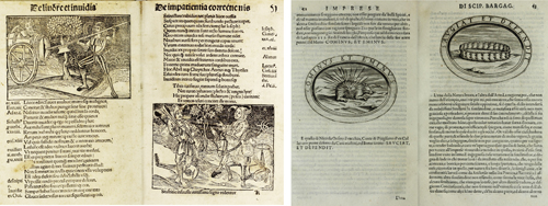 Early printed texts with woodblock images (Brant 1497, Bargagli 1589). Text is separate from image or otherwise minimal.
 It is easier to print the text and image separately. shows an illustration of a watermill from the Encyclopdie , 1777, and the associated descriptive text (Diderot et al., Meunier, Planche II). Items in the illustration are marked with characters and numbers (A,B,C1,2,3), which are then cross-referenced in the descriptive text on separate pages at the beginning of the volume. Both the text and the image can be reproduced at high quality but use different technologies (cast metal type vs. copper plate engravings) and therefore printed on separate pages. However, the viewer is required to flip back and forth between the pages. The viewer needs to rely on short-term memory to keep track of references for example, this one figure has 49 items labeled AZ,123, discretely placed throughout the image.
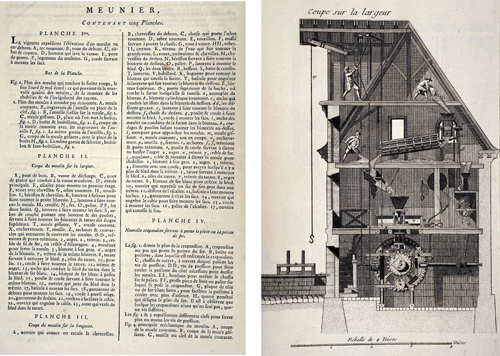 Explanation and illustration of a watermill are completely separated and cross-referenced with tiny characters. From Encyclopdie (Diderot et al. 1777).
 In the early 1900s, this separation between text and illustration was also applied to charts and graphs. shows some example pages from a book by Briton (1919) on charts and their uses. All text is pushed away from the chart; even the axes titles and tick labels are pushed to the perimeter of these charts. Similar to the Encyclopdie , text in the plot area is minimized; on the right chart, tiny labels in the plot (A,B,C) need to be cross-referenced with the text below.
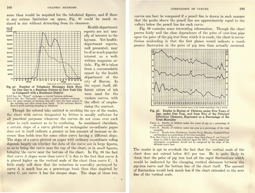 Charts in a book from 1919: text is pushed outside and away from the chart.
 By the 1950s, the International Style was sweeping across the world, promoting design that supported international trade and communication. At the core of the International Style was modernism , which emphasized simplicity, cleanness, and readability, as well as minimizing language-specific text in favor of non-language icons and symbols. Isotype was a visualization approach typified by expressive icons (see Burke et al. 2014). Isotype was created during the early formation of modernism. The Isotype example shown in is highly different from the earlier charts: with no grid lines or axes; a strong reliance on icons (which can be easily counted thereby not needing the axis); and strong use of color. The paired charts strongly suggest a correlation between overcrowding and infant mortality.
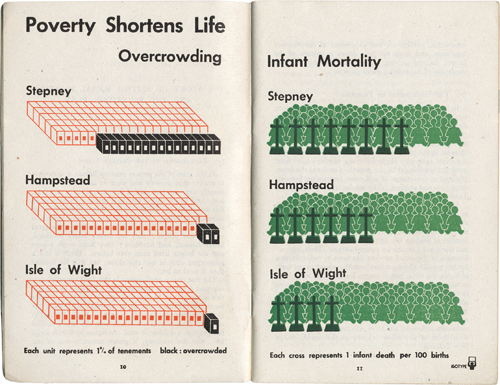 An Isotype chart from 1941. Expressive icons, no grid lines, no axes, bright colors, and minimal labels.
 Isotype became broadly diffused with the International Style, for example, with standardized symbols for international signage, such as airports, Olympics, and road signs. Modernists responsible for communicating data graphically would prefer simpler thematic maps and icons, short concise labels, and reduced use of grid lines.
By the 1960s, the technological shift to photo-compositing lowered costs and reduced time, but also reduced the ability to show fine details; small text was difficult to reproduce. This continued the bias for the design of visualizations to reduce the amount of text.
While the quality of phototypesetting improved, the 1980s introduced personal computers. With computers attached to monitors, visualizations could become interactive, but screens were small, and resolution was low (7296 pixels per inch). Early graphical user interfaces used big icons and minimal labels. Text did not look good on early desktop computers. Adrian Frutiger (designer of the font Univers ) said: Coarse resolution would result in a stair-step effect on curves and diagonals that was referred to as the jaggies (Osterer and Stamm 2014). Poor resolution required text to be large and limited the features of text that could be used. User interface guidelines from 1998 (e.g. Kahn and Lenk) recommended against the use of italics, weights, and small caps.
Font size:
Interval:
Bookmark:
Similar books «Visualizing with Text»
Look at similar books to Visualizing with Text. We have selected literature similar in name and meaning in the hope of providing readers with more options to find new, interesting, not yet read works.
Discussion, reviews of the book Visualizing with Text and just readers' own opinions. Leave your comments, write what you think about the work, its meaning or the main characters. Specify what exactly you liked and what you didn't like, and why you think so.