Pattern Services and Revisions
If you are an Annies customer and have a question about the instructions on a pattern you have purchased, please visit: AnniesCatalog.com/pages/customer_care/pattern_services.html
Templates
To download templates for easy printing, view the download instructions at the end of this book or click the Templates chapter in the Table of Contents.

Table of Contents
EDITOR Tanya Fox
CREATIVE DIRECTOR Brad Snow
PUBLISHING SERVICES DIRECTOR Brenda Gallmeyer
MANAGING EDITOR Brooke Smith
TECHNICAL EDITOR Corene Painter
GRAPHIC DESIGNER Nick Pierce
COPY SUPERVISOR Deborah Morgan
COPY EDITORS Emily Carter, Sam Schneider
PHOTOGRAPHY SUPERVISOR Tammy Christian
PHOTO STYLISTS Tammy Liechty, Tammy Steiner
PHOTOGRAPHY Matthew Owen
PRODUCTION ARTIST SUPERVISOR Erin Brandt
PRODUCTION ARTIST Nicole Gage
PRODUCTION ASSISTANTS Marj Morgan, Judy Neuenschwander
Copic Coloring Guide Level 3: People is published by Annies, 306 East Parr Road, Berne, IN 46711. Printed in USA. Copyright 2012 Annies. All rights reserved.
RETAIL STORES: If you would like to carry this pattern book or any other Annies publication, visit AnniesWSL.com.
RETAIL STORES: If you would like to carry this pattern book or any other Annies publication, visit AnniesWSL.com.
Every effort has been made to ensure that the instructions in this publication are complete and accurate. We cannot, however, take responsibility for human error, typographical mistakes or variations in individual work. Please visit AnniesCustomerCare.com to check for pattern updates. ISBN: 978-1-59635-480-7 Printed in the USA 1 2 3 4 5 6 7 8 9  Copyright 2012 Annies, 306 East Parr Road, Berne, IN 46711.
All rights reserved. This publication may not be reproduced or transmitted in part or in whole without written permission from the publisher. This book is dedicated to our thoughtful readerswho obviously love color as much as we do! In this book, the third in the Copic Coloring Guide series, we endeavor to cover a topic that is near and dear to our heartscoloring people. Whether you enjoy realistic, vintage, cute or whimsical, the popularity of people images is unprecedented.
There are literally thousands of images available just begging to be colored. In the following pages you will find not only photo tutorials stepping you through the most popular methods of coloring skin and hair and a variety of clothing, but also the theory that explains the why behind those techniques. We hope you embrace this book as much as the previous ones and that it finds a home in your crafting library. Colleen and Marianne
The purest and most thoughtful minds are those which love color the most.~ John Ruskin
The face is the most important part of any image. It shows expression and feeling and conveys character.
Before beginning to color an image it is necessary to identify the light source to determine where the light is coming from in the image.
Keep the images facing the light source.
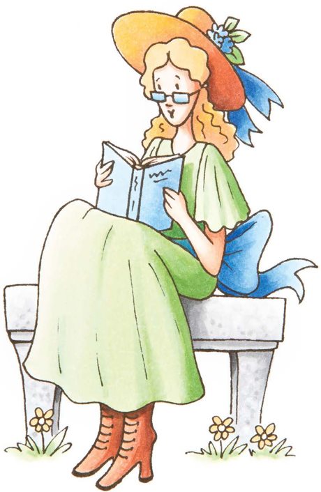
Lets start this exercise by considering some common lighting scenarios.
If a person is outside during the day, the light source is the sun. If a person is inside a home during the evening hours, the light source is most likely an overhead light or lamp. If a person is telling ghost stories around a campfire, the light source is probably the roaring fire. The light from a source will illuminate the things around it and create areas of highlight and areas of shadow. It is important to understand where the light source is when coloring images, especially when faces are included, in order to create accurate and realistic highlights and shadows. Rule 1: Always highlight the most important part of the image by having the light shine directly on that aspect. Rule 1: Always highlight the most important part of the image by having the light shine directly on that aspect.
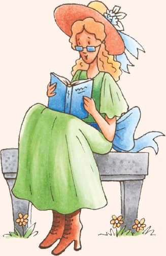
On people images, the face is typically the focal point. Rule 2: The image should always face the light source. 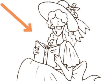 Notice how the young girl is sitting at an angle on the bench. Even though she is glancing down, her face is still facing left. Keeping Rule 2 in mind, place the light source in the upper left corner when coloring this image. Rule 3: Areas that are closest to the light source are brightest and most highlighted.
Turn on a lamp. Hold your hand up to the light. The side of your hand that is closest to the light is bright and the side that is facing away from the lamp is dark or in shadow. Keep this concept in mind when coloring your images.
Seeing the Rules at Work Look at the images on this page and apply the three previous rules about light source. Notice on the top image how the front of her dress, the cover of the book, her face, and the front of her hat are all brightly lit.
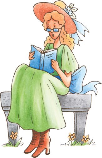
Notice too how the back of the hat, behind the book and the back of her dress are all in shadow. With the light source coming from the upper left, her face and the book become the focal point of the image. Now notice the coloring on the image at the right. Same girl, sitting on the same bench and reading the same book, but it looks totally different because the light source has changed. In this image, the light source is coming from the upper right side of the image, behind her, highlighting her bow, the hat and the back of her head. Since her body and face are facing away from the light, they are thrown into shadow.
While this is not an incorrect light source, it does not convey that the girl and her book are most important.
The light source is coming from the upper right side.


Simple Faces
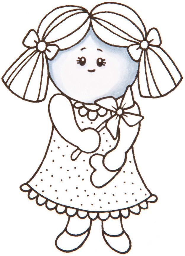
This little girl is similar to many images on the market today.
She has a basic, round face shape with uncomplicated facial features. Since the image itself is simple, we want to keep the coloring simple too. Notice that this image is only colored in two or three values. Any more and it would look too detailed. Keep it simplea highlight (shown by the white), a mid tone (C1) and a shadow (C3). 

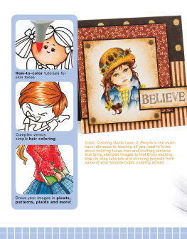








 Table of Contents EDITOR Tanya Fox CREATIVE DIRECTOR Brad Snow PUBLISHING SERVICES DIRECTOR Brenda Gallmeyer MANAGING EDITOR Brooke Smith TECHNICAL EDITOR Corene Painter GRAPHIC DESIGNER Nick Pierce COPY SUPERVISOR Deborah Morgan COPY EDITORS Emily Carter, Sam Schneider PHOTOGRAPHY SUPERVISOR Tammy Christian PHOTO STYLISTS Tammy Liechty, Tammy Steiner PHOTOGRAPHY Matthew Owen PRODUCTION ARTIST SUPERVISOR Erin Brandt PRODUCTION ARTIST Nicole Gage PRODUCTION ASSISTANTS Marj Morgan, Judy Neuenschwander Copic Coloring Guide Level 3: People is published by Annies, 306 East Parr Road, Berne, IN 46711. Printed in USA. Copyright 2012 Annies. All rights reserved. RETAIL STORES: If you would like to carry this pattern book or any other Annies publication, visit AnniesWSL.com. RETAIL STORES: If you would like to carry this pattern book or any other Annies publication, visit AnniesWSL.com.
  Copyright 2012 Annies, 306 East Parr Road, Berne, IN 46711.
 Lets start this exercise by considering some common lighting scenarios.
  Notice how the young girl is sitting at an angle on the bench. Even though she is glancing down, her face is still facing left. Keeping Rule 2 in mind, place the light source in the upper left corner when coloring this image. Rule 3: Areas that are closest to the light source are brightest and most highlighted.