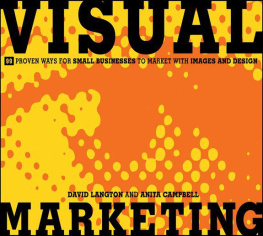
Design Book for Non-Designers: Guidelines for Small Business Owners, Bloggers, and Marketers
This book will teach you how to create good looking designs. After reading it you will never look at a graphic design with the same eyes again.
Anita Nipane

www.digginet.com
T his book was written by Anita Nipane of Digginet.
Design Book for Non-Designers: Guidelines for Small Business Owners, Bloggers, and Marketers
Copyright 2017 by Anita Nipane.
All rights reserved. No part of this book may be used or reproduced in any manner whatsoever without written permission except in the case of brief quotations embodied in critical articles or reviews.
Trademarks
All product or brand names and services identified throughout this book are used in editorial fashion only and for benefit of such companies with no intention of infringement of the trademark. No such use, or the use of any trade name, is intended to convey endorsement or other affiliation with this book.
For information contact:
http://www.digginet.com
First Edition: January 2017
Contents
About author
A nita Nipane has more than 10 years of experience in marketing and has graduated MBA Marketing at Riga Business School. She is also Udemy instructor and has more than 4600 students from 126 countries. In her free time, she blogs at www.digginet.com where she shares useful and practical information about creating well-designed visuals for marketing. She is not a professional designer but has a long experience as a marketing manager and her everyday job involves evaluating the results of professional graphic designers and making sure that the designs they have created will work well for marketing purposes. And yes, a long time ago she graduated art school, too, where she learned most of the design principles that she teaches in this book. In short, she is the person that unifies marketing and graphic design.
Your Free Gift
E verybody wants to get something for free. Wouldnt it be great to create good looking visuals for your website or social networks using free online tools? No expensive graphic software, no extra costs.
If you like this idea, just subscribe to the authors FREE online course and receive useful tips about free resources you can use on the Internet.

Is this book for you?
A re you a starting blogger, small business owner or a zero budget marketing specialist who needs to create images, banners, simple advertisements, brochures or visuals for your web page? Do you find yourself trying to create visuals but end up with something that looks amateurish?
If you lack a degree in art but have to make your own business cards, flyers, web visuals, brochures or any other visuals, buy this book and read it. It wont substitute studying in a design school, but it will give you a vocabulary of the basic design and composition principles, color theory, and typography in a quick and practical way. This book ideally serves as a good starting point, if you want to learn how to produce better-designed visuals and never again make amateur mistakes. Moreover, after reading it you will know exactly why your designs look better than they were before.
The idea of this book is not just telling you theoretical principles about using colors, creating compositional balance and pairing typefaces correctly, but to show you how you can apply these principles in the real world to improve your marketing results. Actually you will be educated enough to understand when the design created really helps you to communicate your marketing message and when it doesnt. It doesnt matter if you created the design yourself, or it was created by a professional designer. Because lets be honest the knowledge and skills of professional designers vary. Actually, they dont always understand the main marketing message you need to convey.
American advertising creative director Bill Bernbach has said: Just because your ad looks good is no insurance that it will get looked at. How many people do you know who are impeccably groomed ... but dull?
This is why you cannot blindly rely on your designer and need to be knowledgeable enough to ask for corrections, if necessary because the main purpose of your advertisement is not to look beautiful but to sell. In general, everything starting from a business card and letterhead to your huge outdoor advertisement must help you to sell your products, services, and brand. This is why it is important to know the basic principles of a good looking design.
In order to make this book as practical as possible, you will see illustrations and examples of every principle that is described as well as will learn about the free online resources you can use for creating your new designs. Recommended especially for non-designers and marketing specialists, this book will change the way you look at graphic designs around you.
Read this book and you will learn how to:
- use the main principles of professionally looking designs
- create a composition and use visual weight, balance, and flow, in order to emphasize your marketing message,
- recognize the difference between the optical and geographic center and why the first one is important.
- use the science behind the good looking color schemes
- combine typefaces and use contrast in a sophisticated way,
- use more than 20 FREE resources for creating your own designs.
The principles described in the book werent created or invented by me. I just have summed them up, in order to teach them in a clear and hopefully interesting way. As a result, after reading this book you will know how to apply the same design principles every professional designer knows and uses.
Why is design important for your business?
A pple Co-founder Steve Jobs once said: "Design is not just what it looks like and feels like. Design is how it works." A common misconception is that design is only about the way a product, advertisement, web page etc. looks. In reality, a purpose of a good design is to make sure that the design works and communicates . It must help to sell your product or communicate your marketing message.
Have you ever bought a product or a service simply because its packaging or website l ooked nicer than the alternative? Nothing big, just perhaps a shampoo that has a nicer packaging, or an online course that has more professionally designed advertisement. When you need to choose between products with similar prices and similar functions, most probably you and your customers, too will choose the more aesthetically pleasing option. Whatever product or service your business offers in most cases there are many other similar products available from your competitors. Perhaps in a similar quality and price range and only distinction you can make is your design, because a common trait of humans is to perceive beautifully designed things as being better.
To create an appropriate design you must consider, who your audience is, what the product is, what information must be accepted, what is the goal of the product or advertisement. Actually, it isnt so difficult as it probably sounds. All you need to do is follow the principles described in this book.
CRAP The Big Four
H ave you noticed that all designs generally can be divided in those that look well-designed and in those that dont? Do you know why? Because the creators of those designs that look well-designed have used some basic principles that every professional designer knows, but others haven't. These principles are applied to all professionally designed advertisements, banners, posters, brochures and other illustrative visuals. The acronym of them is CRAP: contrast, repetition, alignment, and proximity. They complement each other; therefore usually you will use several of them simultaneously. Whats important to know is that if you understand these 4 principles, then over time youll develop a feel for why some designs look good and some - dont. Its like youll have some secret super-sense.
Next page
