MICHAEL FREEMAN
THE COLOUR PHOTOGRAPHY FIELD GUIDE
The essential guide to colour for striking digital images
I L E X
Understand the role colour plays in your images, learn to appreciate its dynamic effects and find out how to capture and reproduce it as precisely as possible in your own images.
The Colour Photography Field Guide provides a unique look at analysing and combining three important ways of dealing with colour. The first is the subjective and cultural response to individual colour: the perception. The second is how colours are found and appear in photography: the science. The third is the means by which they can be viewed and altered digitally: the expression.
A clear and technically precise look at how colour affects your digital images
Portable and lightweight, for on-the-spot information and inspiration
With a host of case studies examining difficult colour situations such as capturing flesh tones and unreal colours
First published in the UK in 2013 by
I L E X
210 High Street
Lewes
East Sussex BN7 2NS
www.ilex-press.com
Distributed worldwide (except North America)
by Thames & Hudson Ltd., 181A High Holborn, London
WC1V 7QX, United Kingdom
Copyright 2013 The Ilex Press Limited
Publisher: Alastair Campbell
Associate Publisher: Adam Juniper
Managing Editor: Natalia Price-Cabrera
Specialist Editor: Frank Gallaugher
Editor: Tara Gallagher
Editorial Assistant: Rachel Silverlight
Creative Director: James Hollywell
Senior Designer: Ginny Zeal
Designer: Jon Allan
Colour Origination: Ivy Press Reprographics
Any copy of this book issued by the publisher is sold subject to the condition that it shall not by way of trade or otherwise be lent, resold, hired out or otherwise circulated without the publishers prior consent in any form of binding or cover other than that in which it is published and without a similar condition including these words being imposed on a subsequent purchaser.
British Library Cataloguing-in-Publication Data
A catalogue record for this book is available from the British Library.
Print ISBN: 978-1-78157-989-3
ePub ISBN: 978-1-78157-149-1
Mobi ISBN: 978-1-78157-150-7
All rights reserved. No part of this publication may be reproduced or used in any form, or by any means graphic, electronic or mechanical, including photocopying, recording or information storage-and-retrieval systems without the prior permission of the publisher.

CONTENTS
INTRODUCTION
Color is a wonderful phenomenon. In images from paintings to photos it can bring a pleasure that is experienced rather than considered, in much the same way as music. Color in photography is now much closer to painting than ever before, not in the way it looks but in the huge amount of control that digital cameras and digital image editing give.

MONOCHROME
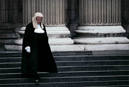
A High Court judge walking down the front steps of St Pauls Cathedral in London. The white of his collar, wig, and cuffs provide a wonderful contrast against his black robes, and chimes nicely with the columns behind him.
C olor isnt just about hue and wavelength, and while its important to understand the technical background in order to get the most from your camera and software, the real secret to making eye-catching and beautiful pictures is understanding the impact that color has on our eye and our mind.
Photographys black-and-white beginnings were overtaken when color film became widely available, and the richness and sensation of color were enthusiastically embraced by almost everyone. Monochrome has its place in photography (and indeed is enjoying a digital revival), but color will always be the major player in imagery. In the first chapter, Ill explain what makes colors the way they areor rather, the way we see themand how your cameras sensor captures them and turns them into a viewable image. However, color becomes meaningful only when it is perceived, and that requires the eye-brain combinationwhat is now known as the HVS (Human Vision System). The main idea behind this book is to teach you how to make full use of colors unique properties when youre shooting. Unique because we are able to actually enjoy it rather than just take it in as a matter of fact, in much the same way that we enjoy music. Of course, what color combinations are pleasurable to the individual varies, just like music. This field guide will also help you with finding and choosing colors that you can expect to have an effect on the people who see your images. For instance, color has many and varied associations. There is, for example, the association of color with temperature. Red, orange, and yellow convey a sense of warmth, while blues and aquas trigger feelings of coldness. Color can convey state of mind, from alert and excitable (fully saturated yellow, orange), to contemplative and even melancholy (cool colors with low saturation). Color can signify status and desirability: think purple and gold. These triggers to our emotions have been used for centuries by painters and more recently by interior and product designers.
The entire digital photo workflow is now full of potential for managing color to perfection, which means being confident in reproducing color accurately, and also being able to interpret color according to the way you see, remember, and think about it. As well see, expressive color in photography goes beyond measurement into personal likes and dislikesa direct result of colors unique ability to trigger feelings. Camera sensors capture more of the subtleties of color than ever before, and when it comes to processing the results, especially from Raw files, the possibilities are endless with the latest software. Ill be showing you how to use your eye as a tool which is ultimately more reliable than any measuring device.
THE LANGUAGE OF COLOR
Understanding color begins with familiarizing yourself with its special terminology. We all think we know what color means, but rarely do we have the need to think about it logically. As photographers, however, we need to. Color from your camera and on your screen is constructed from red, blue, and green, but we dont think about color in these terms.

SIMPLICITY
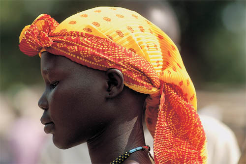
When the feature you want to be the focus in a picture is variously colored or patterned, like this headscarf worn by a young Dinka woman in Southern Sudan, sometimes keeping it simple results in a stronger image.
I nstead, we think, when we have to at all, first about hue, and then about brightness and saturation. Ill explain this in the following pages, and in passing take a quick look at how color has been thought about throughout the ages, before photography. One of the true benefits of digital photography and digital processing is that we can now take this deeper look at color. And in fact, we ought to.
How color affects the vieweryour viewers, the people who are going to look at your imagesis now highly practical. Two developments in digital photography illustrate the new ways of thinking about color that have already entered photography: the color circle and RGB. The color circle as a way of displaying pure hues has a long history, and its far from theoretical. Now, along with color-space models, it is familiar to anyone using Photoshop or Lightroom. It even makes an appearance in most digital cameras, when you adjust the hue. RGB is even more well known, because the cameras sensor, which records monochrome, is filtered with a mosaic of these three colors, and the resulting image is a combination of these three as channels. Digitally, when processing and later, you can actually take these apart and make adjustments.
Next page
