

BUILT
TO
LAST
D AVID M ACAULAY
H OUGHTON M IFFLIN B OOKS FOR C HILDREN
Houghton Mifflin Harcourt
Boston New York 2010

Text and illustration copyright 2010 David Macaulay
All rights reserved. For information about permission or to reproduce selections from this book,
write to Permissions, Houghton Mifflin Harcourt Publishing Company, 215 Park Avenue South,
New York, New York 10003.
Houghton Mifflin Books for Children is an imprint of
Houghton Mifflin Harcourt Publishing Company.
www.hmhbooks.com
The text of this book is set in Times New Roman and Berkeley Oldstyle.
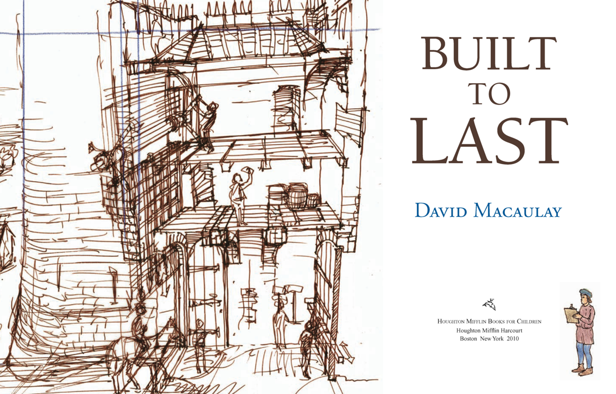
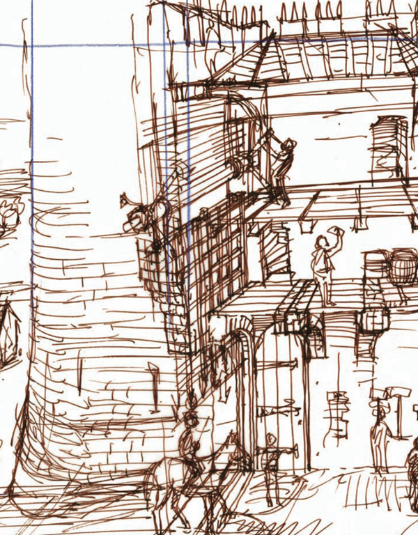
The line work in this book was drawn with a fountain pen, colored pencil, or regular pencil. The
color was created using felt-tip markers, colored pencils, and some watercolor (in Mosque). All of
the illustrations for Castle and Cathedral were finished digitally.
The Library of Congress cataloging-in-publication data is on file.
ISBN 978-0-547-34240-5
Manufactured in the United States of America
DOW 10 9 8 7 6 5 4 3 2 1
4500242813


For Julia and Sander
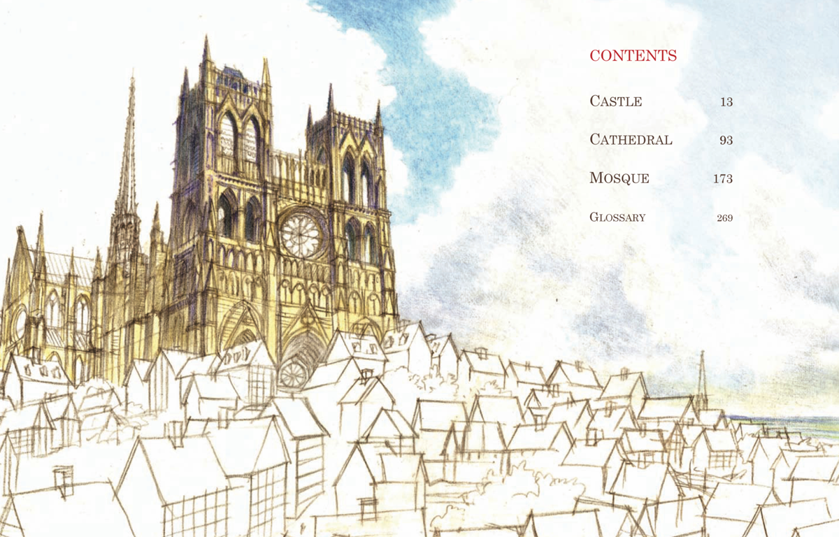
CONTENTS


C ASTLE
C ATHEDRAL
M OSQUE
G LOSSARY
INTRODUCTION


In the beginning of 2009, I was asked how I would feel about reissuing some of my old architecture books along with Mosque in a single volume that, coincidentally, was to be the same size as The Way Things Work and The Way We Work. The new compendium would be called Built to Last, a title I found both interesting and, given the "disposable" times we live in, ironic. My only obligation would be to write an introduction (and probably not this one!). An editor and designer assigned to the project would do the rest, including digitally coloring the old black-and-white material to freshen it up and make it more consistent with the full-color illustrations in Mosque. They had me until "colorizing."
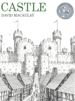
Cross hatchinginking layers of lines at different angles to describe form and space through shadow and textureis what illustrators do or at least used to do when color wasn't available, and my old books are full of it. Putting color either over or under cross hatching after the fact, either to modernize it or make it look like something new, generally results in printed mud. While my protective antennae were chanting "run, don't walk," curiosity had wedged its oversize foot in the doorway. What would Cathedral and Castle look like in color?
Rather than simply coloring in the old art, I decided to trace it and in the process eliminate all that pesky line work before adding color. After looking at a couple of samples, we all agreed this approach could work and sat down to map out a schedule. The one thing we'd forgotten, especially me, is that time runs in two directions. The art for Cathedral, my very first book, was completed thirty-seven years ago, and for Castle, four years later. I've spent most of the time between then and now not only making different kinds of books but also teaching illustration, and both have meant continually learning and relearning what it means to communicate through pictures. As a result, while I remain nostalgically attached to my early books, I'm not as easy to please as I was back then.
The more time I spent with the original illustrations, the more suspicious I became. Had I simply seduced a reading public with miles of India ink and a need to draw every brick? There was too much dependence on ambiguous cross sectionsa language learned while studying architecture but not so helpful in trying to reach a larger public. There were embarrassing lapses in scale and equally embarrassing attempts at drawing human beings. And of course, there were a few inevitable inaccuracies. With deadlines looming, I realized I couldn't just trace the old drawings; I would have to start from scratch. This would mean reconsidering choices of subject matter, altering sequences, and even throwing away some of my old favorites. And because neither pictures nor words are produced in a vacuum, this would also mean looking again at the text to be sure it was accurate and consistent with the new art.
The inevitable moments of doubt about both the effectiveness of the original books and the logic of this new venture were kept in check by two things. First, the ability of my colleagues at Houghton to talk me down from the cliff from time to time, as they patiently threw away schedule after schedule, and second, the fact that I still believe in the content of those old books. They were created not only to show why and how some of the world's best-known buildings were designed and constructed, but to connect the bricks and mortar with the vision and courage of the builders. Whether motivated by faith or fear, these were people who lived ordinary livesraised families, needed jobs, developed skills, and had dreams. In short, they were people like us. By showing how they achieved such extraordinary feats, I hoped and still hope to remind today's "builders" of their own potential.
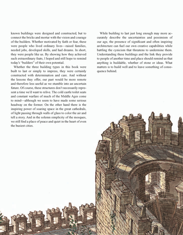
Whether the three building types in this book were built to last or simply to impress, they were certainly constructed with determination and care. And without the lessons they offer, our past would be more remote and therefore less useful as we stumble into an uncertain future. Of course, these structures don't necessarily represent a time we'd want to relive. The cold castle toilet seats and constant warfare of much of the Middle Ages come to mindalthough we seem to have made some serious headway on the former. On the other hand there is the inspiring power of soaring space in the great cathedrals, of light passing through walls of glass to color the air and tell a story. And in the solemn simplicity of the mosques, we still find a place of peace and quiet in the heart of even the busiest cities.
Next page


