1.2 Introduction
(Fast Forward, a new column of Interactions, which the editors of Interactions kindly permitted me to publish, presents an opportunity for me to think about where our profession of user-interface design has been over the past three-and-a-half decades in which I have worked and about its future. I hope you will enjoy and benefit from joining me in this discussion. Your feedback is welcome).
Lets begin our journey in the twenty-first century by thinking about metaphors in user interfaces. I have defined them as the essential concepts in computer-mediated communication that substitute for the underlying code and terminology of operating systems, applications, and data. Instead, concepts are communicated through words, images, sounds, and even touches (Marcus )) and I consider metaphor to be a fundamental component of all user interfaces, not all professionals in the user-interface design community agree.
Some years ago, in the late 1980s, during informal conversation with Jaron Lanier, one of the prime innovators of virtual realitys new paradigms, he made a characteristically mysterious, oracular, and challenging pronouncement. He said that he considered most current user interfaces inadequate and envisioned a future time in which there would be virtual reality displays (e.g., advanced versions of headsets he helped invent) working with input devices (e.g., advance versions of DataGloves he helped invent) that would not require metaphors. He envisioned something like a musical instrument, e.g., a pianos keyboard on a device, which, when played, directly conveyed input to displays that we, in turn, could directly experience.
I challenged him about the notion of a user-interface, a medium of communication, existing without metaphors, because I have been influenced by the likes of George Lakoff and Mark Johnson () to understand that all communication requires agreement on metaphorical underpinnings; otherwise, people talk in a skewed fashion, misunderstanding basic concepts or references, or being baffled by them. If you are talking about football, and I think youre talking about soccer, or the latest marketing skirmish of our company, eventually one of us will become quite puzzled by the other, and we shall have to reconnect, to agree upon fundamental metaphors. The only kind of communication that can take place without metaphors is of a direct signaling kind. If I am foolish enough to place a lighted match below my hand, stimulusresponse mechanisms are invoked that directly signal to my skin that it is facing a dangerous temperature situation. It requires some internal computation in my wetware, but not metaphorical intervention (i.e., substitution, the key to metaphors), to convince me to move my hand.
Some future devices will certainly feature sophisticated virtual reality displays or augmented reality displays. Leaping forward a few generations and imagining direct neural input of signals, as envisioned by early cyberpunk authors like Vernor Vinge in True Names (Vinge ) one might ask: where or what is the user interface under these extreme conditions? In this situation, user interfaces would be deprived potentially of any physical input devices and physical visual or acoustic display devices. What is left is a world of pure mental communication with signs . In my vocabulary, communication includes interaction. In fact, semiotics is usually predicated as a behavioristic science, asking how people behave or interact with signs in order to determine their meaning.-
What one is left with is a kind of mental theater, or mental ceremonies. For me, this is the essence of user-interface design: envisioning facts, concepts, and emotions within dynamic, interactive symbolic and iconic artifacts. One thing seems certain: metaphors wont disappear, they are essential to having any communication at all. In fact, Lakoff and Johnson argue that most of these metaphorical references are spatial in nature, e.g., in our English language expressions things are looking up , and Ive been getting into this new topic of semiotics.
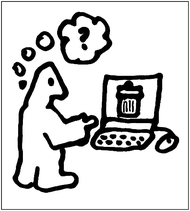
OK, so where are computer metaphors going? Many analysts, prognosticators, and pontificators, e.g., David Gelernter, Don Norman, and George Robertson (Loebl ) are calling for the end of the desktop metaphor. Many seem to sense that something is clumsy about fundamental notions of files and folders, of applications and data, embodied in the visual artifacts of government-surplus 1950s metal desks with manila folders stuffed in the drawers and lying in piles on top, with scattered arrays of papers, mostly full of text and an occasional chart or table.
Some have argued that this entire scheme is notoriously culture-biased. (Chavan ), for example, has argued that most people in India do not own desks or folders, and do not have much experience with them. They do have bookshelves, however, with books that have chapters and pages. Perhaps if some Indian researchers at the National Institute of Design in Ahmedabad originally had invented an equivalent of the Xerox Star at Xerox PARC or later the Apple Macintosh , we might have had a completely different history of envisioning operating systems and windowing environmentsooops, if there had been any windows at all. If Chinese researchers at the Academy of Sciences in Beijing had invented modern computing, as the Chinese did for printing, perhaps a Chinese computer, and most others around the world, would have been displaying vertically unrolling scrolls, not Microsoft Windows .
Baby faces, devices with small user interfaces, invariably shrink the visual real estate and emphasize acoustic and haptic (touch) multimedia communication as well as visual. The desktop metaphor simply does not work in a size of 3 2 cm. We need something else conceptually and perceptually, to help us represent our key structures and processes. What might that be?
Speech interfaces (vocal user interfaces, or VUIs) offer new opportunities, but still have hierarchies of objects and navigation, even when one cannot see them. For example, one can move within Sports to locate the place where one can purchase baseball tickets online. Even menus are a persistent navigation concept or metaphorical construct of all user interfaces. Other key pervasive concepts include options, tasks, preferences, decisions, and contexts (as in contextual awareness).
The early personal communicators, like the Apple Newton, emphasized communication over computation as an essential computer-mediated assistant. Today, nouns and verbs of messaging associated with email functions have become essential paradigms for many peoples interactions with computers and a source of new, fundamental metaphorical concepts for almost all computer-mediated communication. -
Some have argued that having to store files in separate groups related to applications that are also stored in separate groups might do as much damage to mental health, and productive time, as the harm of using the Basic programming language was supposed to cause in the 1980s. Having to store email messages and references about metaphors in a place separate from text documents about the same content seems clumsy, and a number of solutions have been proposed, such as Apples OpenDoc (Apple )), which enable users to focus on contents rather than tools.
