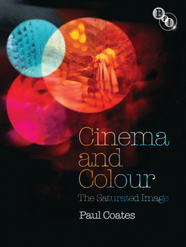
Cinema and Colour

In memoriam Krzysztof Kielowski
Paul Coates 2010
All rights reserved. No reproduction, copy or transmission of this publication may be made without written permission. No portion of this publication may be reproduced, copied or transmitted save with written permission or in accordance with the provisions of the Copyright, Designs and Patents Act 1988, or under the terms of any licence permitting limited copying issued by the Copyright Licensing Agency, Saffron House, 610 Kirby Street, London EC1N 8TS. Any person who does any unauthorized act in relation to this publication may be liable to criminal prosecution and civil claims for damages.
The author has asserted his right to be identified as the author of this work in accordance with the Copyright, Designs and Patents Act 1988.
First published in 2010 by
PALGRAVE MACMILLAN
on behalf of the
BRITISH FILM INSTITUTE
21 Stephen Street, London W1T 1LN
www.bfi.org.uk
Theres more to discover about film and television through the BFI. Our world-renowned archive, cinemas, festivals, films, publications and learning resources are here to inspire you.
Palgrave Macmillan in the UK is an imprint of Macmillan Publishers Limited, registered in England, company number 785998, of Houndmills, Basingstoke, Hampshire RG21 6XS. Palgrave Macmillan in the US is a division of St Martins Press LLC, 175 Fifth Avenue, New York, NY 10010. Palgrave Macmillan is the global academic imprint of the above companies and has companies and representatives throughout the world. Palgrave and Macmillan are registered trademarks in the United States, the United Kingdom, Europe and other countries.
Cover design: Mark Swan
Cover images: Le Mpris (Jean-Luc Godard, 1963), Rome-Paris Films/Films Concordia/Compagnia Cinematografica Champion; Two or Three Things I Know About Her (Jean-Luc Godard, 1967), Anouchka Films/Argos-Films/Films du Carrosse/Parc Film; The Wizard of Oz (Victor Fleming, 1939), Loews Incorporated
Designed by couch
British Library Cataloguing-in-Publication Data
A catalogue record for this book is available from the British Library
A catalog record for this book is available from the Library of Congress
10 9 8 7 6 5 4 3 2 1
19 18 17 16 15 14 131 2 11 10
ISBN 978-1-84457-314-1 (pbk)
ISBN 978-1-84457-315-8 (hbk)
eISBN 978-1-83871-498-7
ePDF 978-1-34992-447-9
CONTENTS
Moments of liberation are ambiguous, even before the revolution begins to consume its children: divesting objects of the contexts that first lent them meaning cannot dispel completely the shadows of old ones. For an incalculable time objects shimmer between different orders of signification. Where one is acknowledged consciously, the other lives an unconscious afterlife, even if only haunting the unconsciousness known as habit. Meaning may then depend on beholders, or their moods. Consequently, such revolutionary moments as the breakthrough into colour of early twentieth-century visual art or 1960s art cinema breathe an ambiguity that feeds polysemy. One example, chosen arbitrarily, can render this clearer. Thus, on the one hand, the primary association encoded within the blue of Krzysztof Kielowskis Trois couleurs: bleu (Three Colours: Blue) (1993) would seem to accord with a cultural one linking it to depression, the blues: after all, a car crash widows its protagonist in its opening minutes. However, when I suggested this to Kielowski, he retorted on the other hand in Spain or perhaps Portugal, Im not sure its quite the reverse: their age-old traditions identify blue with something vital and full of energy. Ive met numerous people from various parts of the world and even from our cultural sphere who have explained that there are vastly different relations with these colours. modernistically acknowledges the slipperiness of colours location, its readiness to inhabit multiple contexts and traditions. The colour of Giottos joy can also exude depression, and blue can also be claimed by Edvard Munch. Consider, for example, Peter Watkins discussion of the prevalence of blue in his Edvard Munch (1974):
We did a series of tests and discovered that filming outdoors with an interior lighting stock produces a blue bias to the colour. We decided that we liked this look, especially as it helped to de-saturate the colours and looked less like Hollywood and more like the lighting in Oslo homes in the last century. I had already experimented with indirect lighting in Privilege [1976], with Peter Suschitzky as cameraman. Now I wanted to go further, especially as colour had meant so much to Edvard Munch as well. He also had a blue period in his work notably when he first moved to France in 1889, when he referred to blue as the colour symbolizing death to the ancient Greeks.
Not surprisingly, blue figures frequently in Munchs deliberations on his art, which the films dialogue quotes. The decision to shoot outdoors using an interior stock itself mixes visual systems towards a possible ambivalence.
If the signifier blue oscillates between joy and depression, a similar range is available to all other colours. The oscillation is inherent in their functioning within any signifying system and not just in the ambiguity-laden modernity documented by Munch as colour names themselves entertain uncertain relations with the realities they designate, varying from culture to culture. Their relationship with referents is often loose. Even at its closest, there is no tight fit; rather, colour shifts around a meaning to which it has been tethered artificially and temporarily, like a ship bobbing at anchor.
What is sometimes called the psychology of colour may overlap with, and partially motivate, colour symbolism, but it is not identical with it. After all, symbolism is culture-specific, whereas human psychology, or some portion of it, may be seen as universal. Whereas culture-specific symbolism is accessed consciously as part of belief systems or ideologies, colour psychology appears to be rooted in physiological and in a sense unconscious reactions and mood changes in persons exposed to particular colours. The degree to which such unconsciousness might correspond to, say an individual (Freudian?) unconscious, or a more collective (Jungian?) one, is moot. In any case, some psychologists align these reactions with a culture-neutral signifying system, for instance on an arc of pleasure running from colours deemed more pleasant and grouped around the wavelength designated blue (blue, blue-green, green, purple-blue, red-purple and purple) to less pleasurable ones grouped around the yellow one (yellow, green-yellow and red-yellow), with red in an intermediate position. for its grounding in the oneiric.)
The extent of the potential disparity of views concerning colour meaning can be gauged by some early twentieth-century remarks by the Canadian Womens Journal on the subject of that most stereotypically female colour, pink. (Correctional facilities have been known to paint walls Baker-Miller pink to reduce aggression in the males who populate them disproportionately.) The Journal declared pink a strong colour, more suitable for boys, with the delicate and dainty blue being girlish. Although Tarr suspects that womens purchases of rouge may reflect their pull towards the masculinity with which it may therefore unconsciously be associated, one can only speculate about the significance of the widespread modern Occidental cultural links (facial, and in attire) between women and red. Freudians and Lacanians might see a red-clad woman (red clothing being far more common among western women than western males) as seeking to render herself more masculine, tapping the denied power signified by the phallus, particularly should the quotient of red be enhanced by the wielding of a significantly shaped lipstick; Platonists might evoke an individual yearning for the other half-self lost when an originally androgynous entity split into two sexes; while evolutionary biologists might speak of a desire to attract male attention (psychoanalysts might add: on the basis of male narcissism) to ensure selection for mating. Such speculations, of course, only scrape the surface of colours deep cultural lability, its openness to variable readings.

