1. Comparison of Batches
Multivariate statistical analysis is concerned with analysing and understanding data in high dimensions. We suppose that we are given a set

of n observations of a variable vector X in

. That is, we suppose that each observation x i has p dimensions:
and that it is an observed value of a variable vector

. Therefore, X is composed of p random variables:
where X j , for

, is a one-dimensional random variable. How do we begin to analyse this kind of data? Before we investigate questions on what inferences we can reach from the data, we should think about how to look at the data. This involves descriptive techniques. Questions that we could answer by descriptive techniques are:
Are there components of X that are more spread out than others?
Are there some elements of X that indicate sub-groups of the data?
Are there outliers in the components of X ?
How normal is the distribution of the data?
Are there low-dimensional linear combinations of X that show non-normal behaviour?
One difficulty of descriptive methods for high-dimensional data is the human perceptional system. Point clouds in two dimensions are easy to understand and to interpret. With modern interactive computing techniques we have the possibility to see real time 3D rotations and thus to perceive also three-dimensional data. A sliding technique as described in Hrdle and Scott () may give insight into four-dimensional structures by presenting dynamic 3D density contours as the fourth variable is changed over its range.
A qualitative jump in presentation difficulties occurs for dimensions greater than or equal to 5, unless the high-dimensional structure can be mapped into lower-dimensional components (Klinke & Polzehl, ). Features like clustered sub-groups or outliers, however, can be detected using a purely graphical analysis.
In this chapter, we investigate the basic descriptive and graphical techniques allowing simple exploratory data analysis. We begin the exploration of a data set using boxplots. A boxplot is a simple univariate device that detects outliers component by component and that can compare distributions of the data among different groups. Next, several multivariate techniques are introduced (Flury faces, Andrews curves and parallel coordinates plots (PCPs)) which provide graphical displays addressing the questions formulated above. The advantages and the disadvantages of each of these techniques are stressed.
Two basic techniques for estimating densities are also presented: histograms and kernel densities. A density estimate gives a quick insight into the shape of the distribution of the data. We show that kernel density estimates (KDEs) overcome some of the drawbacks of the histograms.
Finally, scatterplots are shown to be very useful for plotting bivariate or trivariate variables against each other: they help to understand the nature of the relationship among variables in a data set and allow for the detection of groups or clusters of points. Draftman plots or matrix plots are the visualisation of several bivariate scatterplots on the same display. They help detect structures in conditional dependencies by brushing across the plots. Outliers and observations that need special attention may be discovered with Andrews curves and PCPs. This chapter ends with an explanatory analysis of the Boston Housing data.
1.1 Boxplots
Example 1.1
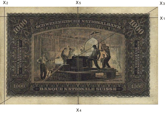
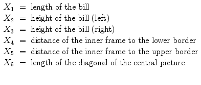
The Swiss bank data (see Chap. ) consists of 200 measurements on Swiss bank notes. The first half of these measurements are from genuine bank notes, the other half are from counterfeit bank notes.
Fig. 1.1
An old Swiss 1000-franc bank note
The authorities measured, as indicated in Fig.,
These data are taken from Flury and Riedwyl (). The aim is to study how these measurements may be used in determining whether a bill is genuine or counterfeit.
The boxplot is a graphical technique that displays the distribution of variables. It helps us see the location, skewness, spread, tail length and outlying points.
It is particularly useful in comparing different batches. The boxplot is a graphical representation of the Five Number Summary . To introduce the Five Number Summary, let us consider for a moment a smaller, one-dimensional data set: the population of the 15 largest world cities in 2006 (Table ).
Table 1.1
The 15 largest world cities in 2006
City | Country | Pop. (10,000) | Order statistics |
|---|
Tokyo | Japan | 3,420 | x (15) |
Mexico city | Mexico | 2,280 | x (14) |
Seoul | South Korea | 2,230 | x (13) |
New York | USA | 2,190 | x (12) |
Sao Paulo | Brazil | 2,020 | x (11) |
Bombay | India | 1,985 | x (10) |
Delhi | India | 1,970 | x (9) |
Shanghai | China | 1,815 | x (8) |
Los Angeles | USA | 1,800 | x (7) |
Osaka | Japan | 1,680 | x (6) |
Jakarta | Indonesia | 1,655 | x (5) |
Calcutta | India | 1,565 | x (4) |




 of n observations of a variable vector X in
  . That is, we suppose that each observation x i has p dimensions:
 . Therefore, X is composed of p random variables:
 , is a one-dimensional random variable. How do we begin to analyse this kind of data? Before we investigate questions on what inferences we can reach from the data, we should think about how to look at the data. This involves descriptive techniques. Questions that we could answer by descriptive techniques are: