Table of Contents
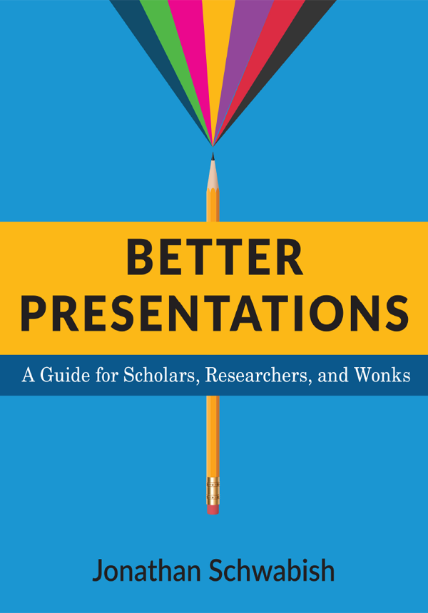
BETTER PRESENTATIONS
Columbia University Press
Publishers Since 1893
New York Chichester, West Sussex
cup.columbia.edu
Copyright 2017 Columbia University Press
All rights reserved
E-ISBN 978-0-231-54279-1
Library of Congress Cataloging-in-Publication Data
Names: Schwabish, Jonathan A., author.
Title: Better presentations : a guide for scholars, researchers, and wonks / Jonathan Schwabish.
Description: New York City : Columbia University Press, 2017. | Includes bibliographical references.
Identifiers: LCCN 2016008168| ISBN 9780231175203 (cloth : alk. paper) | ISBN 9780231175210 (pbk.: alk. paper) | ISBN 9780231542791 (ebook)
Subjects: LCSH: Business presentations.
Classification: LCC HF5718.22 .S349 2016 | DDC 658.4/52dc23
LC record available at https://lccn.loc.gov/2016008168
A Columbia University Press E-book.
CUP would be pleased to hear about your reading experience with this e-book at .
Cover design: Noah Arlow
For Lauren, Ellie, and Jack, my sources of infinite inspiration and happiness.
CONTENTS
A book on presentations can only be written if youve given lots of presentations, even bad presentations. And the book can only get better if youve seen lots of presentations, especially good presentations. So Im thankful for all the people who have watched me present and those who have allowed me to watch them present. Im especially grateful to those who have provided their feedback and support on my presentations and writing.
First, I thank my publisher at Columbia University Press. This book would not have come together if not for my editor, Bridget Flannery-McCoy, who with patience, focus, and thoughtfulness, taught me how to write for my audience.
Special thanks are due to Robert Haveman and Tim Smeeding, who have been trusted advisors and mentors throughout my entire career.
Im indebted to the many people who have supported my research and interest in research communication: Greg Acs, Molly Dahl, Doug Elmendorf, Joyce Manchester, Charles Pineles-Mark, John Sabelhaus, Michael Simpson, Tim Smeeding, Julie Topoleski, and others at the Congressional Budget Office, Urban Institute, and other firms and clients with whom I have worked.
I am also thankful to friends in the data visualization and presentation fields who have provided useful feedback, advice, and expertise: Alberto Cairo, Isaac Castillo, Stephanie Evergreen, Steven Franconeri, Tony Fujs, Nolan Haims, Cole Nussbaumer Knaflic, Robert Kosara, Tim Meko, David Paradi, Severino Ribecca, Robert Simmon, Echo Swinford, and Julie Terberg. Im also grateful to the readers of my blog, PolicyViz, and the various followers and friends on social media and other platforms, whom I all hope to meet in real life one day.
Finally, I could not have maintained the energy and focus this book required without the support of friends and family. My kids, Ellie and Jack, have been sources of inspiration and happiness.
And my deepest thanks to my wife, Lauren, who has edited more than her fair share of chapters, blog posts, and articles. Her love, support, guidance, and intelligence made this book possible.
W hether youre a university professor, a researcher at a think tank, a graduate student, or an analyst at a private firm, chances are you follow three general steps when you approach new projects:
PHASE 1. You have a question. You read the literature and collect and analyze some data. Then you spend days, weeks, or months drafting a brief, a journal article, a background or white paper, or a book. You solicit feedback from colleagues and gauge interest from publishers. You revise, revise, revise, and then you submit your document. Its accepted, and finally published.
PHASE 2. As people read the published work, invitations start coming in to speak at various agencies, schools, organizations, and conferences. You start to prepare your presentation by creating slides. You turn some text from your paper into a few bullet points. You copy Figure 1 and paste it in. Add Figure 2 and Tables 1, 2, and 3. Add some more bullet points. Add a slide titled Previous Literature with your entire reference list. Add a Questions? or Thank You! slide at the end. Youre done! It only took you a couple of hours and youre ready to take it on the road.
PHASE 3. You stand in front of an audience of 10, 50, 300, or maybe 5,000 people. Many have not read your paper and some may be unfamiliar with the topic. This is your opportunity to convince them of your hypothesis, data, and message. It is an occasion for fostering future relationships, research collaborations, or even funding sources. It may even be a chance for you to convince decision makers or policymakers to implement your ideas. Yet you have only spent a short amount of time thinking about how to effectively present your conclusions, and how to convince your audience that your research, methods, or proposal are worth adopting.
This book is about rethinking Phases 2 and 3 of this process. The work doesnt stop once your paper is published. Giving a presentation is your opportunity to sell your results. By sell I mean, bring people to your side. Get them to agree with your conclusions, convince them of your methodology or data, and teach them something they can use in their own work or act upon in their own jobs and lives.
When your reader sits down with your paper, she has access to the notes, footnotes, and other relevant details. She can decipher the labels on your charts, and even perhaps work through your equations. When you give a presentation, however, your audience does not have the same opportunity. They are restrained by your pace and choice of content. If your slides are filled with text and bullet points, equations, and complex detailed graphs, your audience might strain to follow you and have difficulty understanding your message. In this case, you are not designing the presentation for your audience; you are designing the presentation for yourself.
Keep this mantra in mind: Presenting is a fundamentally different form of communication than writing. Treating your presentation and your paper identicallymoving text into bullets, and copying and pasting tables and figures from the paper to the slidesmisses this important distinction, and sets your audience up for death by PowerPoint. Its clear this approach doesnt work: In his annual online survey, author David Paradi consistently finds that the top three things hated by audiences are when (1) the speaker reads the slides, (2) the slides contain full sentences, and (3) the text is too small. We can all relate to the experience of half-listening to a speaker drone on with slides full of text, recounting each bullet point in detail. Yet many researchers, analysts, scientists, and scholars do this in every presentation. Even if you dont have aspirations of a world speaking tour, giving better presentations will help your colleagues, partners, and funders better understand and, hopefully, act upon your work.


