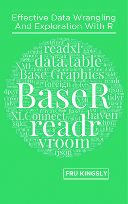
Kingsly - Effective Data Visualization with R: Volume I - Base Graphics
Here you can read online Kingsly - Effective Data Visualization with R: Volume I - Base Graphics full text of the book (entire story) in english for free. Download pdf and epub, get meaning, cover and reviews about this ebook. year: 2021, genre: Home and family. Description of the work, (preface) as well as reviews are available. Best literature library LitArk.com created for fans of good reading and offers a wide selection of genres:
Romance novel
Science fiction
Adventure
Detective
Science
History
Home and family
Prose
Art
Politics
Computer
Non-fiction
Religion
Business
Children
Humor
Choose a favorite category and find really read worthwhile books. Enjoy immersion in the world of imagination, feel the emotions of the characters or learn something new for yourself, make an fascinating discovery.

- Book:Effective Data Visualization with R: Volume I - Base Graphics
- Author:
- Genre:
- Year:2021
- Rating:5 / 5
- Favourites:Add to favourites
- Your mark:
- 100
- 1
- 2
- 3
- 4
- 5
Effective Data Visualization with R: Volume I - Base Graphics: summary, description and annotation
We offer to read an annotation, description, summary or preface (depends on what the author of the book "Effective Data Visualization with R: Volume I - Base Graphics" wrote himself). If you haven't found the necessary information about the book — write in the comments, we will try to find it.
Kingsly: author's other books
Who wrote Effective Data Visualization with R: Volume I - Base Graphics? Find out the surname, the name of the author of the book and a list of all author's works by series.
Effective Data Visualization with R: Volume I - Base Graphics — read online for free the complete book (whole text) full work
Below is the text of the book, divided by pages. System saving the place of the last page read, allows you to conveniently read the book "Effective Data Visualization with R: Volume I - Base Graphics" online for free, without having to search again every time where you left off. Put a bookmark, and you can go to the page where you finished reading at any time.
Font size:
Interval:
Bookmark:
FRU Kingsly
2021-07-15
by FRU Kingsly
Copyright 2021 FRU Kingsly. All rights reserved.
This book or any portion thereof may not be reproduced or used in any manner whatsoever without the express written permission of the publisher except for the use of brief quotations in a book review.
If there is one thing R is famous and known about, is its graphics capabilities. There are many packages out there for producing plots in R, top amongst which is the base graphics package which comes with R preinstalled.
The goal of this book is to explore the nooks and crannies of chart production with base graphics and is the first in a series of books on data visualization with R.
FRU Kingsly is a seasoned Business Intelligence developer, with more than ten years in the field of data management and analysis. He has worked with various applications and software including R, Python, Power BI, Tableau, MS SQL Server, MS Excel, MySQL etc. He is passionate about data and analytics and always encourages others around him to take the data analysis route. You can contact him at frukingsly@live.com .
This book is for anybody interested in understanding and applying data visualization with R.
This book is divided into four parts which are:
- Part1: Introduces you to data visualization in general and R in particular (Chapter 1)
- Part2: Introduces you to plotting with base graphics and plot elements (Chapter 2 and 3)
- Part3: Producing different chart types (Chapter 4 to 10)
- Part4: Map visualization with the maps package (Chapter 11 to 13)
Introduction to data visualization
Introduction to plotting with base graphics
Plot elements
One discrete variable charts
One continuous variable charts
Two discrete variables charts
One discrete and one continuous variable charts
Two continuous variables charts
Three variables charts
More than Three variables charts
Base maps with maps
Qualitative Maps
Quantitative maps
I dedicate this book to my late father, Mr. Joseph Anguh Gariwa .
In this chapter, we shall be looking at the following:
- the meaning and importance of data visualization
- static versus interactive data visualization
- exploratory versus explanatory data visualization
- various chart types and their classification
- plot attributes and elements
- R packages for data viz
Data visualization is to analytics what marketing is to businesses. It does not matter how good a businesss product is, if customers do not know it, the business is going to fail. The same can be said for analytics as it does not matter how good our analysis is, if we cannot adequately communicate and report the results to decision-makers, all the analysis will likely be, is a waste of time and resources. Analytics involves the conversion of data into insights and adequately communicating those insights to the appropriate stakeholders at the right time for the right decision to be taken so that the businesss or institutions results can be improved upon. Data visualization is one of the most important tools in communicating that insight and therefore is a must-have tool in the arsenal of any serious data analyst, data scientist, Business intelligence professional or data professional in general.
Data visualization is simply the visual display of data or information (insights) gather from data to ease the understanding of a given phenomenon or situation. It is often said that a picture is worth a thousand words meaning rather than using words to explain something, it is easier and better to use a picture or a visual. Below are some definitions of data visualization given to us by some major analytics and IT consulting firms.
SAS which is a major developer of analytics applications defines data visualization as:
Data visualization is the presentation of data in a pictorial or graphical format. It enables decision-makers to see analytics presented visually, so they can grasp difficult concepts or identify new patterns. With interactive visualization, you can take the concept a step further by using technology to drill down into charts and graphs for more detail, interactively changing what data you see and how its processed.
Tableau which is and has been the leader of data visualization and data discovery for the past decade defines data visualization as:
Data visualization is the graphical representation of information and data. By using visual elements like charts, graphs, and maps, data visualization tools provide an accessible way to see and understand trends, outliers, and patterns in data.
Gartner which is a major IT service consulting firm defines data visualization as:
Data visualization is a way to represent information graphically, highlighting patterns and trends in data and helping the reader to achieve quick insights. Also known as interactive visual exploration, it enables the exploration of data via the manipulation of chart images, with the colour, brightness, size, shape, and motion of visual objects representing aspects of the dataset being analysed. It includes an array of visualization options that go beyond those of pie, bar, and line charts, including heat and tree maps, geographic maps, scatter plots, and other special-purpose visuals. These tools enable users to analyse the data by interacting directly with a visual representation of it."
Data visualization allows us to identify patterns, clusters, and trends over time in data. It enables us to answer questions such as:
- Who brought in the most amount of sales?
- What was our best or worst performing products?
- What is our sales forecast for the next year?
- Where are our sales coming from or where can we cut cost?
- When are our sales highest during the year?
- Why are sales falling or cost rising?
- How did price reduction affect sales?
Also, it enables us to explore data to identify missing values, outliers and errors and clean them and present results.
There are two main types of data visualization which are static and interactive. Static data visualization are visuals which do not change once they have been produced and are ideal for print reports and dashboards and web post. While interactive data visualizations are visuals which allow the user to change inputs and get different outputs and are ideal for dashboards displayed on a computer screen or a phone or a tablet. Interactive data visualization allows users to hover, filter data, drill down, drill through, highlight data points and zoom amongst others.
There are two main categories of data visualization which are exploratory and explanatory. Exploratory data visualization is aimed at exploring data to discover new patterns or insights while with explanatory data visualization, we know what patterns and insights are found within the data and just want to communicate it. The former is conducted before our analysis and is used to develop new hypotheses while the latter is conducted after our analysis and is aimed at communicating our findings. Exploration is done for one person: us and is done quickly and involves many iterations of different chart types and does not need to be clean or presentable. While explanatory is done for stakeholders other than us, therefore we must understand them, their needs, and data skills level so that we can develop charts that they can interpret and understand.
Font size:
Interval:
Bookmark:
Similar books «Effective Data Visualization with R: Volume I - Base Graphics»
Look at similar books to Effective Data Visualization with R: Volume I - Base Graphics. We have selected literature similar in name and meaning in the hope of providing readers with more options to find new, interesting, not yet read works.
Discussion, reviews of the book Effective Data Visualization with R: Volume I - Base Graphics and just readers' own opinions. Leave your comments, write what you think about the work, its meaning or the main characters. Specify what exactly you liked and what you didn't like, and why you think so.

