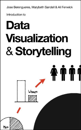
Jose Berengueres - Introduction to Data Visualization & Storytelling: A Guide For The Data Scientist
Here you can read online Jose Berengueres - Introduction to Data Visualization & Storytelling: A Guide For The Data Scientist full text of the book (entire story) in english for free. Download pdf and epub, get meaning, cover and reviews about this ebook. year: 2019, publisher: Stokes-Hamilton, genre: Romance novel. Description of the work, (preface) as well as reviews are available. Best literature library LitArk.com created for fans of good reading and offers a wide selection of genres:
Romance novel
Science fiction
Adventure
Detective
Science
History
Home and family
Prose
Art
Politics
Computer
Non-fiction
Religion
Business
Children
Humor
Choose a favorite category and find really read worthwhile books. Enjoy immersion in the world of imagination, feel the emotions of the characters or learn something new for yourself, make an fascinating discovery.

- Book:Introduction to Data Visualization & Storytelling: A Guide For The Data Scientist
- Author:
- Publisher:Stokes-Hamilton
- Genre:
- Year:2019
- Rating:5 / 5
- Favourites:Add to favourites
- Your mark:
Introduction to Data Visualization & Storytelling: A Guide For The Data Scientist: summary, description and annotation
We offer to read an annotation, description, summary or preface (depends on what the author of the book "Introduction to Data Visualization & Storytelling: A Guide For The Data Scientist" wrote himself). If you haven't found the necessary information about the book — write in the comments, we will try to find it.
Jose Berengueres: author's other books
Who wrote Introduction to Data Visualization & Storytelling: A Guide For The Data Scientist? Find out the surname, the name of the author of the book and a list of all author's works by series.

![Thomas Mailund [Thomas Mailund] - Beginning Data Science in R: Data Analysis, Visualization, and Modelling for the Data Scientist](/uploads/posts/book/119629/thumbs/thomas-mailund-thomas-mailund-beginning-data.jpg)
Introduction to Data Visualization & Storytelling: A Guide For The Data Scientist — read online for free the complete book (whole text) full work
Below is the text of the book, divided by pages. System saving the place of the last page read, allows you to conveniently read the book "Introduction to Data Visualization & Storytelling: A Guide For The Data Scientist" online for free, without having to search again every time where you left off. Put a bookmark, and you can go to the page where you finished reading at any time.
Font size:
Interval:
Bookmark:
Introduction to Data Visualization & Storytelling
A Guide For The Data Scientist
Jose Berengueres
with
Marybeth Sandell &
Ali Fenwick
nd Edition
Type setting by SNASK
Text Copyright Jose Berengueres
Where otherwise stated, artworks,
cover & drawings by Jose Berengueres
TOC
It was May 2018 when I received an email from Kaggle.com , a data science community where people all over the world compete in data modelling challenges. Every year since 2017, Kaggle has surveyed its users and this year they decided to organize a storytelling competition and offer cash prizes for the best survey visualization. I was curious to see what people had submitted so far and sifted through the entries. I was impressed at how much time and effort had been put into analyzing the data. Some charts required laborious data wrangling, others crafty SQL inner joins, and some Python sorcery. And yet, the charts were not doing justice to the compelling findings and the stories that could be told. No doubt, some were creative, extensive in length, exhaustive in the exploration. However, there were also many unimpressive charts. Why was so much IQ not producing more enticing visualizations?
80% of the data scientists graduating today will do so without having received any formal education on storytelling , and 60% of them place data visualization at the bottom of their priority list of skills to have. In addition, the fact that most data science is taught at STEM schools, not Art schools, does not help either. (Really, STEM schools should aspire to be STEAM schools, to include Art). In order to improve the quality of data visualization, there must be a change in how data scientists are trained along with a mind shift regarding the imperative of good story telling. However, to make effective visualizations, art sensibility is not all that is needed.
A second cause, is that the gallery of default chart styles of Microsoft Excel is unlikely to match what is required to tell the story .
A third cause, is that to produce a meaningful visualization we need to know why we are visualizing. To get to the why, its important to explore the story that needs to be told and be able to make it relevant.
To succeed at transforming data into a compelling and relevant story, it helps to connect the data to a context, metaphor or mental framework (frameworks from Economics, Art, and Sociology are particularly useful). In order to make these connections, a cross-functional education is necessary. Unfortunately, this is not the norm resulting in loads of very interesting data failing to become useful knowledge. To address this, in the following pages you will find a set of principles by example that I wish I had learned in grad school.

Happy visualizations!
Jose Berengueres
Stockholm, Oct 25th 2019
How to use this book
- Identify the role of a narrative in a chart
- Transform data into information
- Synthesize knowledge
- Apply visual thinking tools to the decision-making process
- Select visual communication techniques to persuade
This edition adds two new chapters, one on bias by Marybeth Sandell and one on Psychology by Ali Fenwick. Whether you are using this book as course material for a data visualization course, in journalism, or in a data science minor; this is a solid foundation before getting hands on with Tableau, Excel or Python Pandas. We have also upgraded all the images to 600 DPI.
There are several exercises in this book so it is helpful to have paper and black fiber tip pen 0.5-0.7mm such as Pilot EF or a Pilot Sign Pen available.
This book was born out of workshop full color slides that you can use in the classroom. To get them send an email to with subject DATAVIZ101 and link to your verified purchase review on Amazon.
Chapter 1 . Stories, Data & Narratives
Finding the purpose of the chart
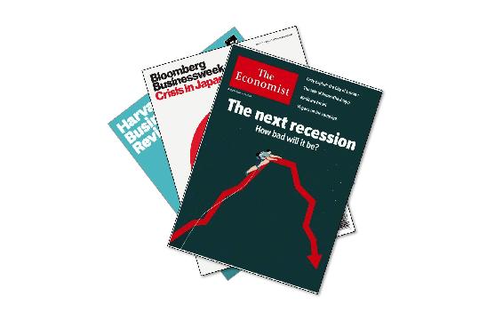
Fig 1 These three magazines publish some of the most influential charts in the newsstand. None of them is made with Excel .
Before visualizing, there is data. However, before working with data it is important to understand what knowledge is. What is knowledge to you? In this chapter, you will learn three things; (i) the difference between: data, information and knowledge; (ii) What wisdom is; and (iii) What the process to produce knowledge is.
What is data to you? We always open data visualization workshops with this exercise.
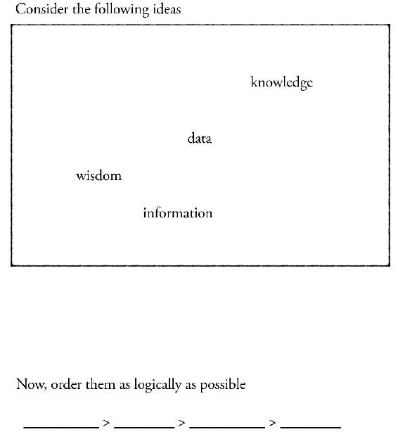
Fig 2 An exercise to understand what data is by relating it to knowledge.
Data has many definitions. However, to understand, theres nothing like doing an exercise. There are various ways to learn something. By listening, by talking about it, by reading about it and, by doing it. Of those four, doing has the highest recall rate. Can you order the four words (data knowledge information wisdom)? Most students will come up with the following ordering:
data > information > knowledge > wisdom
Once the order of the words has been agreed, we can discuss the ordering criteria. Why did we order them the way we did? This is a great conversation starter. To ground the conversation, it further helps to list the attributes of the words at the extremes. What are the attributes that distinguish data vs. wisdom?
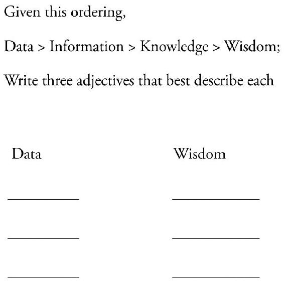
Fig 3 An exercise used to understand the arrow of value between data and wisdom .
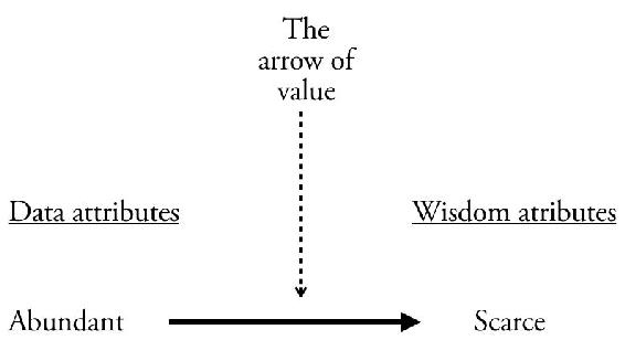
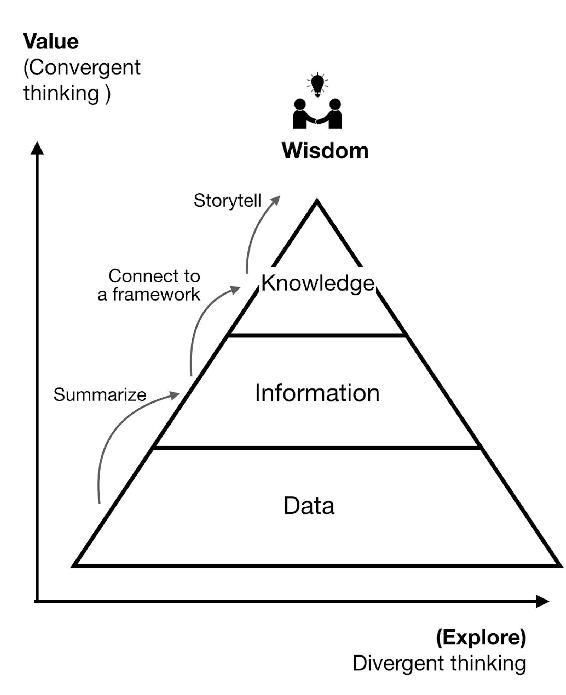
Fig 4 The arrow of value.
Data is many while wisdom is usually characterized by few . Data is abundant, wisdom is scarce. Value is closely correlated with scarcity too. This exercise is great to clarify the pervasive confusion between data, information, knowledge and its relationship to value, scarcity and wisdom.
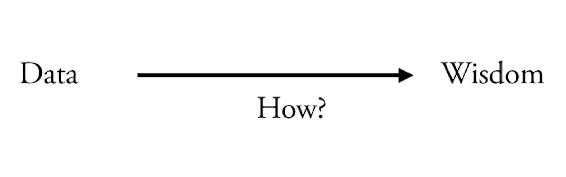
Fig 5 This arrow represents a process.
Jackie Chan says in one of his films, information is not knowledge, and knowledge is not wisdom. But what is wisdom? Is wisdom just knowledge in context? Is wisdom meta knowledge? knowledge about knowledge? And more importantly, knowing in which situation to apply a given knowledge? Even if the definition is not universal, what we are more interested in here is how to transform knowledge into wisdom. Why? Because it is a high added value activity and one of the reasons (if not the only reason) why companies employ data scientists. One way to arrive at wisdom is the Synthesis process the dialectic combination of thesis and antithesis into a higher truth.
Font size:
Interval:
Bookmark:
Similar books «Introduction to Data Visualization & Storytelling: A Guide For The Data Scientist»
Look at similar books to Introduction to Data Visualization & Storytelling: A Guide For The Data Scientist. We have selected literature similar in name and meaning in the hope of providing readers with more options to find new, interesting, not yet read works.
Discussion, reviews of the book Introduction to Data Visualization & Storytelling: A Guide For The Data Scientist and just readers' own opinions. Leave your comments, write what you think about the work, its meaning or the main characters. Specify what exactly you liked and what you didn't like, and why you think so.