Thomas Giannattasio - Mastering Photoshop for Web Design (Smashing Magazine)
Here you can read online Thomas Giannattasio - Mastering Photoshop for Web Design (Smashing Magazine) full text of the book (entire story) in english for free. Download pdf and epub, get meaning, cover and reviews about this ebook. year: 2010, genre: Computer. Description of the work, (preface) as well as reviews are available. Best literature library LitArk.com created for fans of good reading and offers a wide selection of genres:
Romance novel
Science fiction
Adventure
Detective
Science
History
Home and family
Prose
Art
Politics
Computer
Non-fiction
Religion
Business
Children
Humor
Choose a favorite category and find really read worthwhile books. Enjoy immersion in the world of imagination, feel the emotions of the characters or learn something new for yourself, make an fascinating discovery.
- Book:Mastering Photoshop for Web Design (Smashing Magazine)
- Author:
- Genre:
- Year:2010
- Rating:5 / 5
- Favourites:Add to favourites
- Your mark:
- 100
- 1
- 2
- 3
- 4
- 5
Mastering Photoshop for Web Design (Smashing Magazine): summary, description and annotation
We offer to read an annotation, description, summary or preface (depends on what the author of the book "Mastering Photoshop for Web Design (Smashing Magazine)" wrote himself). If you haven't found the necessary information about the book — write in the comments, we will try to find it.
Mastering Photoshop for Web Design (Smashing Magazine) — read online for free the complete book (whole text) full work
Below is the text of the book, divided by pages. System saving the place of the last page read, allows you to conveniently read the book "Mastering Photoshop for Web Design (Smashing Magazine)" online for free, without having to search again every time where you left off. Put a bookmark, and you can go to the page where you finished reading at any time.
Font size:
Interval:
Bookmark:

Introduction
This book was written in the hope of filling a gap a gap that has existed for as long as designers have been using Photoshop for Web design; a gap that we so often fill with tutorials focused on the latest trends and on inspiration galleries that are quickly browsed and forgotten; a gap that is growing as quickly as our technologies. Its a gap of foundation.
The fast pace of the Internet has focused us on the latest and greatest techniques, which typically have a lifespan of only a few months. Rarely do we focus on the fundamentals, the principles that outlive the trends. Unfortunately, the principles are often less appealing than the shiny and new. Photoshop tutorials offer quick results. They hold our hands step by step until something incredible appears, but they rarely go in depth to explain the principles that enable us to create something unique and incredible of our own.
Mastering the fundamentals of our tools opens our minds and unlocks our inherent creativity. It helps us recognize the difference between timeless and trendy. It increases our efficiency and ultimately makes us and our work more valuable.
My hope is that this book helps you gain a deeper understanding of Photoshop. If youre a beginner, I hope it gives you the comprehension you need to bring your ideas to life. If youre a veteran, I hope it unveils some of the mysteries that have always boggled you. Ultimately, though, I hope this book increases your appreciation of the fundamentals and the subtleties that make Photoshop such a powerful tool.
About the Author
Thomas Giannattasio is an interactive designer who resides in the Washington DC metro area. He specializes in Web design and front-end development, particularly art direction, website design and application design, and has 14 years of experience. Thomas cares strongly about typography, simplicity and user experience. Currently he works as a senior designer for a global marketing firm and freelances under the name attasi .

Dedicated to my relentlessly supportive wife, Maggie, without whom this book would not be possible. Thanks for putting up with me!
Tom
Imprint
Published in July 2010
Smashing Media GmbH, Freiburg, Germany
Book Cover Design: Andrea Austoni
Proofreading: Andrew Lobo
Layout: Jessica Bordeau, Vitaly Friedman
Concept & Editing: Sven Lennartz, Vitaly Friedman
Chapter 1, Color Management
Maintaining a consistent appearance on the Web is difficult because you never know the end users environment. They may be viewing a website on their home computer or on a mobile device. They could be on a Windows platform or running a Mac. Even within these parameters, a multitude of other variables affect how their monitor is calibrated. All of these factors amount to an unremediable loss of control over the final output. Colors can appear lighter or darker, more or less saturated, cooler or warmer, or just plain wrong depending on the users environment. This can be quite a problem, especially with a clients brand-specific colors As Web designers, our responsibility is to ensure that the experiences we craft are as true to the original as possible. To do this, you need to manage and align every step of the design process with how the majority of users will be viewing your work. This requires a complex and equally confusing system of color management. While it doesnt completely solve the problem of color shifting, it makes it far less severe and ensures the maximum preservation of colors across a majority of devices.
Calibrating the Display
Gaining control of your color output starts by controlling your input (i.e. your monitor). A properly calibrated monitor is crucial : it lays the foundation for a properly managed workflow. Calibrating your monitor can be done with software, but it is better left to a colorimeter. Purchasing a colorimeter is a good idea if youre concern ed about accuracy. A number of companies sell affordable solutions : Monaco Optix, LaCie blue eye, basICColor displaySQUID, etc. Whether you us e hardware or software to calibrate your monitor, let your monitor warm up for about half an hour. A lso ensure that the lighting in the room is soft and evenly distributed and that no light shin es directly on the monitor.
Because our work will be displayed on both Macs and Windows machines, our gamma and white point should be set to the most common settings. Gamma is basically a value that represents the relationship between luminance values of the monitor. The higher the number, the darker the display appears. Windows machines run a gamma of 2.2, while Macs run 1.8 although, Snow Leopard now defaults to 2.2. A gamma of 2.2 is the most common setting of W eb users , and for th is reason your monitor should be set to match. The most common white point is D65, and youre best off following suit.

The LaCie blue eye colorimeter ( http://bit.ly/cHphAV )
ICC Profiles
Managing color across the ever - increasing spectrum of devices would be impossible without a universal standard. The International Color Consortium (ICC) has provided just that. By specifying vendor-neutral color specifications, the ICC has created the ability for devices to interpret and display color as intended. In order for the ICC specification to work, both devices and files need to have profiles attached to them. An image files ICC profile essentially tells the device how to interpret its color data , and the devices profile tells the system how to display that color data.

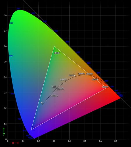
The sRGB color gamut. (http://bit.ly/aYuSGV)
Because the standard red, green and blue profile (or sRGB IEC 61966 - 2.1) representsa wide range of colors that can be replicated across a majority of devices, it has been adopted by the I nternet world as its standard.
Therefore, you should create all of your work in this profile to maintain maximum consistency. For more information, see Color Settings on page.
Setting Up Photoshop
After you have calibrated your monitor , the next thing to manage is Photoshop. This is where things become slightly more complicated. You have two goals f o r color management in Photoshop. The first is to avoid color shifting when your file is exported and displayed in a W eb browser. The second is to save the color data in the file so that it can be used and viewed consistently across different platforms.
Color Management Module (CMM)
Photoshop works with a Color Management Module (CMM), which is used to convert colors between ICC profiles. At the core of the module is the Profile Connection Space (PCS). This is the engine that processes a files raw data along with its ICC profile and tells the target device how to display it based on its profile.
U nderstand ing this process is important, because the colors you see in Photoshop are not necessarily the actual colors of the file. For example, if your working space is set to sRGB (more on this in the next section), and you examine a brownish color (let s say 161, 121, 69 ) using the Macs DigitalColor Meter, youll notice that the display is actually outputting 140, 103, 56. Thats quite a shift, especially in the blue channel. This is because the document is telling the PCS that the file should be converted first to the sRGB profile and then converted to the monitors profile.
Next pageFont size:
Interval:
Bookmark:
Similar books «Mastering Photoshop for Web Design (Smashing Magazine)»
Look at similar books to Mastering Photoshop for Web Design (Smashing Magazine). We have selected literature similar in name and meaning in the hope of providing readers with more options to find new, interesting, not yet read works.
Discussion, reviews of the book Mastering Photoshop for Web Design (Smashing Magazine) and just readers' own opinions. Leave your comments, write what you think about the work, its meaning or the main characters. Specify what exactly you liked and what you didn't like, and why you think so.


