PUBLISHER: Amy Marson CREATIVE DIRECTOR: Gailen Runge ART DIRECTOR: Kristy Zacharias EDITORS: Liz Aneloski and Lee Jonsson TECHNICAL EDITORS: Julie Waldman and Ann Haley COVER/BOOK DESIGNER: April Mostek PRODUCTION COORDINATORS: Rue Flaherty and Freesia Pearson Blizard PRODUCTION EDITOR: Katie Van Amburg ILLUSTRATORS: Wendy Mathson and Rebecca Bryan PHOTO ASSISTANT: Mary Peyton Peppo STYLE PHOTOGRAPHY by Nissa Brehmer; INSTRUCTIONAL PHOTOGRAPHY by Diane Pedersen, unless otherwise noted DEDICATION To my God for giving me the dream and the faith to see it through. To my mother for teaching me how. To my husband for encouraging me. To my children for the future. And to my Savior for redeeming me. Many waters cannot quench love.
Song of Solomon 8:7 ACKNOWLEDGMENTS Thank you to my family and friends for your love and encouragement, support, and prayers.
Your prayers mean so much to me. Thank you! Thank you to the staff at C&T for this opportunity and for working with me along this journey. Thank you to my quilty friends, near and far, who show tremendous versatility and creativity every day! You guys are amazing and so inspiring. Thank you to Angela Walters for (beautifully!) quilting some of my quilts. Thank you to the Warm Company, which provided the Warm & White batting; Aurifil, which provided thread; and Robert Kaufman Fabrics for providing the fabric for the solid rainbow swatches. And lastly, thank you for reading my book.
PREFACE Quilting with rainbow colors combines two things I love dearly: sewing and color. I am fortunate to have grown up in a family heavily endowed with creative spirits. My grandfather built a sturdy boathouse. My stepfather tinkers. My father created a bountiful garden. One day my dad even surprised me by painting a mean landscape.
The women of the family, my great-grandmothers and grandmothers, were quilters. My mother taught me the art of sewing and quilting as I grew. But I didnt become serious about sewing until after I was married. It was then I discovered vibrant, modern-colored fabrics. It was the colors that inspired me to refine my sewing skills and to design and make quilts. I love laying out fabrics, rearranging them until the colors almost shine.
And I love anything arranged in color order. Rainbows themselves are great, but office supplies in color order? Swoon. Books arranged in color order? Swoon. Fabric in color order? Double swoon! Perhaps my love of rainbows started with the popular 80s doll Rainbow Brite. My favorite kindergarten friend gave me a Rainbow Brite doll for my sixth birthday. I remember how her rainbow-colored sleeves shone in sunny, sparkly goodness.
It was a good day. Even now, I can hardly resist anything thats in color order. Surely I cant be the only one who ogles merchandise arranged by color. Be it colored pencils, bowls, paint chips, scarves, or fabric, if it is arranged by color, it might just wind up in my shopping cart. I think its a marketing trick. I am tremendously inspired by the colors of the rainbow.
They hold such possibility. The start of a new school year, the start of a closet, organized. A new drawing or a new quilt waits beyond those colored pencils and fabric. Colors in rainbow order awaken a sense of creativity for me, and I hope I can share this love with you. INTRODUCTION After covering some color basics, I will show you different ways to manipulate the spectrum. My hope is that you find some ideas that develop your natural sense of color and help you create your own unique spectrum.
Classic rainbow colors are great, but I wanted to create spectrums that challenge the rainbow clich. As fashion and design and culture change from year to year, so do the popular colors. New colors can breathe life into a tired rainbow. I designed the quilts included in this book to showcase a spectrum of color. I wanted to make quilts that were easy but also challenging in terms of both skill and design. I love many types of quilting styles, so the patterns are divided into these categories: modern traditional, modern, and improvisational and liberated.
Each of these categories has its own approach to quiltmaking. Be sure to read each sections introduction for special tips. I have invested much work to ensure the accuracy of the patterns, but its always a great idea to read the entire pattern before beginning and, where applicable, make a test block. And one last note: as much as I love colors in color order, I actually just love color. So yes, these quilts would look great in other color stories, too! Enjoy!  USING THE SPECTRUM IN QUILTS This chapter will cover some basics of color theory and show ways to manipulate colors to create a unique rainbow color story. DEFINING THE SPECTRUM We have all seen the spectrum.
Maybe in a rainbow arcing the sky? Perhaps you studied the spectrum in school, in science or art classes. Isnt it interesting that these diverse subjects can cover the same topic? Primary, Secondary, and Tertiary Colors Simply put, the rainbow consists of ordered colors. There are many ways to visualize the rainbow, but typically in sewing and quilting, we refer to a color wheel. Looking at the color wheel, we see that the primary colorsblue, red, and yellowwhen combined, form the secondary colorspurple (red + blue), orange (red + yellow), and green (yellow + blue). Tertiary colorsblue-purple, red-purple, red-orange, yellow-orange, yellow-green, and blue-greenare created when a primary and secondary color blend or when two secondary colors blend. Sprinkled throughout this book, you will find different rainbow color stories.
There are classic rainbows and variations. I hope you can find some color inspiration there as well. Have fun! 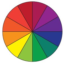 Color wheel
 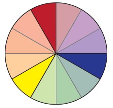 Primary colors
 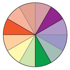 Secondary colors
 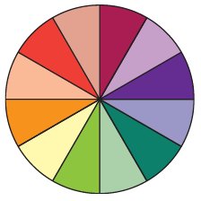 Tertiary colors Warm and Cool The rainbow is composed of warm and cool colors. Warm colors include the energetic side of the color wheel: red, orange, yellow, and their variations. Think red lipstick and red shoes, vibrant fall leaves and fresh-squeezed orange juice, warm sunshine, and a crackling fire. Warm colors seem as though they are coming toward the viewer.
Cool colors include the more subdued colors: green, blue, purple, and their variations. Think purple tulips or a tropical beach, an iceberg or crisp blue sky, green apples or lush green grass. Cool colors seem to recede from the viewer. Color DefinedA hue is a color.A tint occurs when white is added to a color. Pastels are tints.When black is added to a color, it produces a shade.A tone results when gray is added to a color.Chroma is the purity of a color. A color in its purest form, without black, white, or gray, possesses a high chroma.Volume refers to how saturated in color a fabric is.
A high-volume fabric is saturated with color and a low-volume fabric is very light. WORKING WITH DIFFERENT TYPES of Fabrics Identifying a fabrics color is essential if we are to arrange fabrics in color order. Lets consider hue to be the fabrics core color and the twelve colors in the as the twelve basic hues. We might consider the fabric shop to be our crayon box and the fabrics, our crayons. Fortunately, there is a plethora of fabric out there for us! In a well-rounded fabric stash, its good to have many choices within each of the twelve basic colors. Having many fabrics will give you more choices in color, tint, tone, or saturation as you choose fabrics for a rainbow quilt. Solid-Color Fabrics Solids are an easy basic.
Next page

 USING THE SPECTRUM IN QUILTS This chapter will cover some basics of color theory and show ways to manipulate colors to create a unique rainbow color story. DEFINING THE SPECTRUM We have all seen the spectrum.
 Color wheel
  Primary colors
  Secondary colors
  Tertiary colors Warm and Cool The rainbow is composed of warm and cool colors. Warm colors include the energetic side of the color wheel: red, orange, yellow, and their variations. Think red lipstick and red shoes, vibrant fall leaves and fresh-squeezed orange juice, warm sunshine, and a crackling fire. Warm colors seem as though they are coming toward the viewer.