CONTENTS
Guide
To discover the origin of the loft we must go back to New York in the 1950s, specifically the neighborhoods of Tribeca, SoHo, and Chelsea. In the postwar period, the US economy had undergone a transformation: goods were produced with less manpower and the number of workers in the service sector increased. In addition, large companies moved their production plants abroad, where labor was cheaper. As a result, many factories and warehouses were left empty. The need for large spaces and the high rents of apartments, together with the fact that the owners of industrial buildings were seeing their prices drop, made these unused spaces attractive to an unexpected market. Students and artists found cheap places to work and live.
These buildings lacked internal partitions. Steel structures mounted on large slabs made for spaces with generous heights. Furthermore, they were very bright, thanks to the light filtering through the huge windows of their stone faades. These were open spaces where you could grow and show all your creative activity to the full. Over time these spaces were adapted to other usesshops, art and photography galleries. Its fair to say that, half a century later, the loft has come, more than any other space, to symbolize a modern, cutting-edge lifestyle.
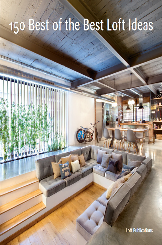
The essence of the loft is an open plan, featuring visual continuity, environments that flow into one another, and copious natural light. Unified materials and color palettes, along with an absence of doors and partitions, enhance the effect. Spatial division is often achieved with slopes and changes in color, texture, or lighting. A wide range of creative solutions has been developed to replace partitions: multifunctional furniture, plants, sliding panels, glass walls... The great ceiling height of many lofts encourages the construction of upper floors or mezzanines, which tends to separate shared areasliving room, dining room, kitchenfrom bedrooms, studies, or other rooms. The staircase linking multiple levels often becomes a decorative element in and of itself.
The prevailing philosophy is to refurbish the loft, optimizing it, while retaining as many original structural elements as practicable. Beamed roofs, vaulted ceilings, columns, and ancient brickwork are all refurbished, and the pipes and ducts of the original facilities are left in plain sight, giving each space its own personal seal and style. On the other hand, made-to-measure furniture pieces are designed which, as well as exhibiting contemporary and well-polished aesthetics, often perform several roles: space separator, cupboard, display unitthe comfort and functionality of the modern harmonizes with nostalgia for the old. Since its inception, loft style has defined itself as industrial, sober, and authenticsometimes even coldsince it divests itself of surplus elements and any artifice. Common practice has been to use unfinished materialscement, brick, iron, and steeland a neutral color palette, with white predominating. But the current loft boomincluding newly constructed buildings based on a nineteenth-century industrial aesthetichas moved far beyond the boho with warm and welcoming spaces that retain the light and the spatial continuity of the classic loft style.
This book presents a carefully chosen and diverse selection of projects from prestigious architects around the world who, while always bearing in mind their clients wishes, show us a series of compelling approaches to spatial design, both practical and innovative in the use of materials and light, attuned to modern and avant-garde lifestyles without neglecting aesthetic harmony and beauty. Integrated spaces, airy, light spaces in which to live and share, and, in many cases, work; in short, spaces adapted to the lives of those who inhabit them and impregnated, no doubt, with their personality. 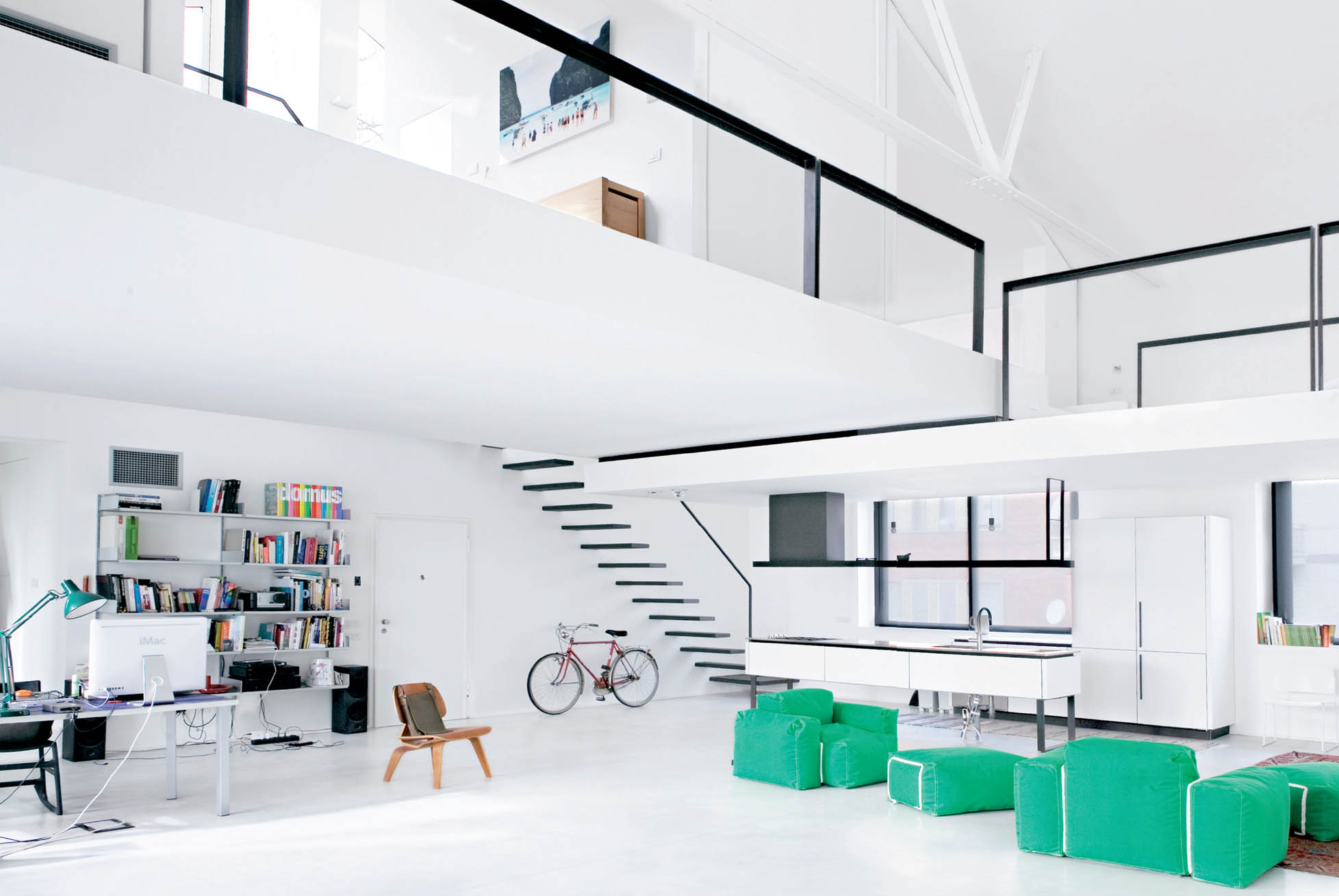 Roberto Murgia Milan, Italy Francesco Jodice
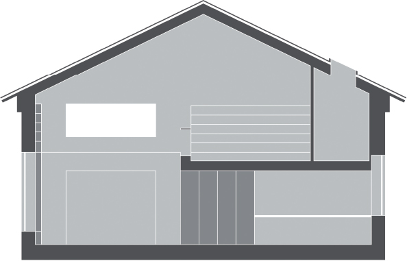
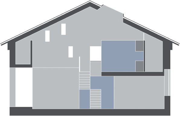
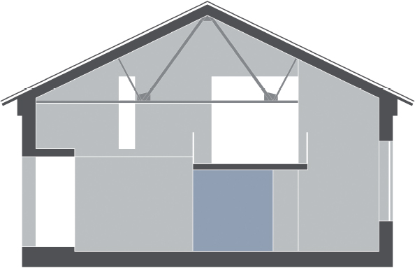
  Four friends bought part of the first floor of an old building housing the offices of the Domus Academy, the first postgraduate design school in Italy. The clients idea was clear: to create a space for living and working, both representative and intimate, public but private. The space was divided into four equal parts, of 1,076 square feet each, which, together with a height of nearly twenty-five feet allowed for the construction of two stories.
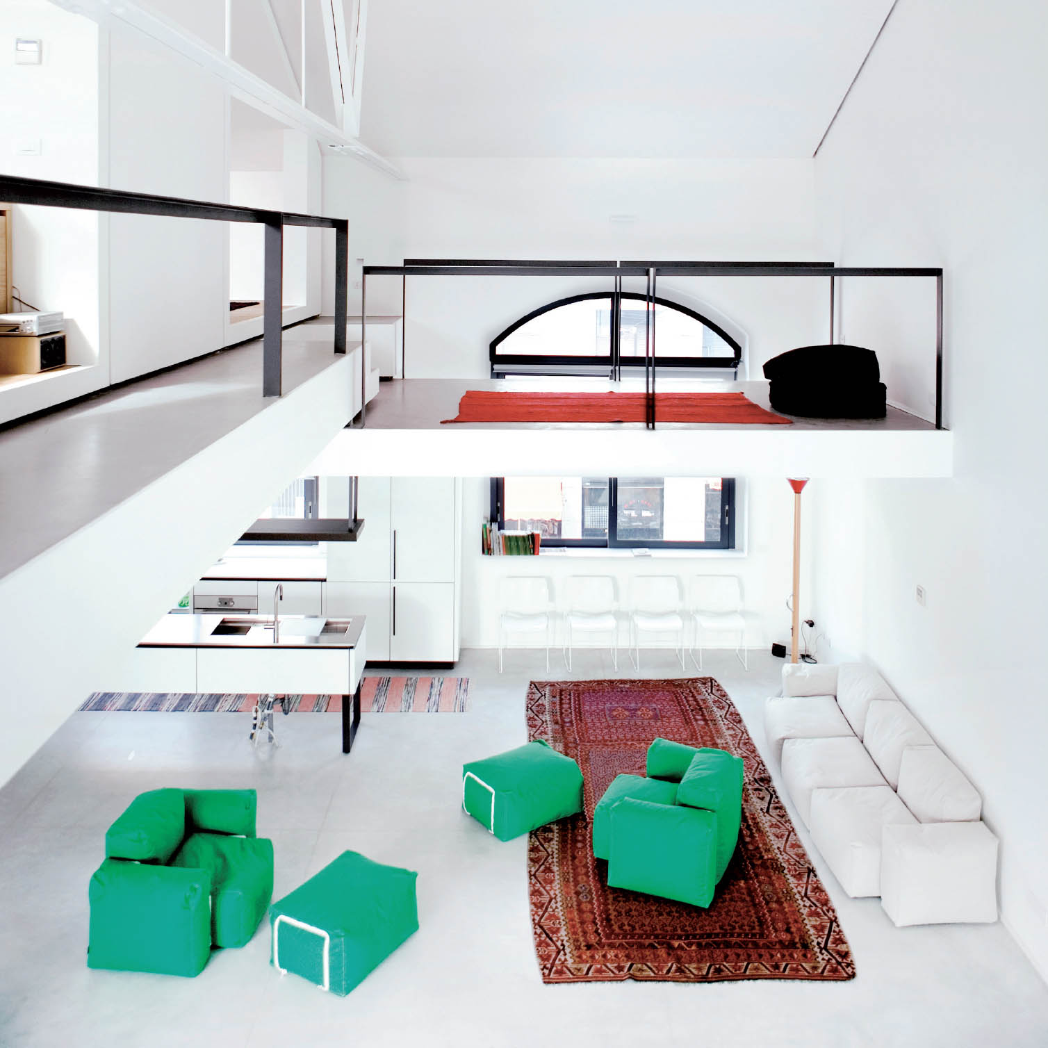
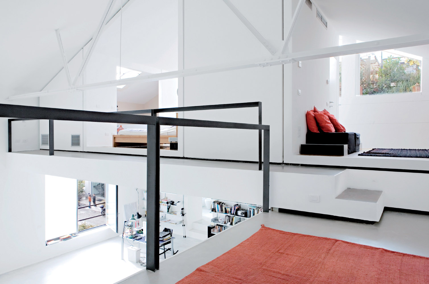
Carpets deliberately placed break with the uniform white, delimiting the spaces, at the same time dressing them up, providing a sense of warmth and thermal insulation.

Longitudinal section

Upper-floor plan

Lower-floor plan
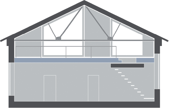
Cross section through loft 1
Cross section through loft 2
Cross section through loft 3
Cross section through loft 4
Live-work lofts make it affordable to have office space.

Longitudinal section

Upper-floor plan

Lower-floor plan

Cross section through loft 1

Cross section through loft 2

Cross section through loft 3






 Roberto Murgia Milan, Italy Francesco Jodice
  Four friends bought part of the first floor of an old building housing the offices of the Domus Academy, the first postgraduate design school in Italy. The clients idea was clear: to create a space for living and working, both representative and intimate, public but private. The space was divided into four equal parts, of 1,076 square feet each, which, together with a height of nearly twenty-five feet allowed for the construction of two stories.

 Longitudinal section
  Upper-floor plan
  Lower-floor plan
  Cross section through loft 1
  Cross section through loft 2
  Cross section through loft 3
  Cross section through loft 4