Ann Jackson - Tableau Strategies
Here you can read online Ann Jackson - Tableau Strategies full text of the book (entire story) in english for free. Download pdf and epub, get meaning, cover and reviews about this ebook. year: 2021, publisher: OReilly Media, Inc., genre: Home and family. Description of the work, (preface) as well as reviews are available. Best literature library LitArk.com created for fans of good reading and offers a wide selection of genres:
Romance novel
Science fiction
Adventure
Detective
Science
History
Home and family
Prose
Art
Politics
Computer
Non-fiction
Religion
Business
Children
Humor
Choose a favorite category and find really read worthwhile books. Enjoy immersion in the world of imagination, feel the emotions of the characters or learn something new for yourself, make an fascinating discovery.
- Book:Tableau Strategies
- Author:
- Publisher:OReilly Media, Inc.
- Genre:
- Year:2021
- Rating:4 / 5
- Favourites:Add to favourites
- Your mark:
Tableau Strategies: summary, description and annotation
We offer to read an annotation, description, summary or preface (depends on what the author of the book "Tableau Strategies" wrote himself). If you haven't found the necessary information about the book — write in the comments, we will try to find it.
Ann Jackson: author's other books
Who wrote Tableau Strategies? Find out the surname, the name of the author of the book and a list of all author's works by series.


![Jones - Communicating data with Tableau : [designing, developing, and delivering data visualizations; covers Tableau version 8.1]](/uploads/posts/book/108879/thumbs/jones-communicating-data-with-tableau.jpg)

Tableau Strategies — read online for free the complete book (whole text) full work
Below is the text of the book, divided by pages. System saving the place of the last page read, allows you to conveniently read the book "Tableau Strategies" online for free, without having to search again every time where you left off. Put a bookmark, and you can go to the page where you finished reading at any time.
Font size:
Interval:
Bookmark:

by Ann Jackson and Luke Stanke
Copyright 2021 Jackson Two, LLC and Tessellation LLC. All rights reserved.
Printed in the United States of America.
Published by OReilly Media, Inc. , 1005 Gravenstein Highway North, Sebastopol, CA 95472.
OReilly books may be purchased for educational, business, or sales promotional use. Online editions are also available for most titles ( http://oreilly.com ). For more information, contact our corporate/institutional sales department: 800-998-9938 or corporate@oreilly.com .
- Editors: Michelle Smith and Sarah Grey
- Production Editor: Caitlin Ghegan
- Copyeditor: FILL IN COPYEDITOR
- Proofreader: FILL IN PROOFREADER
- Indexer: FILL IN INDEXER
- Interior Designer: David Futato
- Cover Designer: Karen Montgomery
- Illustrator: Kate Dullea
- May 2021: First Edition
- YYYY-MM-DD: First Release
See http://oreilly.com/catalog/errata.csp?isbn=9781492080084 for release details.
The OReilly logo is a registered trademark of OReilly Media, Inc. Tableau Strategies, the cover image, and related trade dress are trademarks of OReilly Media, Inc.
The views expressed in this work are those of the author(s), and do not represent the publishers views. While the publisher and the author(s) have used good faith efforts to ensure that the information and instructions contained in this work are accurate, the publisher and the author(s) disclaim all responsibility for errors or omissions, including without limitation responsibility for damages resulting from the use of or reliance on this work. Use of the information and instructions contained in this work is at your own risk. If any code samples or other technology this work contains or describes is subject to open source licenses or the intellectual property rights of others, it is your responsibility to ensure that your use thereof complies with such licenses and/or rights.
978-1-492-08008-4
[FILL IN]
With Early Release ebooks, you get books in their earliest formthe authors raw and unedited content as they writeso you can take advantage of these technologies long before the official release of these titles.
This will be the 1st chapter of the final book. Please note that the GitHub repo will be made active later on.
If you have comments about how we might improve the content and/or examples in this book, or if you notice missing material within this chapter, please reach out to the authors at ann@jacksontwo.com and luke.stanke@tessellationconsulting.com.
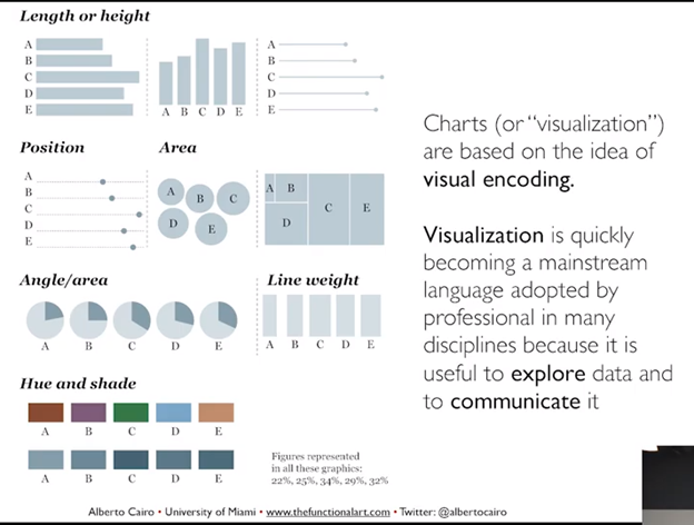
Categorical analysis is the foundation of data visualization. It is the first and most frequent type of data visualization data analysts use. Categorical analysis takes a dimension (example: Regions) and breaks apart by a measure (example: Sales). A dimension is typically a categorical value; these do not get aggregated. They are likely used to create data headers or to generate filters. A measure is a (usually numerical) value that can be aggregated using mathematical functions (like sum, average, or median). Measures create unbroken axes, those that extend from one end of a range to the other.
This type of analysis aids in answering common business questions such as:
- How does A compare to B?
- How is X measure distributed across Y categories?
- How much do A, B, and C contribute to the total?
- How does X measure change over time (where time is the dimension)?
Categorical analysis is usually presented as bar charts. Bar charts use height or length as visual encoding to express a measure. Visual encoding refers to different techniques for displaying data in charts. Encoding data in bar charts is very effective because humans can quickly analyze the variation among the size of the bars; they are also very easy to understand and label.
In our first use case, we will explore how to make effective bar charts. Youll play the role of a large financial institution that wants to understand which merchant categories make up the majority of transactional spend in order to drive marketing efforts and partnerships and better serve customers interests. We will also expand from the defaults and learn two additional methods for making bar charts that demonstrate the most important information.
In the second case study, on treemaps, youll learn about working with many dimensions. While bar charts are very useful, there are other data visualization tools youll need to leverage when doing categorical analysis. Sometimes when there are many members of a dimension, it becomes problematic to display each member as a bar chart. When this happens, you can use alternative chart forms to conserve space but still display all members. The most useful chart for this scenario is a treemap. Here youll play a non-profit organization that controls and awards grant money for Creative, Performing, and Cultural Arts Programs and Initiatives for the state of New York.
In our final use case within the chapter, youll learn how to use pie charts and donut charts to visualize whole relationships. Here, you are conducting a survey about IT professionals, their employment, their mental health and their employers attitudes toward mental health. Often these are the first type of data visualization you learn in school, but we like to use them sparingly and as an alternative option. By the time we get to this use case, youll see how properly executed pie charts can be great tools to craft and share data with your audience.
- Create compelling bar charts that work dynamically to display top contributor information and also those that can automatically group together dimensions of small values
- Understand when to utilize bar charts vs. treemaps when faced with a dimension of several members. Utilize drill-down features within TreeMaps to explore tiered dimensions. Leverage additional data encoding by way of color to express alternative information.
- Utilize pie charts to demonstrate part-to-whole relationships. Turn pie charts into donut charts that communicate multiple data points. Utilize small multiple charts to do dual dimension comparisons.
Bar charts should be the first visualization type you try when exploring categorical analysis. Because they use length and height as visual encoding, they make it easy to interpret and compare members.
If you have many members of a dimension and only need to focus on top contributors, you can create a Top N bar chart that uses a parameter, or dynamic entry value, to limit the amount of data in the view. Since a parameter is defined by the audience, it can make customized charts that suit the audiences preferences.
To enhance bar charts further, you can also create percent- of- total calculations and dynamically combine small members. This is useful when its important to see all the data in a chart, but you need to focus on large contributors. Well walk through how to create a Set that changes based on a parameter.
Font size:
Interval:
Bookmark:
Similar books «Tableau Strategies»
Look at similar books to Tableau Strategies. We have selected literature similar in name and meaning in the hope of providing readers with more options to find new, interesting, not yet read works.
Discussion, reviews of the book Tableau Strategies and just readers' own opinions. Leave your comments, write what you think about the work, its meaning or the main characters. Specify what exactly you liked and what you didn't like, and why you think so.